Tag Archives: Experiment

…The Cool Exec with a Heart of Steel.”

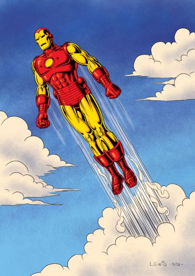
This time out, it’s the invin­ci­ble Iron Man! Thanks to the recent movies, now even more peo­ple know Tony Stark’s alter ego. Obvi­ous­ly I’m not doing the movie ver­sion here. Instead, this is the out­fit that first comes to mind for me when some­one says the phrase “clas­sic Iron Man armor” (though I real­ize oth­ers may think of dif­fer­ent suits).

I can’t claim to have fol­lowed Iron Man reg­u­lar­ly as a kid, but there were still some very cool images and sto­ry­lines I caught back then that stayed with me (such as his epic bat­tle with the giant Tita­ni­um Man!). And as far as wish-ful­fill­ment goes, Iron Man’s a pret­ty cool idea: hav­ing the smarts and mon­ey to invent an armored suit which enables you to fly, gives you great strength as well as many oth­er kinds of cool abil­i­ties and weapons. And he even made his first suit out of spare parts, right under the noses of his cap­tors while being held hostage!

This draw­ing was a big exper­i­ment for me. I elect­ed to make myself do it 100% dig­i­tal­ly, final­ly give myself a project to do using my Man­ga Stu­dio EX soft­ware. It just seemed the appro­pri­ate thing to do, with such a high-tech character.

Work­ing all-dig­i­tal­ly is a dif­fer­ent expe­ri­ence. While I’m very com­fort­able with most oth­er aspects of gen­er­at­ing my art using my com­put­er, the ini­tial draw­ing is a dif­fer­ent mat­ter. It feels very weird to start a draw­ing with­out first pick­ing up a pen­cil and a piece of paper. Almost like I can’t quite ful­ly think or visu­al­ize clear­ly with­out those items. The feel­ing’s a bit like those old dreams where you’d go to school and have this nag­ging sen­sa­tion you for­got some­thing, only to look down and see you left your pants at home! This will take fur­ther work. But regard­less, I don’t think I’ll ever want to entire­ly give up my pen­cil and paper!

This one’s for Frank, A.K.A. Iron Man Fan #1. Hope I did jus­tice to your favorite!

We’ve Got You Covered!”

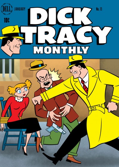
Per­haps some of you read­ing this might be famil­iar with the Cov­ered Blog. If not, it’s a site where artists are chal­lenged to take an exist­ing, pub­lished com­ic book cov­er and rein­ter­pret it. The results can be inter­est­ing, and I thought it might be fun to take a shot at doing one.

I chose to rework the cov­er of Dell Comics’ Dick Tra­cy Month­ly #13, cov­er-dat­ed Jan­u­ary 1949 (If you’re curi­ous to com­pare, you can view the orig­i­nal side-by-side with mine over on Cov­ered here). But I did­n’t do it in one of my usu­al styles. Instead, I real­ized that Chester Gould’s style on Dick Tra­cy was pret­ty 2D and graph­ic to begin with, and that it might be fun to push it just a lit­tle fur­ther into look­ing some­thing like a Flash ani­ma­tion style.

I worked on a Flash-ani­mat­ed direct-to-video fea­ture, Hydee and the Hy Tops, and enjoyed it very much. The look of Flash is fun, and I would wel­come the oppor­tu­ni­ty to work on anoth­er project in that vein. I have a lot of respect for artists like Craig McCrack­en and Lau­ren Faust who do that kind of work very well. So it seemed like this would be a good oppor­tu­ni­ty to stretch some artis­tic mus­cles and try some­thing new.

The BG por­tion of this cov­er was done using Pho­to­shop, but the rest of it was done in Adobe Illus­tra­tor. If you’ve vis­it­ed my site before, you know I’ve used Illus­tra­tor for a num­ber of dif­fer­ent projects. But this project required car­ry­ing out the final image in a dif­fer­ent way from how I’d done before.

As far as why I chose to rein­ter­pret a Dick Tra­cy cov­er in the first place, I think it might be because I’ve been fol­low­ing the reg­u­lar Dick Tra­cy strip these last sev­er­al months, so Tra­cy was in the back of my mind. The strip’s been reju­ve­nat­ed by Joe Sta­ton and Mike Cur­tis, and I’ve been hav­ing a blast fol­low­ing it. If you get the chance, give it a look!

It’s the Fourth of July!

It’s Inde­pen­dence Day today in the U.S. of A.! That usu­al­ly means time off, doing fun things like pic­nics or bar­be­cues with friends, pos­si­bly tak­ing in a fire­works show (depend­ing on where you live), and maybe hope­ful­ly even giv­ing a thought to some of the free­doms we’re priv­i­leged to enjoy in this coun­try, which we can some­times take for granted.

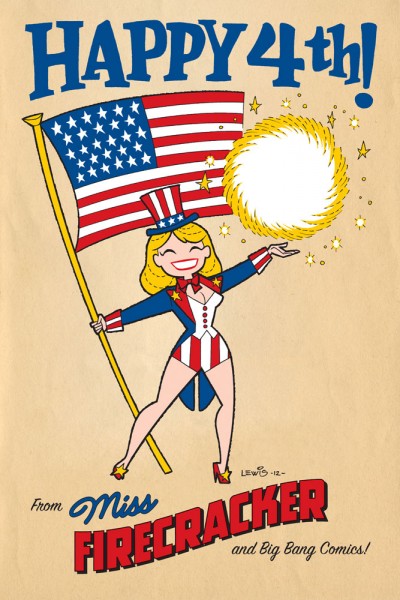
This post is most­ly moti­vat­ed by the fact that real­iz­ing the hol­i­day was com­ing up, I had an image pop into my mind appro­pri­ate for the day, so I thought I’d go for it! As not­ed there, the char­ac­ter is Miss Fire­crack­er from Big Bang Comics, though she’s depict­ed here in a dif­fer­ent style from how she ever appeared in Big Bang.

This is a good oppor­tu­ni­ty to talk about Big Bang Comics a lit­tle bit. Some peo­ple read­ing this may know that I was a con­trib­u­tor to Big Bang through its most active years. Though I can’t claim to have been there from the absolute very begin­ning, I did get in pret­ty ear­ly on. The char­ac­ter I had the most involve­ment in shap­ing would’ve been the Badge. But thanks to Big Bang hon­chos Gary Carl­son and Chris Eck­er, I got the chance to get my hands into a whole lot more than that.

Not only did I get to draw a num­ber of oth­er Big Bang char­ac­ters (par­tic­u­lar­ly on fake com­ic cov­ers as seen in “The Big Bang His­to­ry of Comics” issues of Big Bang Comics), I got to design sev­er­al oth­er char­ac­ters, cre­ate logos, even kib­itz on some sto­ry­lines, ink and col­or. The way I looked at Big Bang, it was sort of  “comics his­to­ry through a fun­house mir­ror.” You got to cre­ate things that felt famil­iar, yet new at the same time. It was a real­ly fun ride, guys! Thanks much!

I’ve got anoth­er post already in the pipeline that I hope to be able to pull the trig­ger on soon, but that’s it for this one. Have a great 4th, everyone!

The Original Black Cat

This time out, for no spe­cial rea­son, here is the orig­i­nal Black Cat. I’ve kind of had a soft spot for Har­vey Comics’ ver­sion of the Black Cat from the gold­en age for a while now.

If you’re not famil­iar with the char­ac­ter, behind the Black Cat’s mask in the comics was actress Lin­da Turn­er. She’d start­ed out her career orig­i­nal­ly as a stunt­woman, but had suc­cess­ful­ly tran­si­tioned into becom­ing a lead actress. The var­i­ous skills she’d picked up dur­ing her stunt­woman career enabled her to fight crimes and solve mys­ter­ies incog­ni­to as the Black Cat. The ’40s Hol­ly­wood milieu gave her sto­ries a lit­tle dif­fer­ent feel from oth­er, more typ­i­cal­ly NYC-fla­vored super­hero comics.

Sev­er­al artists drew her sto­ries, but the artist most asso­ci­at­ed with the char­ac­ter would have to be Lee Elias. Elias was clear­ly a Can­iff dis­ci­ple, and he did that style very well. He gave his hero­ine (and the strip in gen­er­al) a real charm and appeal.

Obvi­ous­ly I did­n’t both­er try­ing to mim­ic Elias’ work here. For some rea­son, I envi­sioned this from the begin­ning as using a vec­tor-based Adobe Illus­tra­tor approach. Yet anoth­er exper­i­ment. The beau­ty of this being my site, I can exper­i­ment with all kinds of approaches.

If you’re curi­ous to see some Black Cat comics for your­self, I’m not sure where you could buy them now (with­out pay­ing the usu­al prices for gold­en age comics). I picked up a set of reprints some years back now via Bud Plant (and thanks once again to my bud­dy Eric Wight for alert­ing me to those back then!). Unfor­tu­nate­ly though, I don’t think those are in stock any­more. But, the good news is, you can view just about every issue of Black Cat online, cour­tesy of The Dig­i­tal Com­ic Muse­um (What a great resource!).

And that’s a wrap for this one!

The 50th

This is not exact­ly some­thing brand new, but done a few years back for the invites to my Mom and Dad’s 50th Anniver­sary cel­e­bra­tion. I thought maybe a few more peo­ple than just those who saw it back then might enjoy it.

I don’t nor­mal­ly do a lot of car­i­ca­ture. So I fig­ured as long as I was going to attempt it, I might take my cues from one of the best: Al Hirschfeld. It was def­i­nite­ly a chal­lenge to work this way, but I was hap­py with the result. Oh; don’t strain your eyes look­ing for “Ninas,” because there aren’t any!

Not much more to say about this right now, except; Mom, Dad, I love you very much.

Looking Back

This will be one of those schizo posts I’ve done from time to time, where the illus­tra­tion part does­n’t nec­es­sar­i­ly relate to the bulk of the text. And “bulk” is prob­a­bly the right word; this post will be length­i­er than usu­al, so I apol­o­gize for that in advance.

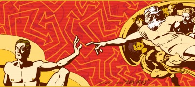
Let me explain about the illus­tra­tion first. My younger broth­er is writ­ing a book, and asked me to do the cov­er illus­tra­tion. Over the years, we’ve col­lab­o­rat­ed on a num­ber of projects (includ­ing our band, back in the ’80s). And it’s always an inter­est­ing and chal­leng­ing expe­ri­ence (in the best sens­es of those words), because I have a lot of free­dom to try things that I prob­a­bly could­n’t for oth­er clients. Usu­al­ly, I wind up head­ing into new and unfa­mil­iar ter­ri­to­ry that I might not have explored on my own. This piece is a case in point: we wound up with Michelan­gelo’s The Cre­ation of Adam as rein­ter­pret­ed through a kind of “street art” lens. Def­i­nite­ly not a direc­tion I would’ve imag­ined myself going, but I’m pleased with the end prod­uct. Though don’t expect to go out late at night and find me throw­ing it up on the side of some build­ing in the wilds of down­town Los Angeles!

Now on to my main sub­ject: I’ve real­ized that this month marks the one year anniver­sary of my site. It seemed like this might be a good point to take a look back, and give some­thing of a peek behind the cur­tain. When I first began to weigh the idea of putting up my own site, I was very reluc­tant to both­er, to be hon­est. The only rea­son I did it was because it has become absolute­ly essen­tial as an artist (par­tic­u­lar­ly in ani­ma­tion) to have a web­site. Most stu­dios now don’t want to han­dle phys­i­cal port­fo­lios any­more; they’d rather just have a link they can click on to view your work. So this was a case of “like it or not, you’ve got to do the research and get your own site up.”

But I’ve found a real­ly good thing that has come out of hav­ing the site. As a kid, I used to love to draw. I’d spend hours at the kitchen table doing it. But fast-for­ward to adult­hood, and an unfor­tu­nate side effect some­times of turn­ing the thing you loved doing as a kid into the work you do for a liv­ing as an adult, is that you can lose that love. When you spend all day being told what you’re sup­posed to draw and how to draw it, that can sap your moti­va­tion to draw any­thing for your­self when you’re off work. The last thing you feel like doing some­times at the end of the day is to pick up a pen­cil again for your­self. But the thing is, it’s impor­tant to keep at least a por­tion of your art as an out­let for your own expres­sion. Mak­ing time to draw for your­self is impor­tant. Hang­ing onto that love for draw­ing you once had as a kid is important.

And hav­ing my own site, where I can draw what­ev­er I want, and in what­ev­er style I want, has gone a ways toward help­ing me to regain that love. Though it’s a lame sim­i­le, it’s almost like my site’s become the inter­net equiv­a­lent of hav­ing a giant refrig­er­a­tor that I can tack my art to, for peo­ple to see when they come by.

One oth­er thing I decid­ed, ear­ly on, (and I guess you can file this under “state­ment of pur­pose”) is that I want­ed to stay on the pos­i­tive side in any­thing I write here. It’s very easy to go neg­a­tive. As my friends can tell you, I have my opin­ions about the things I don’t like in movies, car­toons, comics, etc., just like any­one else. But there are plen­ty of places on the inter­net where peo­ple can (and do) vent at length about things like that. I’d pre­fer to be a pos­i­tive voice. Rather than waste time talk­ing about what I don’t like (why give those things any fur­ther expo­sure?), why not spend my time talk­ing about the things that I like? Why not give those things the spot­light? So that’s what I’ve tried to do thus far, and what I intend to keep doing. That, and show­ing off new work on my big inter­net refrig­er­a­tor when I feel like it. 🙂

And that’s prob­a­bly more than enough ver­bosi­ty for one post! If you’ve actu­al­ly made it through to this point, I wish all read­ing this a Hap­py Thanksgiving!

The Man from Planet X

A con­fes­sion: I like a lot of old movies. And I have a bit of a soft spot for many of the old sci-fi or mon­ster movies. Recent­ly, I had the chance to watch The Man from Plan­et X (cour­tesy of TCM and my DVR), which I’d nev­er seen before. I had only ever run across men­tions of it as a kid from time to time in library books on sci-fi films. Turned out the film was decent, but noth­ing real­ly all that special…except for one thing: the title char­ac­ter. There was some­thing real­ly strik­ing about the alien design for this film.

When you boil it down, I sup­pose there’s not all that much to it. It’s just a nice bit of sculp­tur­al design for the head and hel­met assem­bly. The thing that prob­a­bly sells the alien and makes him mem­o­rable is the built-in up-light­ing they includ­ed in his hel­met, so he car­ried “dra­ma” with him wher­ev­er he went. Oth­ers’ mileage may vary, but the visu­al was strik­ing enough to lodge in my head at least. It’s a good exam­ple of mak­ing very effec­tive use of what was prob­a­bly a lim­it­ed pro­duc­tion budget.

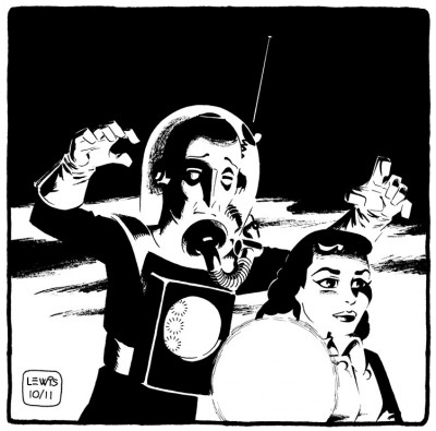
So here’s my shot at the Man from Plan­et X. I saw it as a chance to play around with some dra­mat­ic light­ing and black-spot­ting. It’s a bit of an exper­i­ment, in that I tried to ink it the way Mil­ton Can­iff and Noel Sick­les used to do: bang­ing in all my blacks first with a brush (scary!), then going back in with pen where it still need­ed it. I do like the whole “lost edges” effect that work­ing this way helps to achieve.

This scene did­n’t exact­ly hap­pen this way in the movie, but so what? It’s my blog, and I can draw what I want! And any­way, it seems a rea­son­ably appro­pri­ate image for Halloween.

One last thing here, a bit of triv­ia: the female lead in the film was Mar­garet Field, the moth­er of Sal­ly Field. I don’t know if any­thing like that would ever come up in a game of Triv­ial Pur­suit or not, but if so, don’t say I nev­er did any­thing for you!

UPDATE: FCA Edi­tor P.C. Hamer­linck made me aware of the fact Faw­cett had actu­al­ly pub­lished a com­ic adapt­ing this movie, with art by Kurt Schaf­fen­berg­er, and that you can check out a b/w UK reprint of it here. Inter­est­ing to see Schaf­fen­berg­er take his art in a dif­fer­ent direc­tion from what we’re used to see­ing him do, and to note that there are places in the com­ic where they diverged from the movie! Thanks Paul!

Missile Mouse

I men­tioned ear­li­er that from time to time, I intend to do posts of “inspi­ra­tional stuff.” Basi­cal­ly, we’re talk­ing comics I’ve come across that I think are real­ly good, and kind of inspire you to draw. So here’s another.

If you’ve ever checked out the list of artists over in my side­bar, per­haps you’ve looked at the work of Jake Park­er. He’s one of those artists that seem to strad­dle mul­ti­ple media, includ­ing comics and ani­ma­tion. His stuff is very imag­i­na­tive, appeal­ing and a lot of fun to look at.

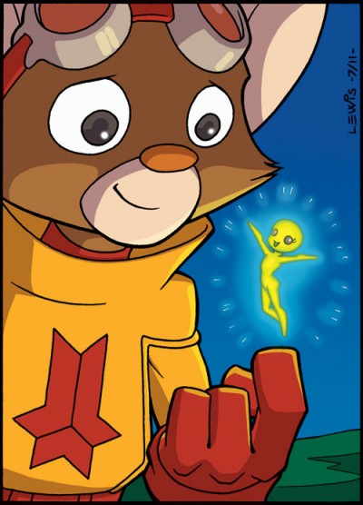
One of Jake’s cre­ations, Mis­sile Mouse, has now been fea­tured in two books: The Star Crush­er and Res­cue on Tanki­um 3 (Actu­al­ly, Mis­sile Mouse has appeared in three books, if you want to count Flight Explor­er Vol. 1) . You can buy them here. Mis­sile Mouse is a tough lit­tle char­ac­ter who usu­al­ly has to face down char­ac­ters and sit­u­a­tions that are much big­ger than him, but he nev­er backs down. He always does what he has to do.

In my opin­ion, one of the best aspects of these books is the way every­thing’s so clear­ly been thought out in great detail. Jake is a “world-builder.” He plain­ly puts a lot of thought into design­ing even the tini­est prop. In the back of Res­cue on Tanki­um 3 is a sec­tion where among oth­er things, he goes into great detail about all of Mis­sile Mouse’s gear, how it’s assem­bled, what prin­ci­ples it works on. The lev­el of back detail and thought put into these books makes for a fun and rich read­ing expe­ri­ence. They’re good all-ages reads, and worth check­ing out.

Since it’s my art­blog, of course I’ve got to put up some art. So up top is my Mis­sile Mouse fan art piece. As usu­al, my ani­ma­tion train­ing seems to have com­pelled me to try to get as close to on-mod­el as I can.  I did some exper­i­ment­ing with the col­or meth­ods, because if I can’t do that here, where can I? It struck me that most­ly we’ve seen Mis­sile Mouse inter­act­ing with beings who are a good deal big­ger than he is (play­ing the “David and Goliath” card very well), so I thought it might be fun to see him inter­act with some­thing much small­er than himself.

Mis­sile Mouse is ™ and © Jake Parker.

UPDATE: If you look in the Com­ments below, you’ll see that Jake has seen this post. He appar­ent­ly liked my draw­ing well enough to post it on his own site here. I’m very flat­tered! Thanks, Jake!

Rasputin

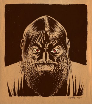
Cour­tesy of Turn­er Clas­sic Movies and my DVR (what a great inven­tion!), I had the chance not long ago to check out a cou­ple of old movies I’d nev­er seen before, both deal­ing with the infa­mous Rasputin. TCM played both films back to back when they aired. First on the agen­da was Rasputin and the Empress from 1932, with Lionel Bar­ry­more play­ing Rasputin (and doing a good and creepy job of it, too!). They fol­lowed that up with Christo­pher Lee play­ing the role in the 1966 Ham­mer Stu­dios film Rasputin: The Mad Monk. Lee, as usu­al, did a great job. He’s always a lot of fun to watch.

I don’t pre­tend to be any kind of an expert on the his­tor­i­cal Rasputin, so I can’t com­ment on the accu­ra­cy of either of these films. But they were fas­ci­nat­ing to watch. And obvi­ous­ly I’m not the only one who finds the char­ac­ter intrigu­ing; look­ing on IMDB, the first time some­one played Rasputin on film was back in 1917, only one year after his death. And he keeps crop­ping up as a char­ac­ter in films, to this day!

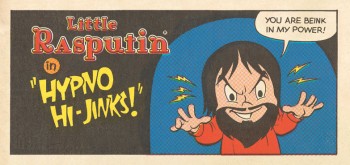
With­out try­ing for a like­ness of either Bar­ry­more or Lee (or the real Rasputin), I thought it might be fun to take a shot at a char­ac­ter draw­ing. I only meant to do one draw­ing, but then I was­n’t entire­ly sure about how it was com­ing out, so I kept going, envi­sion­ing dif­fer­ent approach­es. There’s a whole bunch of exper­i­men­ta­tion going on here, with styles, tools, col­or­ing etc. Instead of mak­ing myself crazy try­ing to decide which way to go, I thought I’d just go ahead and run them all up the flag­pole, let the chips fall where they may. And that’s prob­a­bly more than enough Rasputin for any­body in one dose!

I was a one-man meme!

Animation Insider

Pon­tif­i­ca­tion”

I did an inter­view with the site Ani­ma­tion Insider.com, which they just post­ed. You can check it out here, if you like. The site has inter­views with a num­ber of us who toil in the ani­ma­tion trench­es, if you have any curios­i­ty about what that’s like, what dif­fer­ent kinds of things we all do, or how we got there. We’re a pret­ty var­ied bunch.

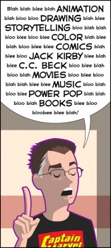
And, of course, I got­ta post some art to go with this announce­ment. I had an idea of an image, and thought it might work to do it in Illus­tra­tor as an exper­i­ment. Guess the “no con­tain­ment lines” look of the project I teased in my pre­vi­ous post was still in the back of my mind. And that’s all for this one, before I get accused of liv­ing up to this illustration!

Bloobee blee blah!