Tag Archives: Golden Age

The Forgotten Ones: Bee-29, the Bombardier

Bee-29There’s prob­a­bly a lot of ground I should cov­er to explain this one, so I’ll get right to it.

In doing research for a recent project (which you’ll find out about at a lat­er date), I was point­ed towards a web­site fea­tur­ing com­ic book char­ac­ters that are now report­ed­ly in the pub­lic domain. While going through all those char­ac­ters, it struck me that there was mate­r­i­al there which might be worth min­ing for future blog posts. As a result, this will be the first of a series of posts on “For­got­ten Ones,” which I may do from time to time.
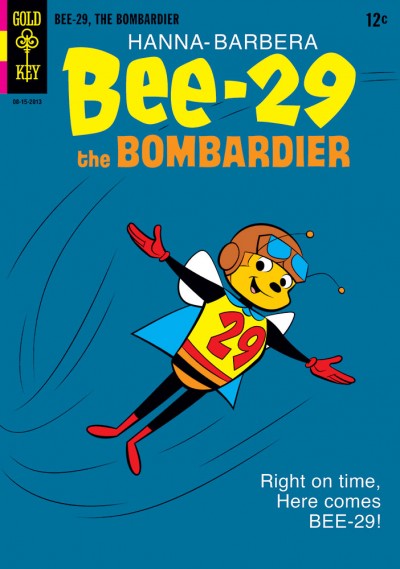
For this inau­gur­al out­ing, I chose Bee-29, the Bom­bardier. Bee-29 is unique because so far as I know, he’s the only bee super­hero! He only made a few appear­ances back in 1945, but one of them was in a com­ic named for him. In the inter­ests of sav­ing col­umn space, if you’d like to read the entry for Bee-29 on the Pub­lic Domain Super Heroes site, you can check it out here.

If you’ve vis­it­ed this site much, you’ve prob­a­bly picked up on the fact I often like to try to find an angle to approach a char­ac­ter like this, some kind of a dif­fer­ent spin I can put on it instead of just repro­duc­ing some­thing ver­ba­tim. So I thought, “What if in some alter­nate world, Han­na-Bar­bera had picked up the rights to this char­ac­ter?” Going down that path lead to my attempt at an HB ver­sion of Bee-29 on the faux Gold Key cov­er you see here, since Gold Key han­dled most of the car­toon-based comics back in the day.

Let me go on record here and say that I am def­i­nite­ly a fan of the clas­sic Han­na-Bar­bera look. Yes, I grew up watch­ing those shows, but it’s more than that. Years ago when Han­na-Bar­bera was locat­ed on the 14th floor of the Impe­r­i­al Bank Build­ing in Sher­man Oaks, mul­ti­ple times a day I would walk by these great framed cels from shows like The Flint­stones and The Jet­sons, hang­ing on the walls in the hall­way. I saw how well-designed all those char­ac­ters were, and how strong­ly sil­hou­ette-ori­ent­ed they were. The HB design­ers took the restric­tions of lim­it­ed ani­ma­tion and small TV screens, and actu­al­ly turned them into strengths.

I’ve not had a lot of oppor­tu­ni­ty to attempt that clas­sic HB look, so this was a chance to ven­ture onto that play­ground a lit­tle bit. And I’d be remiss if I did­n’t tip my hat here and say thanks to my good friend Mark Chris­tiansen, who is tru­ly a clas­sic HB master.

Mary’s Dad

FCA Marc Swayze Tribute CoverNow that it’s a new month, I’ve got clear­ance to reveal the last two of those images I teased you with pre­vi­ous­ly. These will both be appear­ing in the FCA por­tion of the upcom­ing August cov­er-dat­ed issue of Roy Thomas’ Alter Ego (avail­able start­ing in July, so you don’t have to wait all that long!).

First up is my FCA cov­er, done as a trib­ute to Gold­en Age artist Marc Swayze. While the orig­i­nal order to give Bil­ly Batson/Captain Mar­vel a sis­ter may have come down from the Faw­cett front office, the job fell to Mr. Swayze to bring her to life. He designed Mary and drew at least her first cou­ple of appear­ances, before being moved on to oth­er jobs. So I think it could be argued that Marc Swayze deserves the title of Mary Mar­vel’s hon­orary father.

This FCA issue is appear­ing in the month which would’ve been Mr. Swayze’s 100th birth­day. Though he did­n’t quite make that mile­stone, it’s still a worth­while moment to pause and give trib­ute. FCA read­ers know Mr. Swayze had a long-run­ning col­umn there, enti­tled “We Did­n’t Know…It Was the Gold­en Age!” Writ­ten in a very appeal­ing­ly gra­cious and hum­ble style, the read­er got the priv­i­lege of look­ing in on snap­shots of rem­i­nis­cence tak­en at dif­fer­ent moments in Mr. Swayze’s life. It was­n’t all about the comics; this man lived a very full and rich life. Hence my inscrip­tion. He and his con­tri­bu­tions to FCA will be missed.

I was huge­ly hon­ored to be asked to do this trib­ute cov­er, and want­ed to be sure to do right by Mr. Swayze. FCA Edi­tor P.C. Hamer­linck and I bat­ted a num­ber of ideas back and forth before we set­tled on a con­cept we both liked and felt was fit­ting. My first incli­na­tion of course was to try to just flat-out mim­ic Mr. Swayze’s style, make it look like maybe he drew it him­self. But P.C. made it clear that was­n’t what he want­ed. He was after my ver­sion of Mr. Swayze’s Mary. I hope I’ve done them both justice.

Binder Column HeaderThe sec­ond image (at left) is a head­er for a new reg­u­lar col­umn debut­ing in FCA the same month. You can see the title there in the art. This col­umn will fea­ture the writ­ing and rem­i­nis­cences of writer Otto Binder, a cre­ative dynamo who had an enor­mous hand in shap­ing not only Cap­tain Mar­vel and the Mar­vel Fam­i­ly for Faw­cett, but he lat­er made huge con­tri­bu­tions to Super­man’s mythol­o­gy as well! And that’s real­ly just the tip of the ice­berg. I’m look­ing for­ward to read­ing these columns and find­ing out what he has to say.

Of Mad Scientists and Big Red Cheeses

FCA Colón/RubinsteinLooks like I missed post­ing last month, due to still being pret­ty busy. Again, that’s a good thing! How­ev­er, now that it’s a new month, I’ve got clear­ance to reveal in full one of the three items I teased back in Feb­ru­ary. This is a cov­er for anoth­er issue of FCA, appear­ing in the upcom­ing July issue of Roy Thomas’ Alter Ego mag­a­zine (actu­al­ly on stands in June, so you don’t have to wait that long!).

Right up front, I need to make it clear that I did not pen­cil or ink this cov­er. It was drawn by Ernie Colón, and inked by Joe Rubin­stein. If you’re famil­iar with those gen­tle­men and their work, that may sound like an unusu­al pair­ing to you at first. I know it did to me, but I’m told that they are col­lab­o­rat­ing quite a bit in recent times. (And if you’re not famil­iar with them, let your fin­gers get to googling!)

So why did I post this on my site if I did­n’t draw it? It’s because I col­ored it. FCA Edi­tor P.C. Hamer­linck con­tact­ed me to ask if I’d be will­ing to, and I said “yes.” Some­thing about the way this was put togeth­er remind­ed me a bit of those clas­sic old illus­trat­ed mag­a­zine cov­ers (for exam­ple, The Sat­ur­day Evening Post). So I tried to give the col­ors on this a lit­tle more of a painter­ly feel than I’ve attempt­ed before, though that might not be entire­ly vis­i­ble at this res­o­lu­tion. I hope Mr. Colón and Mr. Rubin­stein feel I did jus­tice to their work.

Again with the Teasing!

FCA Teaser 3BDue to “busy-ness” here late­ly (a good thing), I’m falling back on the ol’ reli­able tease once again.

The images you’re see­ing here are details from a few illus­tra­tions that have crossed my desk this month which I had a hand in gen­er­at­ing, in one capac­i­ty or anoth­er. These were all done for the FCA sec­tion of Roy Thomas’ Alter Ego mag­a­zine, pub­lished by Twom­or­rows. Full images will appear on my site even­tu­al­ly, once I’ve been giv­en the “all clear” to do so. Mean­time, hope­ful­ly there’s enough here to whet your appetite to see more at a lat­er date.

FCA Teaser 3AI hope the New Year is being good to you all thus far.

FCA Teaser 3C

We’ve Got You Covered!”

Per­haps some of you read­ing this might be famil­iar with the Cov­ered Blog. If not, it’s a site where artists are chal­lenged to take an exist­ing, pub­lished com­ic book cov­er and rein­ter­pret it. The results can be inter­est­ing, and I thought it might be fun to take a shot at doing one.

I chose to rework the cov­er of Dell Comics’ Dick Tra­cy Month­ly #13, cov­er-dat­ed Jan­u­ary 1949 (If you’re curi­ous to com­pare, you can view the orig­i­nal side-by-side with mine over on Cov­ered here). But I did­n’t do it in one of my usu­al styles. Instead, I real­ized that Chester Gould’s style on Dick Tra­cy was pret­ty 2D and graph­ic to begin with, and that it might be fun to push it just a lit­tle fur­ther into look­ing some­thing like a Flash ani­ma­tion style.

I worked on a Flash-ani­mat­ed direct-to-video fea­ture, Hydee and the Hy Tops, and enjoyed it very much. The look of Flash is fun, and I would wel­come the oppor­tu­ni­ty to work on anoth­er project in that vein. I have a lot of respect for artists like Craig McCrack­en and Lau­ren Faust who do that kind of work very well. So it seemed like this would be a good oppor­tu­ni­ty to stretch some artis­tic mus­cles and try some­thing new.

The BG por­tion of this cov­er was done using Pho­to­shop, but the rest of it was done in Adobe Illus­tra­tor. If you’ve vis­it­ed my site before, you know I’ve used Illus­tra­tor for a num­ber of dif­fer­ent projects. But this project required car­ry­ing out the final image in a dif­fer­ent way from how I’d done before.

As far as why I chose to rein­ter­pret a Dick Tra­cy cov­er in the first place, I think it might be because I’ve been fol­low­ing the reg­u­lar Dick Tra­cy strip these last sev­er­al months, so Tra­cy was in the back of my mind. The strip’s been reju­ve­nat­ed by Joe Sta­ton and Mike Cur­tis, and I’ve been hav­ing a blast fol­low­ing it. If you get the chance, give it a look!

The Original Black Cat

This time out, for no spe­cial rea­son, here is the orig­i­nal Black Cat. I’ve kind of had a soft spot for Har­vey Comics’ ver­sion of the Black Cat from the gold­en age for a while now.

If you’re not famil­iar with the char­ac­ter, behind the Black Cat’s mask in the comics was actress Lin­da Turn­er. She’d start­ed out her career orig­i­nal­ly as a stunt­woman, but had suc­cess­ful­ly tran­si­tioned into becom­ing a lead actress. The var­i­ous skills she’d picked up dur­ing her stunt­woman career enabled her to fight crimes and solve mys­ter­ies incog­ni­to as the Black Cat. The ’40s Hol­ly­wood milieu gave her sto­ries a lit­tle dif­fer­ent feel from oth­er, more typ­i­cal­ly NYC-fla­vored super­hero comics.

Sev­er­al artists drew her sto­ries, but the artist most asso­ci­at­ed with the char­ac­ter would have to be Lee Elias. Elias was clear­ly a Can­iff dis­ci­ple, and he did that style very well. He gave his hero­ine (and the strip in gen­er­al) a real charm and appeal.

Obvi­ous­ly I did­n’t both­er try­ing to mim­ic Elias’ work here. For some rea­son, I envi­sioned this from the begin­ning as using a vec­tor-based Adobe Illus­tra­tor approach. Yet anoth­er exper­i­ment. The beau­ty of this being my site, I can exper­i­ment with all kinds of approaches.

If you’re curi­ous to see some Black Cat comics for your­self, I’m not sure where you could buy them now (with­out pay­ing the usu­al prices for gold­en age comics). I picked up a set of reprints some years back now via Bud Plant (and thanks once again to my bud­dy Eric Wight for alert­ing me to those back then!). Unfor­tu­nate­ly though, I don’t think those are in stock any­more. But, the good news is, you can view just about every issue of Black Cat online, cour­tesy of The Dig­i­tal Com­ic Muse­um (What a great resource!).

And that’s a wrap for this one!

With One Magic Word…

Final­ly I get to show off the last of those two items I teased back in Decem­ber. I gave a fur­ther peek at it here. It’s anoth­er cov­er done for FCA, which appears in the back of Roy Thomas’ Alter Ego mag­a­zine. This one was obvi­ous­ly done up to look like one of those issues of Secret Ori­gins that DC Comics pub­lished in the ear­ly ’70s. I loved those as a kid, because back then they were one of the rare venues where you had an oppor­tu­ni­ty to see any of that gold­en age com­ic material.

I’ve talked in pre­vi­ous posts about how much I liked the gold­en age Super­man and Bat­man. But with­out a doubt, my favorite gold­en age char­ac­ter would have to be Cap­tain Mar­vel. When DC brought him back from pub­lish­ing lim­bo in the ear­ly ’70s, I was already primed for it. I’d read about the “Big Red Cheese” in our local library’s copy of All in Col­or for a Dime, as well as in The Ster­anko His­to­ry of Comics. Some­thing about the visu­al and the idea of the char­ac­ter hooked me, even with­out ever hav­ing seen a sin­gle Cap­tain Mar­vel sto­ry yet.

Not to dis­miss the sto­ries, but a huge part of the appeal of those gold­en age Cap­tain Mar­vel comics for me is the art. As the char­ac­ter’s design­er and main artist, C.C. Beck set the tone there. Most gold­en age com­ic book artists doing super­heroes looked to the news­pa­per adven­ture strips for their inspi­ra­tion. They most­ly tend­ed to fall into one of two schools: it was either the illus­tra­tive real­ism of Fos­ter and Ray­mond, or the more impres­sion­is­tic approach of Sick­les and Can­iff. Instead, Beck looked to the “fun­ny” por­tion of the fun­ny pages for his inspi­ra­tion (like Jack Cole did with Plas­tic Man). The result was a strip that had a look and feel like no oth­er. And of course, the writ­ing played a role in mak­ing that pos­si­ble too.

While the high­er-ups at Faw­cett may have want­ed Bill Park­er and C.C. Beck to just give them a knock­off of Super­man, that was not what they got. They got some­thing bet­ter. Many read­ers back then must have thought so too; at the peak of the char­ac­ter’s pop­u­lar­i­ty, they were pub­lish­ing Cap­tain Mar­vel Adven­tures bi-week­ly and sell­ing 1.3 mil­lion copies of each issue!

I know some­times mod­ern fans have trou­ble with Mr. Tawky Tawny and some of the more whim­si­cal aspects of the strip, but for me, the clas­sic Cap­tain Mar­vel mate­r­i­al is inspi­ra­tional stuff. I wish I could tell you of a rel­a­tive­ly cheap and easy way to lay hands on that work if you haven’t seen it, but it seems hard­er to come by these days.

Doc (“Don’t Call Me ‘Doctor!‘”) Strange

Now that it’s fin­ished, I can show you one of the two items I teased back in Decem­ber. It’s a pin-up of the old Nedor Comics hero Doc Strange, as he might have appeared on the cov­er of an issue of Thrilling Comics in 1965, had Nedor still been pub­lish­ing at that point.

If you’re not famil­iar with the com­pa­ny, Nedor pub­lished (under sev­er­al names) dur­ing the gold­en age. They actu­al­ly had a fair­ly siz­able group of heroes, includ­ing Doc Strange. Nedor ceased pub­lish­ing comics at the end of the gold­en age. Since then, many peo­ple have tak­en a shot at doing some­thing with their old char­ac­ters. AC Comics has made use of them over the years, and so did Alan Moore and Peter Hogan more recent­ly in the Tom Strong spin­off minis­eries, Ter­ra Obscura.

Doc was a scientist/adventurer who invent­ed a serum he named Alo­sun, dis­tilled from “sun atoms.” This serum gave him super­hu­man strength, flight and invul­ner­a­bil­i­ty when he used it.

Enough of the his­to­ry les­son. So why did I do this pin-up/­cov­er? Easy; because I was asked. The one and only Will Meugniot is cur­rent­ly doing a new cre­ator-owned series (in the back of AC Comics’ Fem­Force) that picks up the threads of the Nedor books with the descen­dants of some of the char­ac­ters. It’s called “Agents of N.E.D.O.R.,” and is intend­ed as a peri­od piece tak­ing place in 1965. Will invit­ed sev­er­al artists to con­tribute pin-ups of the orig­i­nal Nedor char­ac­ters, and I was very flat­tered to be asked if I’d like to do so too.

As is typ­i­cal for me, instead of mak­ing things sim­ple on myself, I had to make a whole cov­er out of it. Since Will’s sto­ry takes place in 1965, I thought this should be a cov­er for Thrilling Comics (which starred Doc) also from ’65, as if Nedor had kept on pub­lish­ing all that time. I even did some math to work out the issue num­ber. How’s that for obsessive?

Doc Strange most often went on his adven­tures accom­pa­nied by his young side­kick Mike (who wore an iden­ti­cal out­fit, only with the addi­tion of a green cape for some rea­son). I thought it would be more fun though to show Doc with his girl­friend, Vir­ginia Thomp­son, as she would also some­times take part in his adven­tures. Of course, I updat­ed her look here for the times.

This will appear in b/w line art form in Fem­Force #159, since the book has b/w inte­ri­ors. But for my blog here, I want­ed to go full col­or. Because it’s how I saw this in my head from the start. I get asked to do a b/w pin-up and I envi­sion some­thing in col­or; go figure!

Thanks, Will. This was a lot of fun!

She’s a Sensation!

Though DC’s big reboot has already been sprung on us, I had one more image in that poster style that I had to try. Might as well com­plete the tri­fec­ta, right?

So this time out, it’s Won­der Woman. If you’ve read my pre­vi­ous posts on these gold­en age char­ac­ters, I real­ized I kind of uncon­scious­ly set up a pro­gres­sion; I men­tioned that I liked Super­man, but lat­er con­fessed I liked Bat­man a lit­tle more. So you might be expect­ing me this time out to say I liked Won­der Woman the best. But you’d be wrong.

Sor­ry to say, I real­ly was­n’t all that into Won­der Woman as a kid. I appre­ci­ate the strip much more now as an adult than I did back then, for its his­toric sig­nif­i­cance as well as some of the aspects that are unique to it (the fan­ta­sy ele­ments, the mytho­log­i­cal, etc.). Per­haps the gold­en age art (by H.G. Peter) looked a lit­tle heavy-hand­ed and crude to me in some ways as a kid. Look­ing at it now, I have more of an appre­ci­a­tion for it (It feels at times like a sort of car­toon ver­sion of an Albrecht Dür­er engraving).

Won­der Woman is an inter­est­ing con­cept that seems to be a tough one for writ­ers and artists to get a han­dle on. And even if they man­age, it seems hard to get a han­dle on it such that it will engage peo­ple and get them to buy the book (Which is prob­a­bly the more impor­tant point). Many approach­es have been tried with vary­ing degrees of suc­cess, and some don’t get tried at all. But Marston and Peter must’ve had a han­dle on some­thing when they cre­at­ed her. She’s sur­vived this long and man­aged to become part of our col­lec­tive pop cul­ture men­tal land­scape, rec­og­niz­able even to non-comics read­ers. I think that’s worth a lit­tle salute here.

A con­fes­sion: this poster is a loose homage (which I acknowl­edged in how I signed it) to an orig­i­nal poster by Lud­wig Hohlwein. In study­ing his work online, I stum­bled across one poster that just seemed a nat­ur­al to adapt for a Won­der Woman image. It all but cried out for it. So that is what I did!

I Shall Become a BAT!”

The clock is count­ing down to DC Comics’ big reboot, and it’s still got me think­ing back on the orig­i­nals. I thought I should get at least one more post in here, before it hap­pens. Super­man was look­ing a lit­tle lonely.

Like I said in my pre­vi­ous post, I’ve always had an attrac­tion to the ear­ly gold­en age ver­sions of some of these char­ac­ters, despite the occa­sion­al rugged­ness in exe­cu­tion. There was a pri­mal kind of ener­gy there that per­haps got lost a lit­tle bit along the way, as the artists and writ­ers got bet­ter at their craft, and began to for­mu­late the rules for how you were sup­posed to do this sort of thing.

Last time, I copped to hav­ing an affec­tion for the gold­en age Super­man. But if pushed, I’d have to admit that I prob­a­bly liked the gold­en age Bat­man just a lit­tle bit more. Those ear­ly strips just dripped with mood: dark shad­ows, misty nights with almost always an enor­mous full moon, and plen­ty of strange char­ac­ters for the Bat­man to go up against. When I first began to encounter this stuff in those DC 100-Page Super-Spec­tac­u­lars as a kid, I had no prob­lem at all under­stand­ing why kids encoun­ter­ing these sto­ries for the first time on news­stands back in the gold­en age were attract­ed to it. This stuff cap­tured your imagination.

In the same vein as the Super­man poster, here’s one fea­tur­ing Bat­man in that ear­ly 20th Cen­tu­ry Poster Style. This time out, I did my ver­sion of a clas­sic pose that Kane used a num­ber of times in those ear­ly issues. A very big “Thank You” to Bill Fin­ger, Bob Kane, Jer­ry Robin­son, George Rous­sos, and all the rest of Kane’s “ghosts” over the years who made Bat­man what he was!