If you follow comics news at all, you’ve probably heard there’s this big reboot that DC Comics is doing in September. They’re starting all their books over from #1, redesigning all the characters and redoing their origins. You can’t assume now that you know anything for sure about who they are, their motivations or the overall scenario.
I’m not going to get into commentary on that here (there’s been plenty of that already in other places online). But I’ll admit the idea of the retirement of the original characters has me thinking back on them a bit wistfully. Though technically a child of comics’ silver and bronze ages, I’ve always had a fascination with the golden age era too. Despite the fact that work was often a bit crude in comparison to what came later, there was a certain life and raw energy to those early incarnations of the characters.
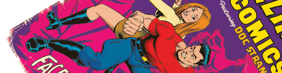
It’s a lot easier to lay hands on golden age comics stories now. Back when I was a kid, mostly you just got to read about them (in books like Steranko’s History of Comics, or All in Color for a Dime). If you could lay hands on one of DC’s 100-Page Super-Spectaculars though, you knew you were in for a rare treat.
") Like I say, I’ve long had a soft spot for these early, primal versions of characters like Superman (the proof is at left; a scan of a fake golden age cover I did when I was about 12 or 13). And with the DC reboot coming, I thought I’d revisit the original Superman once again. The new image up top could’ve gone in several different directions, but what I wound up honing in on is a Shuster-esque version, posed more formally. It’s been taken in the direction of vintage poster art from an even earlier era. Because that seemed like a fun idea at the time.
Like I say, I’ve long had a soft spot for these early, primal versions of characters like Superman (the proof is at left; a scan of a fake golden age cover I did when I was about 12 or 13). And with the DC reboot coming, I thought I’d revisit the original Superman once again. The new image up top could’ve gone in several different directions, but what I wound up honing in on is a Shuster-esque version, posed more formally. It’s been taken in the direction of vintage poster art from an even earlier era. Because that seemed like a fun idea at the time.
Just my salute to the golden age in general, and the original Superman in particular. Thanks very much, Mr. Siegel and Mr. Shuster!
UPDATE: I recently discovered online these neat Superman pages, drawn by Stewart Immonen some years back. Done in the style of Winsor McCay’s “Little Nemo,” they’re not entirely unrelated to what I’m trying to do here with this poster. I thought these were really neat, and worth sharing. It’s funny how well Superman works in a style like this!
 This is not exactly something brand new, but done a few years back for the invites to my Mom and Dad’s 50th Anniversary celebration. I thought maybe a few more people than just those who saw it back then might enjoy it.


Web")