Monthly Archives: June 2024

Oblivious

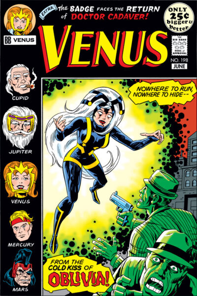
Fake comic cover for Big Bang Comics' Venus #198, with the character Olivia featured on the cover.As has no doubt become clear, I did a lot of fake cov­ers for “The Big Bang His­to­ry of Comics” issues. This one end­ed up being espe­cial­ly fun, for rea­sons you’ll under­stand when I explain who did what.

This cov­er is for the most part my work. I pen­ciled it, let­tered it, and now col­ored it. The inks? By none oth­er than (drum­roll please) Mr. Mike Roy­er him­self! He was Kir­by’s best inker in the ’70s, no ques­tion in my mind. I still kind of can’t believe this hap­pened. More about that in a minute.

Oblivia came about because I was think­ing of those odd char­ac­ters like the Black Rac­er who would sud­den­ly pop up ran­dom­ly out of nowhere in the midst of Jack­’s Fourth World saga at DC. I start­ed think­ing about what Joe Kingler (Big Bang Comics’ equiv­a­lent for Jack) might have done in the con­text of work­ing on Venus, and the name “Oblivia” popped into my head. It seemed to me very much the sort of “play on words” name that Jack often used. So a Venus cov­er fea­tur­ing her did­n’t at all seem out of line.

When I pen­ciled this cov­er, I had no clue who might end up ink­ing it. I prob­a­bly would­n’t have gone ahead and let­tered it if I had known. So when Big Bang’s Gary Carl­son raised a few pos­si­bil­i­ties for inkers, Mike Roy­er being one of them, it was the no-brain­er of all no-brain­ers to say, “Yes!”

I actu­al­ly had the oppor­tu­ni­ty to pick up the fin­ished cov­er in per­son, and was thrilled with the end result. I got to spend a very fun Sun­day after­noon hang­ing out at Mr. Roy­er’s home, con­vers­ing and hear­ing a lot of great sto­ries about his time in comics, work­ing for Dis­ney doing licens­ing art, plus oth­er top­ics. Again, thanks so much, Mr. Royer!

In col­or­ing this, I heav­i­ly ref­er­enced the way all those Fourth World cov­ers at DC were col­ored. That guid­ed me to go in some direc­tions I prob­a­bly would­n’t have gone if I were just col­or­ing this nor­mal­ly on my own (like knock­ing the gang­sters out all in green), but it helped to real­ly get across the right peri­od look.

Thanks for looking!

Venus Vs. Cupid

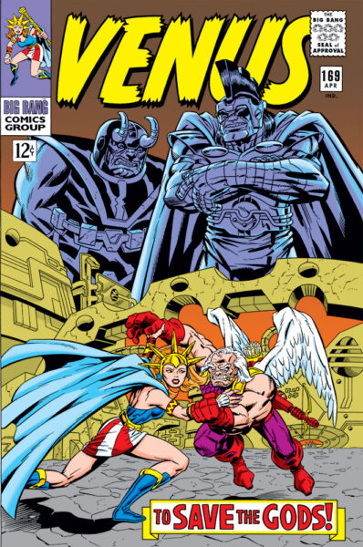
Fake comics cover for Big Bang Comics' Venus #169, with Ares looming in the backgroundI’m adding anoth­er to the group of fake cov­ers I had a hand in cre­at­ing some­time back for “The Big Bang His­to­ry of Comics” issues of Big Bang Comics. Cred­its on this one take a lit­tle expla­na­tion. Pen­cils were by Frank Squil­lace, inks and let­ter­ing by me. Frank did a col­or comp on a pho­to­copy with mark­ers, which I marked up with col­or for­mu­la call­outs to cre­ate a col­orist guide.

This cov­er end­ed up being repur­posed as an actu­al Big Bang cov­er for issue #34, with dif­fer­ent trade dress. For that instance, I believe some­one at Image actu­al­ly gen­er­at­ed the col­or file used to print it, based on the col­or guide we’d pro­vid­ed. I don’t think I actu­al­ly did that one myself in Pho­to­shop, because after much search­ing, I don’t seem to have a file for it. Which means the ver­sion you see here has been total­ly recol­ored by me from scratch in Pho­to­shop, ref­er­enc­ing the col­or guide. I tweaked the ren­der­ing in a few spots to plus what was in the print­ed ver­sion a lit­tle bit, so a sharp eye might spot some of those differences.

I sus­pect most vis­i­tors will imme­di­ate­ly real­ize that Frank and I were shoot­ing for a Jack Kir­by style here. I always thought of Big Bang as sort of “comics his­to­ry through a fun­house mir­ror.” It’s known that when Jack Kir­by jumped from Mar­vel to DC, they offered him any book he want­ed. Jack was­n’t com­fort­able with putting any­one out of work, so he said, “give me your least-sell­ing book.” That’s how Jim­my Olsen end­ed up as part of Jack­’s Fourth World Saga at DC. Any­one who’s stud­ied Jack­’s work knows he had a life­long fas­ci­na­tion with myths and leg­ends. So I thought, what if instead of Jim­my Olsen, Jack had tak­en on Won­der Woman? In Big Bang terms, that would’ve trans­lat­ed to Joe Kingler (Big Bang’s Kir­by equiv­a­lent) tak­ing on the char­ac­ter Venus.

This is the first time this has appeared in col­or with the orig­i­nal Venus mast­head. Hope you enjoy it!

Getting Animated

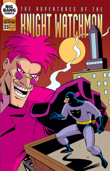
Fake comic cover for Adventures of the Knight Watchman #23, with Big Bang Comics' the Knight Watchman and Pink Flamingo facing off.Here’s anoth­er fake com­ic cov­er I gen­er­at­ed for one of “The Big Bang His­to­ry of Comics” issues, this one fea­tur­ing ani­mat­ed-style ver­sions of the Knight Watch­man and his neme­sis, the Pink Flamin­go. With my pen­cils, inks and let­ter­ing, it appeared orig­i­nal­ly in black and white in Big Bang Comics #24. And now for the first time, it’s in col­or here!

I’m sure I don’t have to explain what style I’m going for here. At the time I orig­i­nal­ly did this, I believe I was like­ly still work­ing on X‑Men: the Ani­mat­ed Series. It would be awhile yet before I final­ly got the chance to work on an ani­mat­ed Bat­man project for Warn­ers, on the direct-to-video Bat­man: Mys­tery of the Bat­woman. Thanks to Curt Geda for giv­ing me the call!

Like with some of the oth­er fake cov­ers I did for Big Bang that I’ve post­ed here recent­ly, I tried to take my col­or cues from the source mate­r­i­al I was imi­tat­ing when draw­ing it. Those books were done around the time that Pho­to­shop was start­ing to be used on some comics, and though I don’t think Pho­to­shop was ever used on those Bat­man Adven­tures comics, it did appear to be hav­ing an influ­ence, in that they were clear­ly using a great­ly expand­ed col­or palette from the usu­al Gold­en, Sil­ver or Bronze age style comics cov­ers I usu­al­ly imi­tate. So it was a fun chal­lenge to try to put my head in a lit­tle dif­fer­ent place and work that out.

A unique thing about all those DC comics based on the WB car­toons was that hard-edged shad­ow col­or they used on the art. I’ve seen orig­i­nal b/w art from those comics, and they’d usu­al­ly indi­cate the shad­ow edges direct­ly on there with a fine point red felt pen (I assume drawn in by the inker). Those red lines would be dropped from the final print­ed art, but the col­orists would use them as their guides for exact place­ment of the shad­ow areas. The shad­ow col­or I’m using here is most like­ly not the same one they used back then, but it’s one I’ve used in the past that’s always worked well for me. I felt like it worked well here, too.

Hope you like it!