Category Archives: Personal

Work done just for fun.

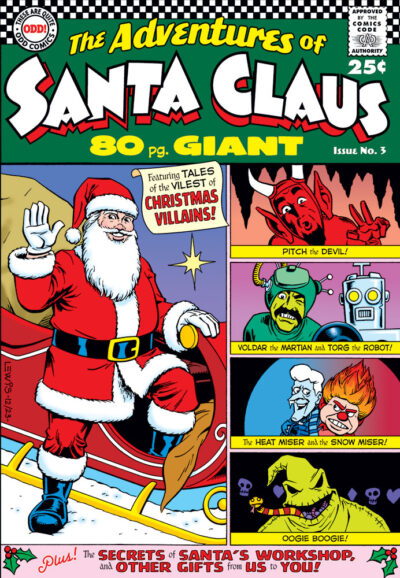
The Adventures of Santa Claus

Here’s one that’s been in my head since last Christ­mas, but there was too much going on then for me to get to it in time. So it feels good to final­ly get this real­ized this year!

I’ve always had a soft spot for those DC 80 Pg. Giants and 100 Pg. Super-Spec­tac­u­lars, and the idea of a some­what super­hero-style San­ta Claus 80 Pg. Giant com­ic sound­ed like a fun idea that need­ed to exist. And it’s a giv­en that Go-Go Checks auto­mat­i­cal­ly make any com­ic cov­er better!

Of course, there were a lot of pos­si­ble vil­lains to pick from, but ulti­mate­ly I grav­i­tat­ed towards these. For those who don’t know, Pitch comes from the 1959 Mex­i­can movie San­ta Claus. Voldar and Torg appear in the 1964 “clas­sic” San­ta Claus Con­quers the Mar­tians. The Heat Miser and the Snow Miser show up in the TV spe­cial, The Year With­out a San­ta Claus. And final­ly, Oogie Boo­gie comes from the Dis­ney clas­sic The Night­mare Before Christ­mas. Just real­ized: they’re all in chrono­log­i­cal order. I had­n’t real­ly planned it that way (I was think­ing more about even­ly dis­trib­ut­ing the reds and greens), but so be it!

That’s about all I can think of to say for this image, except: I’d like to wish all my site vis­i­tors a Mer­ry Christ­mas and a Hap­py New Year!

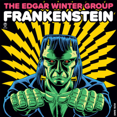
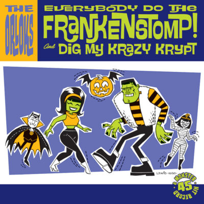
Do the Frankenstomp!

It’s that time of year again! Hal­loween! And long-time vis­i­tors to my site might recall that I have some­thing of a loose tra­di­tion of doing Franken­stein-themed stuff in hon­or of the hol­i­day. Here’s this year’s: a sin­gle from the ’60s by the Orloks, doing the Frankenstomp.

There was a big pop cul­ture fas­ci­na­tion with mon­sters in the ’60s, like­ly spurred ini­tial­ly at least in part by TV sta­tions look­ing to fill time, and resort­ing to run­ning old mon­ster movies. They caught on with young view­ers and cre­at­ed a demand for more, result­ing in all kinds of games, mod­els, TV shows, cartoons…and even nov­el­ty 45’s like this.

I’m a big fan of this kind of mid-cen­tu­ry art style (and the style of graph­ic design that goes with it). It’s very sil­hou­ette- and shape-ori­ent­ed. I must con­fess, it does­n’t come entire­ly nat­ur­al to me to try to draw this way (it’s like throw­ing a car in hard reverse, after years of try­ing so hard to get vol­ume and dimen­sion into all my work). But it’s fun to at least attempt it like this every now and then.

Enjoy, and Hap­py Halloween!

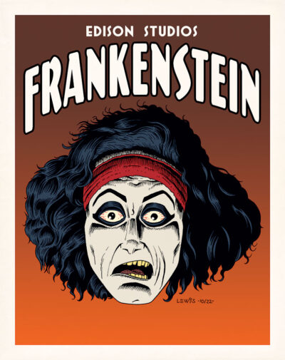
Frank? Is That You?

Long­time vis­i­tors here might recall I have some­thing of a loose tra­di­tion of doing draw­ings of Franken­stein’s mon­ster on Hal­loween. So here you go again!

…What? You don’t rec­og­nize this guy? That’s because he pre-dates the Uni­ver­sal Studios/Boris Karloff ver­sion we’re all more famil­iar with. In fact, you’re look­ing at the first film ver­sion of Franken­stein ever, from 1910! Released by Thomas Edi­son and run­ning between 11–16 min­utes (depend­ing on how fast the film passed through the pro­jec­tor), you could say it was some­thing of a “Cliffs Notes” ver­sion of the sto­ry. Like the lat­er Uni­ver­sal ver­sion, there were some alter­ations to Mary Shel­ley’s orig­i­nal nov­el for var­i­ous rea­sons (such as run­ning time).

For years, this film was thought to be one of the (sad­ly) many lost films of the silent era. Grow­ing up, I only ever saw a cou­ple of still images from it in library books about old sci fi, hor­ror and fan­ta­sy films. But the film was lat­er dis­cov­ered in a pri­vate film col­lec­tion! Appar­ent­ly, the Library of Con­gress did a restora­tion project of the film not long ago, and you can see it here.

One of the things I was struck by was how dif­fer­ent the mon­ster’s cre­ation is in this film. In place of the more pseu­do-/qua­si-sci­en­tif­ic birth of the clas­sic Uni­ver­sal ver­sion, we have some­thing that feels more magical/mystical/alchemical in nature. It must have been stun­ning for audi­ences 100+ years ago. As a mod­ern view­er, it’s not hard to fig­ure out how they did the effect here, but it’s no less effec­tive for being able to under­stand it. The whole film has some­thing of a dream-/night­mare-like feel to it.

I start­ed this off just think­ing it would be fun to do a creepy por­trait of the mon­ster, and def­i­nite­ly got car­ried away with the ren­der­ing, but I was hav­ing fun doing it. Obvi­ous­ly the film is in B/W, so my col­ors are only a guess. But they felt about right to me, and kind of worked with the val­ues in the still shots.

Hope you enjoy my ver­sion of Edis­on’s ver­sion of Franken­stein. Hap­py Halloween!


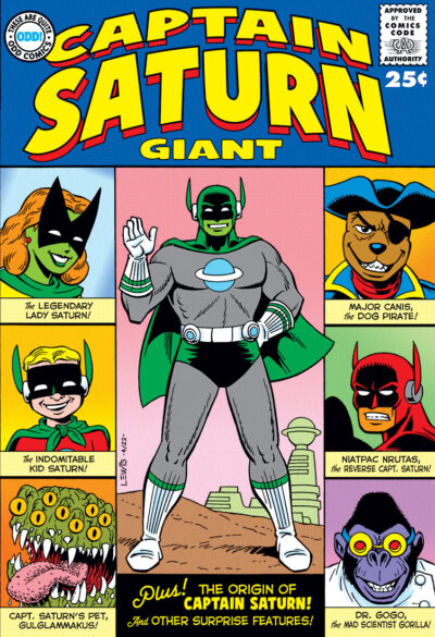
Captain Saturn Giant!

Some of you may rec­og­nize this as the cov­er of Odd Comics’ Cap­tain Sat­urn Giant, pub­lished in the ear­ly ’60s. Odd Comics as a pub­lish­er seems to have been large­ly for­got­ten these days, and it takes a lot of dig­ging to find their comics, but it’s worth the effort.

Okay, I con­fess: the above was a lie! It’s just a fake com­ic cov­er, by me. I’ll tell you the truth as to how this came about.

Over on LinkedIn, the very tal­ent­ed Thomas N. Perkins IV post­ed a draw­ing he’d done on the first page of a copy of his book If…. Thomas does a lot of cool stuff, but some­thing about this draw­ing par­tic­u­lar­ly caught my eye. It had a sort of Sil­ver Age-look­ing super­hero char­ac­ter, with a big mon­ster behind him. I com­ment­ed on how I liked it, and in Thomas’ reply, he said it was “Cap­tain Sat­urn and his pet Gulglammakus.”

Some­how, their being named plant­ed a seed in my brain. And sud­den­ly, I was envi­sion­ing Cap­tain Sat­urn fea­tured in a Sil­ver Age extra-length Giant com­ic. I told Thomas about this, and with his bless­ing, I went to work on this cover.

Thomas’ orig­i­nal draw­ing was in black and white with gray tones, and he want­ed to fig­ure out the col­or scheme for Cap­tain Sat­urn for me first, which I then trans­lat­ed into the Sil­ver Age comics col­or palette.

His response when I gave him a pre­view of the fin­ished cov­er was, “I won’t lie, I am sure this is a book I would’ve read as a kid.” I’m very pleased to get that kind of reac­tion. And I’ll con­fess, this is the sort of thing that would’ve caught my eye too. And prob­a­bly still would!

For a time after grad­u­at­ing col­lege, I used to have this recur­ring dream: I’d walk into a comics shop I’d nev­er been in, and dis­cov­er all these real­ly cool comics that I’d nev­er seen before! The sad part though is that I could nev­er remem­ber any­thing about them after I woke up, or maybe I’d have tried to cre­ate those comics myself. Maybe one of them might have been some­thing like Cap­tain Saturn!

Cap­tain Sat­urn is ™ & © Thomas N. Perkins IV. Thomas, thanks much for let­ting me play with your toys for a minute!

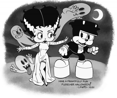
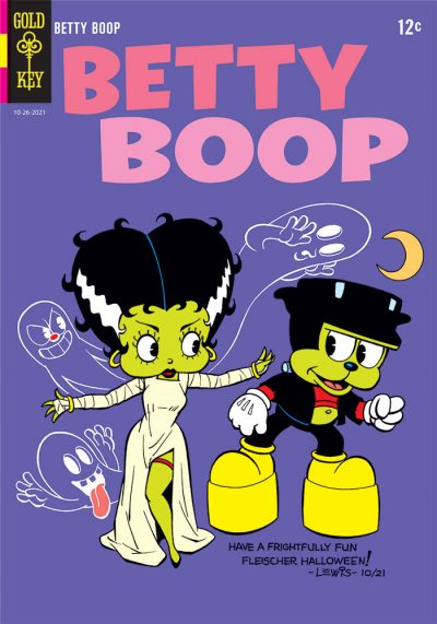
The Boop! of Frankenstein

Long time vis­i­tors to this site may recall that come Hal­loween, I have some­thing of a loose tra­di­tion of doing a Franken­stein draw­ing to celebrate.

This year, I was kind of wrack­ing my brain for inspi­ra­tion, look­ing at var­i­ous old comics cov­ers, movie stills and things, and none of the ideas I was com­ing up with were real­ly grab­bing me. Then I stum­bled across a two hour block of Fleis­ch­er Stu­dios car­toons air­ing on TCM, done by way of cel­e­brat­ing the stu­dio’s 100th anniver­sary. Watch­ing one of the Bet­ty Boop car­toons, an idea final­ly struck me that I had to do. It grew from there. This is the result.

Orig­i­nal­ly, I was just going to do the black and white image, but while work­ing on it, the thought struck me that this could also work as a com­ic book cov­er. Some of you may be won­der­ing: why make this a Gold Key cov­er par­tic­u­lar­ly? Because back in the Sil­ver Age, if you want­ed to read a com­ic fea­tur­ing a car­toon char­ac­ter, you were going to end up buy­ing a Gold Key com­ic. They had the licens­es to pret­ty much all of the char­ac­ters. Though (so far as I’ve been able to deter­mine) they nev­er actu­al­ly did a Bet­ty Boop com­ic, if any­one had pub­lished one back then, Gold Key would’ve been the publisher.

I’ve always had a gen­er­al soft spot for the “ball and rub­ber hose” school of ani­ma­tion. And more specif­i­cal­ly, I’ve always got­ten a kick out of the Fleis­ch­er Stu­dios car­toons, because they have their own per­son­al­i­ty that’s noth­ing like Dis­ney’s, Warn­er Bros., or any­one else’s. The Fleis­ch­er car­toons are chaot­ic in a fun way, where almost any­thing can hap­pen. Inan­i­mate objects come to life at a momen­t’s notice.

If you don’t know about the Fleis­ch­er Stu­dios car­toons, you real­ly should do some­thing to rec­ti­fy that. You can prob­a­bly find a num­ber of them on YouTube. They’re a real treat (no trick!).

Dad joke” free of charge. Hap­py Halloween!

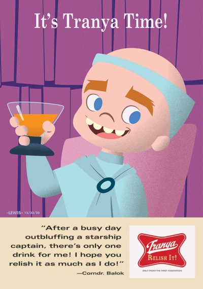
To Boldly Go where No Tastebuds Have Gone Before!

Recent­ly, cour­tesy of Net­flix, I’ve been re-watch­ing the orig­i­nal Star Trek. It’s not like I haven’t already watched all of these episodes mul­ti­ple times over the years, but they’re always enter­tain­ing (even the less­er ones have some­thing to rec­om­mend them). Yeah, I’ll admit it: I was a bit of Trekkie grow­ing up. I prob­a­bly built the Enter­prise mod­el three or four dif­fer­ent times (always hop­ing that maybe this time they’d fig­ured out a way to engi­neer it so the nacelles would­n’t sag out­wards). I even did my own lit­tle home­made 8mm Star Trek movie when i was in ele­men­tary school (but that’s anoth­er story).

Watch­ing the episode “The Cor­bomite Maneu­ver” again for the umpteenth time, I got struck by this sil­ly idea for a retro-styled ad. It was one of those things that gets stuck in your head, and you feel like you have to do it in order to get it unstuck. So here it is! If you’re as famil­iar with the show as I am, you’ll get it.

Though my his­to­ry with Illus­tra­tor goes back quite a ways (Illus­tra­tor 88, any­one?), I tried a tech­nique I haven’t done before on this. I’m used to Illus­tra­tor always look­ing pris­tine clean, so get­ting more of a tex­tured look was some­thing dif­fer­ent. I’d guess in the pre-dig­i­tal art era when peo­ple did illus­tra­tions like this, it was like­ly done using an air­brush set so it would spray in a more tex­tur­al way. Or maybe it was done by paint­ing with a sponge and frisket material.

It occurs to me this also kind of works pret­ty well as a year-end piece! I wish all my site vis­i­tors the best, and may 2021 be a much bet­ter year for us all!

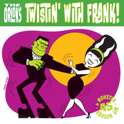
Twistin’ with Frank!

If you’ve poked around my site for any length of time, you might have noticed I have some­thing of a loose tra­di­tion of cre­at­ing some kind of Franken­stein image for my site around Hal­loween, when I have the chance. Here’s this year’s!

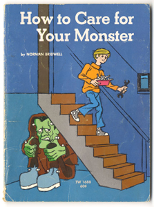
I had the good for­tune that dur­ing my child­hood, mon­sters were a big part of the pop cul­ture land­scape. This def­i­nite­ly informed me (or warped me, depend­ing on your per­spec­tive). Mon­sters were kind of every­where! Car­toons, TV shows, books (like How to Care for Your Mon­ster), mod­el kits, toys, games…all kinds of fun stuff! There was even the occa­sion­al nov­el­ty mon­ster-themed 45 record.
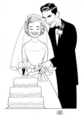
That’s sort of where this idea came from. This mid-cen­tu­ry Car­toon Mod­ern type of style is not some­thing I’ve done a lot, but it’s how I envi­sioned this look­ing in my head. You spend years try­ing to get vol­ume into your draw­ings, but you kind of have to throw your brain into reverse and think more in terms of flat­ter shapes and sil­hou­ettes in order to do some­thing like this. I find it a chal­lenge, but a fun one.

When this idea came into my head, it just felt like a record that should’ve exist­ed back then, so I took it upon myself to make it hap­pen. I hope you enjoy my lit­tle illus­tra­tion and design experiment.

Hap­py Halloween!
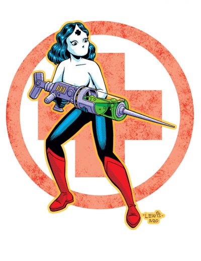
Call the Nurse!

This is a bit dif­fer­ent, in that I don’t usu­al­ly do a lot of top­i­cal, cur­rent events-relat­ed things.

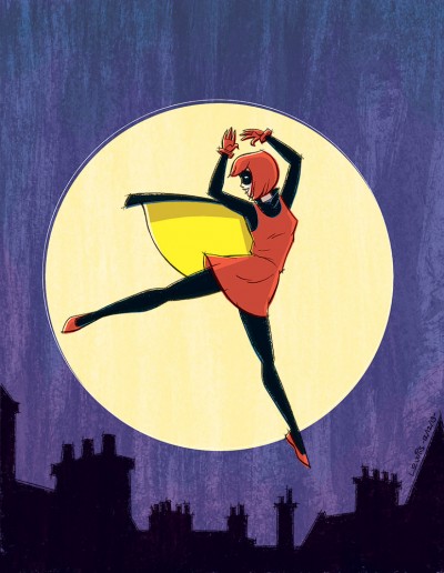
It’s impos­si­ble not to know about Covid-19. I’m aware that we have front­line work­ers, espe­cial­ly in the med­ical pro­fes­sion, who are deal­ing with it on a dai­ly basis. And for some rea­son recent­ly, I was think­ing about nurs­es and super­heroes, and thought of this odd­ball old Gold­en Age comics char­ac­ter called Pat Park­er, War Nurse.

Start­ing off as a straight strip in Speed Comics #13, about the adven­tures of a British nurse in WWII, appar­ent­ly it must have been felt by Har­vey Comics that she was­n’t dynam­ic enough in that form to help boost sales. So they end­ed up giv­ing her super­pow­ers and a cos­tume. At one point, she was even the leader of a group called the Girl Com­man­dos. Her last comics appear­ance was in March of 1946.

My brain start­ed to think about what would hap­pen if you updat­ed Pat Park­er, send­ing her into bat­tle against Covid-19. After all, she was a “war nurse.” She looks a bit dif­fer­ent here, because it did­n’t seem prac­ti­cal she’d bat­tle this with her orig­i­nal out­fit: bare midriff, short shorts and no facial covering.

And after the fact, I real­ized what I’d done was prob­a­bly also sub­lim­i­nal­ly inspired by anoth­er draw­ing I saw on LinkedIn by the very tal­ent­ed Thomas Perkins.

So this is my slight­ly sil­ly, but no less sin­cere, trib­ute to those med­ical per­son­nel on the front­lines. Thank you for your super­hu­man efforts. You are superheroes.

Art Vs. Artist!

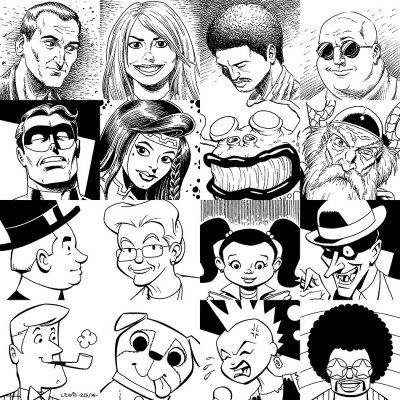
So there’s this thing, and I guess all the cool kids are doing it over on the Twit­ters and the Insta­grams. It’s called “Art Vs. Artist.” You put some of your work togeth­er in this for­mat, along with a pic­ture of your­self in the cen­ter. It seemed like some­thing that might be sor­ta fun to take a crack at, so here we go!

To be hon­est, I’m not entire­ly sure what all the rules are (if there are any), so I’m prob­a­bly break­ing some of them. I did get the idea that this was sup­posed to cen­ter around faces, so there’s at least that. Some of these sam­ples are more recent and oth­ers slight­ly old­er. At the moment, I feel like this works pret­ty well. If I were to attempt this again tomor­row, it’s pos­si­ble I could pick a few oth­er images.

I feel like I might be break­ing one of the rules with my pho­to in the cen­ter. It’s (obvi­ous­ly) not a cur­rent self­ie. Not by a long shot! That’s a 12 year-old me, on my birth­day. If you could see more of the pic­ture, you’d see I was attempt­ing to paint a pic­ture (using oils) of the USS Enter­prise fir­ing on a Klin­gon ship. Why that pho­to? I fig­ure: don’t we all start some­place like that as artists? Every­thing else flows from that.

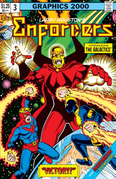
When Titans Clash!

Long­time vis­i­tors to this site may remem­ber that I got my start in ani­ma­tion work­ing on X‑Men: the Ani­mat­ed Series. That meant my first boss was Lar­ry Hous­ton, who I came to con­sid­er both my men­tor in the busi­ness, and a friend. Lar­ry’s now get­ting to enjoy much-deserved recog­ni­tion for his con­tri­bu­tions to X‑Men, as well as a num­ber of oth­er car­toons peo­ple think of fond­ly from their youth.

But before he got into ani­ma­tion, Lar­ry aspired to do comics. And he did! In his 20’s, he self-pub­lished three issues of his own com­ic, The Enforcers, with a lit­tle help from his friends.

Those comics have been out of print for years. But not long ago, Lar­ry decid­ed to re-pub­lish them all togeth­er in one big col­lec­tion. You can pur­chase it off of Lar­ry’s site, using the link above, in either dig­i­tal or phys­i­cal form. Orig­i­nal­ly his comics were in black and white (as was typ­i­cal for inde­pen­dent comics in those days), but this time it’s in full color!

I ordered myself a copy, and I found it a real blast. You can feel the excite­ment on the page, that “we’re doing our own comics!” Of course there are some rough edges, but you can see Lar­ry and friends learn­ing their craft and improv­ing vis­i­bly with each issue. It’s cer­tain­ly bet­ter than what I was doing in my 20’s! The art has a real ener­gy to it, and so does the dia­logue. There’s this ’70s Mar­vel/qua­si-Roy Thomas feel to it. I real­ly enjoyed the com­ic quite a bit!

So this is a bit of fan art on my part, recre­at­ing the cov­er of the col­lec­tion (which was also the cov­er to the orig­i­nal issue #3). But of course, it’s not just a straight re-cre­ation. I always have to have some kind of spin on it, or re-inter­pre­ta­tion. In this case, the idea was to tweak it slight­ly in some aspects to make it look even more like a main­stream com­ic from that late ’70s peri­od. Except for one or two pan­els, these sto­ries feel like they could have seen print in a Comics Code-approved book of that era.

So Lar­ry: thanks, and much respect always! Hav­ing read these sto­ries, I’d real­ly like to see you do some new comics with your char­ac­ters, using all the sto­ry­telling craft you’ve picked up in the inter­ven­ing years.

Lar­ry Hous­ton’s The Enforcers are ™ & ©1975, 1978, 1979 and 2018 Lar­ry F. Houston.