This will be one of those schizo posts I’ve done from time to time, where the illustration part doesn’t necessarily relate to the bulk of the text. And “bulk” is probably the right word; this post will be lengthier than usual, so I apologize for that in advance.
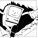
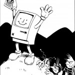
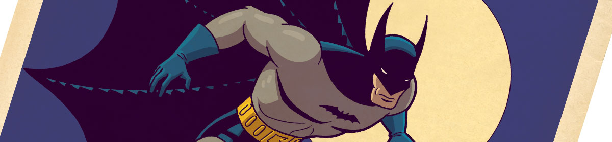
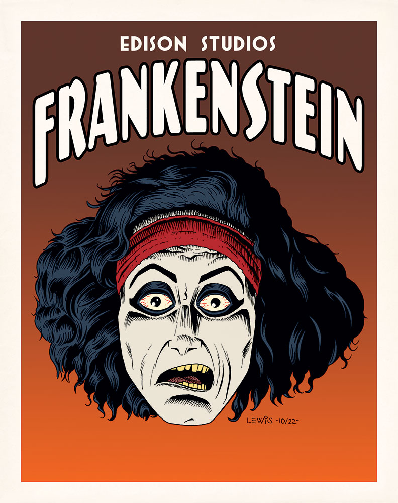
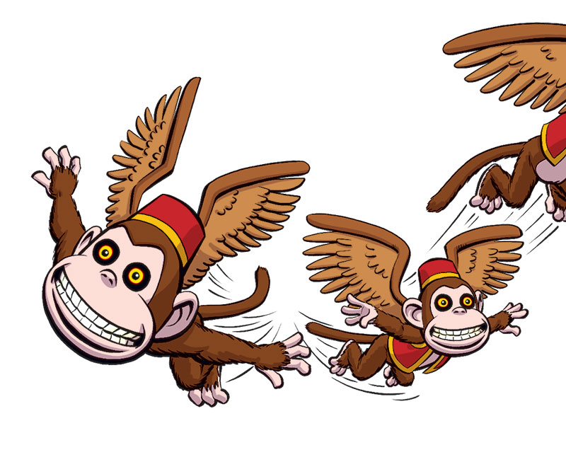
Let me explain about the illustration first. My younger brother is writing a book, and asked me to do the cover illustration. Over the years, we’ve collaborated on a number of projects (including our band, back in the ’80s). And it’s always an interesting and challenging experience (in the best senses of those words), because I have a lot of freedom to try things that I probably couldn’t for other clients. Usually, I wind up heading into new and unfamiliar territory that I might not have explored on my own. This piece is a case in point: we wound up with Michelangelo’s The Creation of Adam as reinterpreted through a kind of “street art” lens. Definitely not a direction I would’ve imagined myself going, but I’m pleased with the end product. Though don’t expect to go out late at night and find me throwing it up on the side of some building in the wilds of downtown Los Angeles!
Now on to my main subject: I’ve realized that this month marks the one year anniversary of my site. It seemed like this might be a good point to take a look back, and give something of a peek behind the curtain. When I first began to weigh the idea of putting up my own site, I was very reluctant to bother, to be honest. The only reason I did it was because it has become absolutely essential as an artist (particularly in animation) to have a website. Most studios now don’t want to handle physical portfolios anymore; they’d rather just have a link they can click on to view your work. So this was a case of “like it or not, you’ve got to do the research and get your own site up.”
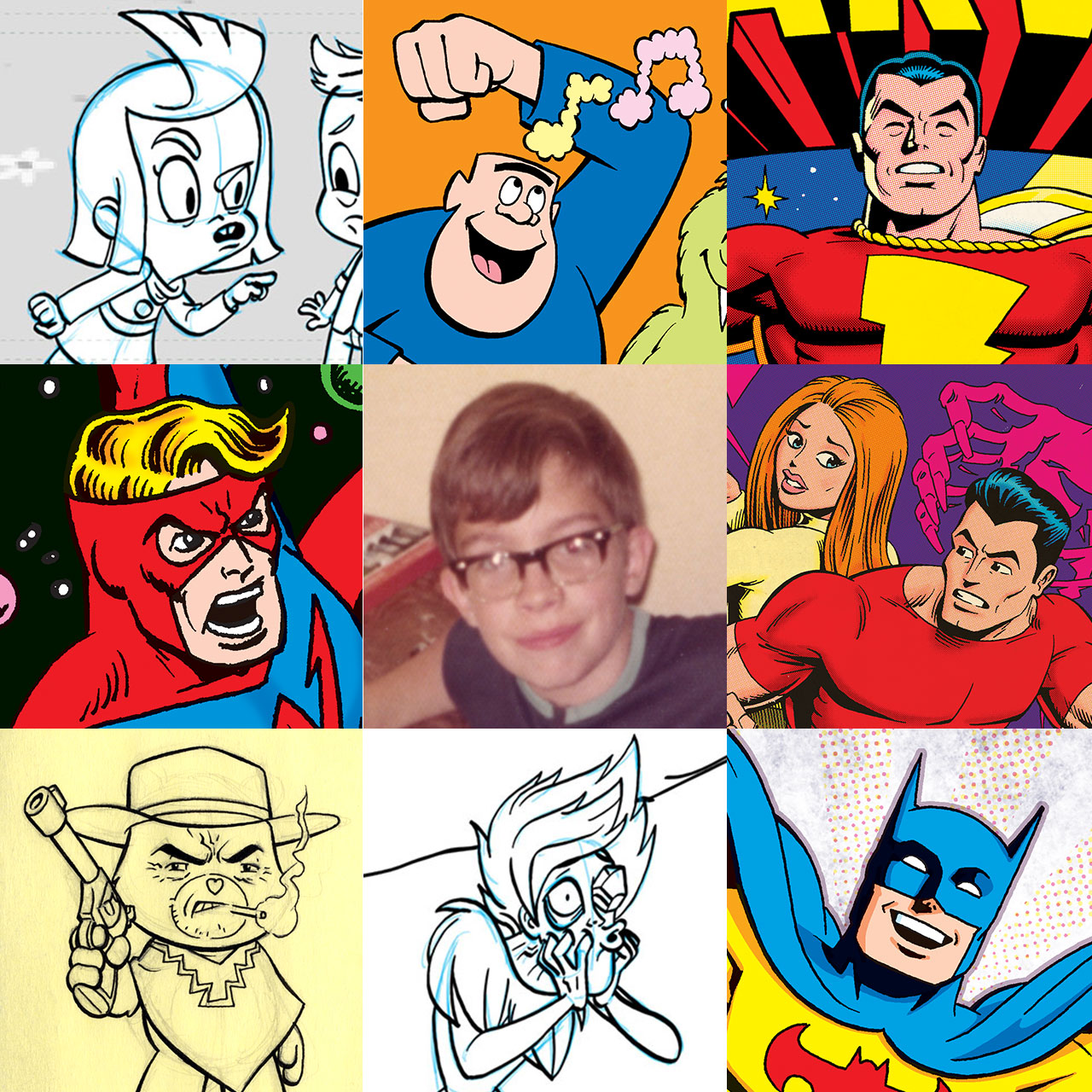
But I’ve found a really good thing that has come out of having the site. As a kid, I used to love to draw. I’d spend hours at the kitchen table doing it. But fast-forward to adulthood, and an unfortunate side effect sometimes of turning the thing you loved doing as a kid into the work you do for a living as an adult, is that you can lose that love. When you spend all day being told what you’re supposed to draw and how to draw it, that can sap your motivation to draw anything for yourself when you’re off work. The last thing you feel like doing sometimes at the end of the day is to pick up a pencil again for yourself. But the thing is, it’s important to keep at least a portion of your art as an outlet for your own expression. Making time to draw for yourself is important. Hanging onto that love for drawing you once had as a kid is important.
And having my own site, where I can draw whatever I want, and in whatever style I want, has gone a ways toward helping me to regain that love. Though it’s a lame simile, it’s almost like my site’s become the internet equivalent of having a giant refrigerator that I can tack my art to, for people to see when they come by.
One other thing I decided, early on, (and I guess you can file this under “statement of purpose”) is that I wanted to stay on the positive side in anything I write here. It’s very easy to go negative. As my friends can tell you, I have my opinions about the things I don’t like in movies, cartoons, comics, etc., just like anyone else. But there are plenty of places on the internet where people can (and do) vent at length about things like that. I’d prefer to be a positive voice. Rather than waste time talking about what I don’t like (why give those things any further exposure?), why not spend my time talking about the things that I like? Why not give those things the spotlight? So that’s what I’ve tried to do thus far, and what I intend to keep doing. That, and showing off new work on my big internet refrigerator when I feel like it. 🙂
And that’s probably more than enough verbosity for one post! If you’ve actually made it through to this point, I wish all reading this a Happy Thanksgiving!
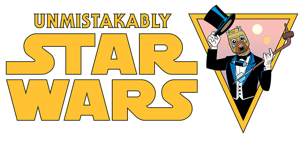 You all know today is May the Fourth, right? All kinds of Star Wars stuff going on, online and elsewhere. And I remembered I had something I could post relevant to that. Strangely, somehow I never got around to posting this before!


")


")


Web")