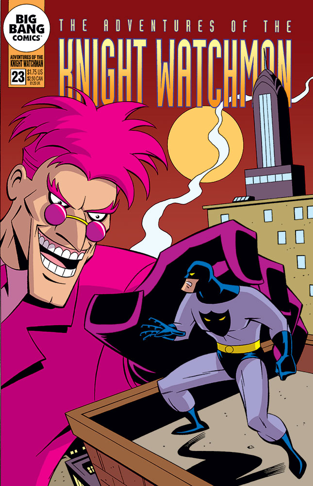
 Here’s another fake comic cover I generated for one of “The Big Bang History of Comics” issues, this one featuring animated-style versions of the Knight Watchman and his nemesis, the Pink Flamingo. With my pencils, inks and lettering, it appeared originally in black and white in Big Bang Comics #24. And now for the first time, it’s in color here!
I’m sure I don’t have to explain what style I’m going for here. At the time I originally did this, I believe I was likely still working on X‑Men: the Animated Series. It would be awhile yet before I finally got the chance to work on an animated Batman project for Warners, on the direct-to-video Batman: Mystery of the Batwoman. Thanks to Curt Geda for giving me the call!
Like with some of the other fake covers I did for Big Bang that I’ve posted here recently, I tried to take my color cues from the source material I was imitating when drawing it. Those books were done around the time that Photoshop was starting to be used on some comics, and though I don’t think Photoshop was ever used on those Batman Adventures comics, it did appear to be having an influence, in that they were clearly using a greatly expanded color palette from the usual Golden, Silver or Bronze age style comics covers I usually imitate. So it was a fun challenge to try to put my head in a little different place and work that out.
A unique thing about all those DC comics based on the WB cartoons was that hard-edged shadow color they used on the art. I’ve seen original b/w art from those comics, and they’d usually indicate the shadow edges directly on there with a fine point red felt pen (I assume drawn in by the inker). Those red lines would be dropped from the final printed art, but the colorists would use them as their guides for exact placement of the shadow areas. The shadow color I’m using here is most likely not the same one they used back then, but it’s one I’ve used in the past that’s always worked well for me. I felt like it worked well here, too.
Hope you like it!
Your work is great as always, Mark! I hope you’re doing well!
Thanks, Don! Glad you like it. Hope you guys are also doing well.
Pink flamingo is such a great color contrast to the colors of Knight Watchman. It makes me want to find some of the old candy Fizzes. Big hands grabbing superheroes also make the situation interesting. The shadowing works nicely, lending more oomph to my eyes for the contrasts. I hope these colored covers have a future venue. Thanks.
Glad you like it. Yeah, the “giant villain menacing the hero” is a fun cover trope that works well. It’s too bad it seemed to fall out of favor after the ’70s.
I’ve been coloring all the fake covers I did for Big Bang, and sending them on to Gary Carlson so he can use them at some point. I figure they might be sort of used as filler/pin-ups, but I suppose if there are enough of them, he might even be able to fill a whole issue.
Hello, my name is Omari Hargett and I’m a fellow cartoonist/comic book artist and writer and I just want to say I love the art. Also huge Knight Watchman fan right here.
Could it be possible if you could do some more art of the Knight Watchman and this time Kid Galahad and the two of them fighting their enemies?
Hi Omari,
Glad you’re enjoying my work! No current plans to do a new Knight Watchman and Kid Galahad piece, but who knows? Maybe if the right inspiration happens to strike.