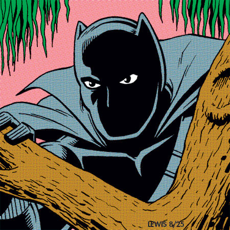
 We’re now at Day Six of this year’s Jack Kirby Tribute Month. This time, curator Howard Simpson has focused on characters from Jack and Stan’s Fantastic Four run. And today’s prompt is the Black Panther!
Though Black Panther was not the first black superhero (most agree that distinction should go to the Golden Age character Lion Man), he was still groundbreaking. Thankfully, they didn’t go with the name “Coal Tiger” that they were apparently considering at one point (based on notes on an early sketch).
Since this Tribute Month is FF-themed, I opted to base how I drew Black Panther on how he first appeared during Jack and Stan’s FF-run. Kirby and Joe Sinnott (in the inks) really pushed the black-spotting on his costume, plus there was the short cape held on by a strap across his chest.
Instead of the standard blues typically used in comics for black costumes like this, initially they went with a color formulated out of all three of the usual printers’ inks (cyan, magenta and yellow) that mimicked gray. An actual gray was not possible inside a comic in those days, with the limited palette of 64 colors. It was a unique look. Later, they changed the Panther’s color to a more standard blue. Most likely because they could guarantee it would print more consistently than the fake gray.
I almost drew the Panther in the “techno-jungle” where he confronted the FF in his first appearance. Such a wild concept (and very Kirby), I don’t think they ever used that idea again after his first appearance. So I figured going with a more regular type of jungle foliage would probably be best.
A bit of trivia: some years back in my day job in animation, I ended up (so far as we know) creating the character model for Black Panther’s very first appearance in animation! It was in X‑Men: The Animated Series. You can read about it here.
That’s it for this one. Come by tomorrow if you’d like to see who’s up next!
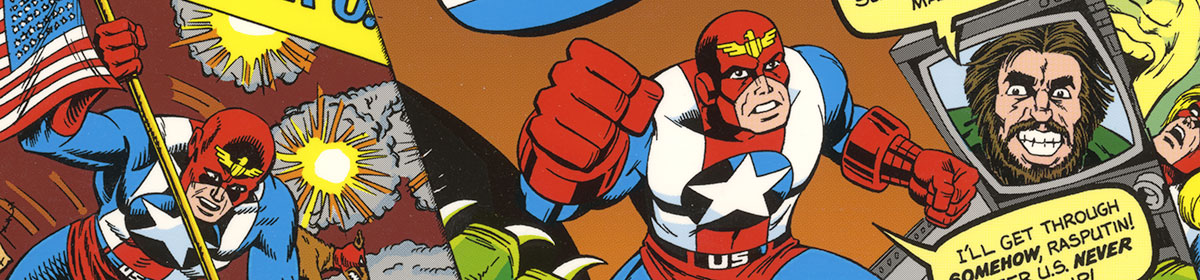
One of the best parts of this challenge is that it makes me go back and check my comics. I thought that maybe Kirby used the Techno Jungle idea in Tales of Suspense 97 to Cap 100. But no, it was a fun and exciting team up with Cap and the Black Panther.
I never thought too much about the coloring of the Panther’s costume, great information on that topic!
Kirby’s best characters are incredibly flexible, they work in all kinds of environments. The Black Panther is King and monarch, fighting gangs with Daredevil, or working in a team like the Avengers. This is a great illustration of his early days. The cape makes him look regal.
Glad you like this, Lyle!
Yeah, the “going back and checking the comics” thing is in effect for me too! I have to do that in order to draw these. And that has the affect of inspiring me and firing me up again, just like it all did when I first saw Jack’s work.
Marvel in the ’60s would often experiment with color. The Hulk would be another example of that. As you know, he was initially kind of a fake gray (made up of cyan, magenta and yellow) in his first appearance. But they quickly shifted over to green, which (using only two colors) was a lot easier to keep consistent in printing.
Nice take on Black Panther. And great bit of comment on Lion Man. I had not realized another name was being considered. Lion Man was of course a much better choice. Somewhere not far off from where I am sitting, I know there is a reprint that can be found. I need to peruse it again.
The actual effort to achieve the correct intended color for the character was helpful to know. Lots more effort needed to be in place to get the books that were in the spinner racks back in the day. But the coloring achieved using fewer colors had more going for a good look than the overdone material we see around now, in my opinion.
Your interpretation of the finger tips on the Black Panther’s gloves takes a cue from Jack for sure. Thanks for your efforts.
Thanks for looking in, Joe! Glad you like this take.
To be clear: Lion Man was a totally unrelated character. He appeared in All-Negro Comics #1 in 1947, one of several strips (I believe I just saw a solicitation for another reprinting of it, to be released in early November this year). The alternate name they were apparently considering at one point for Black Panther was “Coal Tiger.”
While I like the work of certain modern colorists who use the tools in Photoshop well, with a certain restraint, I understand where you’re coming from. There’s something to be said for color that works with the b/w art, supporting it and not burying it.
I recall reading an interview a little while back with Walt Simonson, which had to do with a new reprinting of his Thor material, recolored. The interviewer asked how he felt about the differences between the old school color palette and all the colors available now. He made the observation that with the limited old palette of 64 colors, it was a lot harder to do a bad coloring job. While with millions of colors, it was paradoxically a lot easier to make a mistake unless you really knew what you were doing.