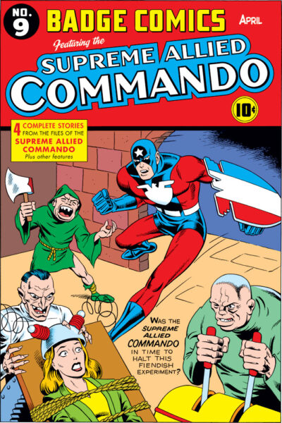
 Here’s another fake cover I drew for Big Bang’s History issues. Not only freshly colored, but also inked for the first time! A lot of fake covers needed to be generated for those issues, and there wasn’t time to ink them all. Since they were being printed pretty small, it was okay if some of them were in pencils, as long as they were fairly clean and tight.
Gary Carlson had incorporated into the Badge’s back story that at a certain point during WWII, he took up another name for a time and changed his uniform accordingly, going into action as the Supreme Allied Commando. I think this is the first time he’s appeared in color in this garb.
Initially when I first tackled designing the Badge, I took my inspiration from the heroes Simon and Kirby created for DC (probably the Guardian especially). For this version, I looked back at what they had been doing with Captain America, of course.
While Captain America was a patriotic superhero (the prime one people think of from WWII), I realized awhile back that Simon and Kirby’s Cap stories also had something else going on. There was a definite influence from the “weird menace” pulp genre, with the kind of foes they went up against. It was even on the covers, with the mad scientists performing unspeakable experiments, evil henchmen, deformed monsters, and odd men in hooded robes who would sometimes throw axes. Strangely, I’ve rarely heard anyone else calling attention to that influence.
That’s why all those things are present here. I even came up with names for the two main bad guys that I jotted down on the outside border of my cover: Dr. Von Mungler and his henchman Oggar.
Enjoy! And with the timing of this posting, I wish you a Happy Independence Day!

The extremely exaggerated facial features and hair does get me. I wonder what influence any of this style of cover had on Mel Brooks’s Young Frankenstein? Marty Feldman’s character in the movie exudes the Simon Kirby Lewis characters. Good point about the pulp covers. So true.
This cover is particularly brilliant even with your bright presentations. I love it. The issue number as you did it is in keeping with some of those very early covers.
Your work out there to inspire we the viewers is appreciated.
Very glad you’re enjoying this.
Yeah, trying to stick to color schemes used on the old covers this one was inspired by led to my sometimes making color choices I probably wouldn’t have, if left to my own devices. But it makes for a more authentic-feeling result, when you’re trying to evoke a particular period look or feel.