 As you know, it’s Jack Kirby Tribute Month 2025 (curated by Howard Simpson), and the theme is the Fantastic Four and related characters. We’ve moved into the rogues’ gallery, and today is the biggest of them all (literally): Galactus!
Galactus as a character was like nothing no one had ever seen before in a superhero comic when he showed up in Fantastic Four #48 (part one of what would come to be known as the classic “Galactus Trilogy”).
He comes to Earth to consume our world and the energy it contains, with no thought to any of the living beings on our planet. When the FF try to stop him, they quickly realize that they might as well be insects! Seemingly there is nothing they can do. In fact, if not for the Watcher stepping in to give them some assistance, the Earth would have met its end!
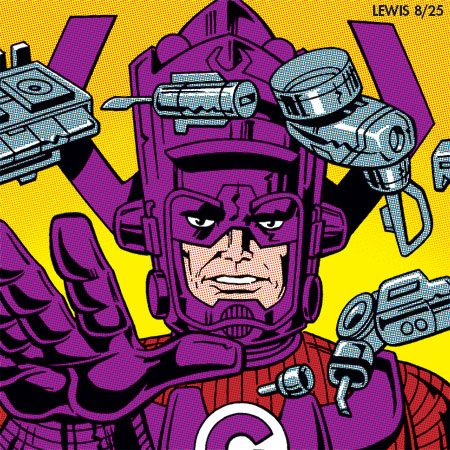
You might look at my depiction of Galactus here and feel like something is a little odd compared to what you’re used to. That’s because (as I mentioned in an earlier post) I’ve set myself a rule to stick to how these characters were depicted during Jack and Stan’s FF run. And in this case, I felt like sticking with Galactus’ portrayal in his first appearance, “The Galactus Trilogy.”
They were still figuring out the Big G’s color scheme during the Trilogy. Each issue, it’s a little different. In fact, in the first issue (#48), he was red and dark green! It wasn’t until #50 when they got something fairly close to what would become his standard color scheme (though they weren’t yet using the blue-violet). For comparison, you can see my depiction of Galactus done for the first Kirby Tribute Month here.
Hope you enjoyed this, and feel free to tune in again tomorrow to see which villain comes up next!
Thanks for the fine art and insider information regarding Galactus’ outfits. I would also would like to know what the factors are in color choices, not in the case of “supreme being G” alone, but generally speaking. I like the colors in your version for this year better than others. It think at least for my eyes, the contrast with the skin colors is more pronounced, accentuating Galactus’s cold decision making.
I have a sense that maybe at that particular point in time, a lot of color decisions might have been made on the fly. The fact Galactus was colored differently in each issue of “The Galactus Trilogy” certainly seems to indicate that as a possibility. It wasn’t until a little later that they settled on the red-violet and blue-violet color scheme most people think of for the big G. I suspect they went with that because A) the colors were simpler (just combinations of cyan and magenta) and more reliable in how they would print, and B) those two colors looked good together. Harmonious.
I think a little later, companies started to figure out color schemes on supporting characters and villains in advance. But maybe not so much in this era. The fact Marvel had a much smaller staff at this point might also have a bearing on it.
Sometimes artists might have suggestions for color. But they were keeping Jack hopping with his workload at this point in time, so I doubt he had a chance to suggest anything. If he had, maybe the color scheme would’ve been more locked in from the start.
On a personal level, color is a funny thing. There have been times in animation (or the rare comic thing I’ve done) where I have done something in b/w and thought I had no particular idea about how it should be colored. Then I’ll see what the colorist did and be surprised. Not that what was done was bad, by any means (sometimes it’s better than I would’ve imagined)! But the fact I can be surprised says to me that somewhere in the back of my mind, I must have some idea about the color, even when I don’t think I do.