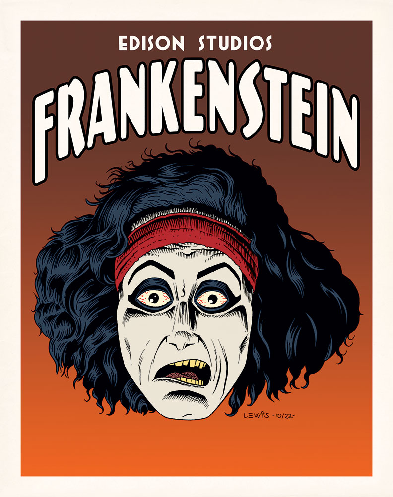
Tag Archives: Poster

Frank? Is That You?

Long­time vis­i­tors here might recall I have some­thing of a loose tra­di­tion of doing draw­ings of Franken­stein’s mon­ster on Hal­loween. So here you go again!

…What? You don’t rec­og­nize this guy? That’s because he pre-dates the Uni­ver­sal Studios/Boris Karloff ver­sion we’re all more famil­iar with. In fact, you’re look­ing at the first film ver­sion of Franken­stein ever, from 1910! Released by Thomas Edi­son and run­ning between 11–16 min­utes (depend­ing on how fast the film passed through the pro­jec­tor), you could say it was some­thing of a “Cliffs Notes” ver­sion of the sto­ry. Like the lat­er Uni­ver­sal ver­sion, there were some alter­ations to Mary Shel­ley’s orig­i­nal nov­el for var­i­ous rea­sons (such as run­ning time).

For years, this film was thought to be one of the (sad­ly) many lost films of the silent era. Grow­ing up, I only ever saw a cou­ple of still images from it in library books about old sci fi, hor­ror and fan­ta­sy films. But the film was lat­er dis­cov­ered in a pri­vate film col­lec­tion! Appar­ent­ly, the Library of Con­gress did a restora­tion project of the film not long ago, and you can see it here.

One of the things I was struck by was how dif­fer­ent the mon­ster’s cre­ation is in this film. In place of the more pseu­do-/qua­si-sci­en­tif­ic birth of the clas­sic Uni­ver­sal ver­sion, we have some­thing that feels more magical/mystical/alchemical in nature. It must have been stun­ning for audi­ences 100+ years ago. As a mod­ern view­er, it’s not hard to fig­ure out how they did the effect here, but it’s no less effec­tive for being able to under­stand it. The whole film has some­thing of a dream-/night­mare-like feel to it.

I start­ed this off just think­ing it would be fun to do a creepy por­trait of the mon­ster, and def­i­nite­ly got car­ried away with the ren­der­ing, but I was hav­ing fun doing it. Obvi­ous­ly the film is in B/W, so my col­ors are only a guess. But they felt about right to me, and kind of worked with the val­ues in the still shots.

Hope you enjoy my ver­sion of Edis­on’s ver­sion of Franken­stein. Hap­py Halloween!


Oh, the Pain…”

PainI had­n’t planned on post­ing this one espe­cial­ly, but things have been busy here, and I did­n’t want to let anoth­er month go by with­out post­ing any­thing. So here you go!

I was asked to do an edi­to­r­i­al-type illus­tra­tion visu­al­iz­ing “pain” in a par­tic­u­lar way, and this is what I came up with. Style­wise, for some rea­son I grav­i­tat­ed towards want­i­ng this to look like it was done as a poster, per­haps some­what in the style of David Lance Goines. It remains for oth­ers to say whether or not I achieved that, but I was hap­py with the end result, not pained. 🙂

She’s a Sensation!

Though DC’s big reboot has already been sprung on us, I had one more image in that poster style that I had to try. Might as well com­plete the tri­fec­ta, right?

So this time out, it’s Won­der Woman. If you’ve read my pre­vi­ous posts on these gold­en age char­ac­ters, I real­ized I kind of uncon­scious­ly set up a pro­gres­sion; I men­tioned that I liked Super­man, but lat­er con­fessed I liked Bat­man a lit­tle more. So you might be expect­ing me this time out to say I liked Won­der Woman the best. But you’d be wrong.

Sor­ry to say, I real­ly was­n’t all that into Won­der Woman as a kid. I appre­ci­ate the strip much more now as an adult than I did back then, for its his­toric sig­nif­i­cance as well as some of the aspects that are unique to it (the fan­ta­sy ele­ments, the mytho­log­i­cal, etc.). Per­haps the gold­en age art (by H.G. Peter) looked a lit­tle heavy-hand­ed and crude to me in some ways as a kid. Look­ing at it now, I have more of an appre­ci­a­tion for it (It feels at times like a sort of car­toon ver­sion of an Albrecht Dür­er engraving).

Won­der Woman is an inter­est­ing con­cept that seems to be a tough one for writ­ers and artists to get a han­dle on. And even if they man­age, it seems hard to get a han­dle on it such that it will engage peo­ple and get them to buy the book (Which is prob­a­bly the more impor­tant point). Many approach­es have been tried with vary­ing degrees of suc­cess, and some don’t get tried at all. But Marston and Peter must’ve had a han­dle on some­thing when they cre­at­ed her. She’s sur­vived this long and man­aged to become part of our col­lec­tive pop cul­ture men­tal land­scape, rec­og­niz­able even to non-comics read­ers. I think that’s worth a lit­tle salute here.

A con­fes­sion: this poster is a loose homage (which I acknowl­edged in how I signed it) to an orig­i­nal poster by Lud­wig Hohlwein. In study­ing his work online, I stum­bled across one poster that just seemed a nat­ur­al to adapt for a Won­der Woman image. It all but cried out for it. So that is what I did!

I Shall Become a BAT!”

The clock is count­ing down to DC Comics’ big reboot, and it’s still got me think­ing back on the orig­i­nals. I thought I should get at least one more post in here, before it hap­pens. Super­man was look­ing a lit­tle lonely.

Like I said in my pre­vi­ous post, I’ve always had an attrac­tion to the ear­ly gold­en age ver­sions of some of these char­ac­ters, despite the occa­sion­al rugged­ness in exe­cu­tion. There was a pri­mal kind of ener­gy there that per­haps got lost a lit­tle bit along the way, as the artists and writ­ers got bet­ter at their craft, and began to for­mu­late the rules for how you were sup­posed to do this sort of thing.

Last time, I copped to hav­ing an affec­tion for the gold­en age Super­man. But if pushed, I’d have to admit that I prob­a­bly liked the gold­en age Bat­man just a lit­tle bit more. Those ear­ly strips just dripped with mood: dark shad­ows, misty nights with almost always an enor­mous full moon, and plen­ty of strange char­ac­ters for the Bat­man to go up against. When I first began to encounter this stuff in those DC 100-Page Super-Spec­tac­u­lars as a kid, I had no prob­lem at all under­stand­ing why kids encoun­ter­ing these sto­ries for the first time on news­stands back in the gold­en age were attract­ed to it. This stuff cap­tured your imagination.

In the same vein as the Super­man poster, here’s one fea­tur­ing Bat­man in that ear­ly 20th Cen­tu­ry Poster Style. This time out, I did my ver­sion of a clas­sic pose that Kane used a num­ber of times in those ear­ly issues. A very big “Thank You” to Bill Fin­ger, Bob Kane, Jer­ry Robin­son, George Rous­sos, and all the rest of Kane’s “ghosts” over the years who made Bat­man what he was!

Look! Up in the Sky!”

If you fol­low comics news at all, you’ve prob­a­bly heard there’s this big reboot that DC Comics is doing in Sep­tem­ber. They’re start­ing all their books over from #1, redesign­ing all the char­ac­ters and redo­ing their ori­gins. You can’t assume now that you know any­thing for sure about who they are, their moti­va­tions or the over­all scenario.

I’m not going to get into com­men­tary on that here (there’s been plen­ty of that already in oth­er places online). But I’ll admit the idea of the retire­ment of the orig­i­nal char­ac­ters has me think­ing back on them a bit wist­ful­ly. Though tech­ni­cal­ly a child of comics’ sil­ver and bronze ages, I’ve always had a fas­ci­na­tion with the gold­en age era too. Despite the fact that work was often a bit crude in com­par­i­son to what came lat­er, there was a cer­tain life and raw ener­gy to those ear­ly incar­na­tions of the characters.

It’s a lot eas­i­er to lay hands on gold­en age comics sto­ries now. Back when I was a kid, most­ly you just got to read about them (in books like Ster­anko’s His­to­ry of Comics, or All in Col­or for a Dime). If you could lay hands on one of DC’s 100-Page Super-Spec­tac­u­lars though, you knew you were in for a rare treat.

Like I say, I’ve long had a soft spot for these ear­ly, pri­mal ver­sions of char­ac­ters like Super­man (the proof is at left; a scan of a fake gold­en age cov­er I did when I was about 12 or 13). And with the DC reboot com­ing, I thought I’d revis­it the orig­i­nal Super­man once again. The new image up top could’ve gone in sev­er­al dif­fer­ent direc­tions, but what I wound up hon­ing in on is a Shus­ter-esque ver­sion, posed more for­mal­ly. It’s been tak­en in the direc­tion of vin­tage poster art from an even ear­li­er era. Because that seemed like a fun idea at the time.

Just my salute to the gold­en age in gen­er­al, and the orig­i­nal Super­man in par­tic­u­lar. Thanks very much, Mr. Siegel and Mr. Shuster!

UPDATE: I recent­ly dis­cov­ered online these neat Super­man pages, drawn by Stew­art Immo­nen some years back. Done in the style of Win­sor McCay’s “Lit­tle Nemo,” they’re not entire­ly unre­lat­ed to what I’m try­ing to do here with this poster. I thought these were real­ly neat, and worth shar­ing. It’s fun­ny how well Super­man works in a style like this!