 Welcome to the lucky 13th Day of this month’s Jack Kirby Art Tribute, suggested by Howard Simpson! It’s open to all creatives, and you should be able to find people’s work on your favorite social media platforms by the hashtag #KirbyArtTributes.
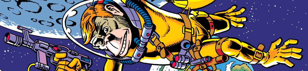
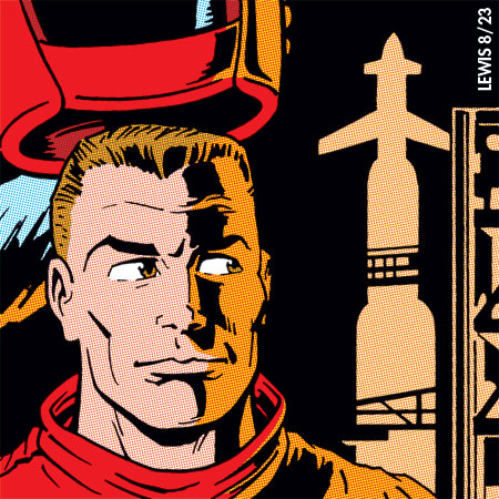
Today’s prompt is Sky Masters of the Space Force. Most of the prompts are comic book creations, but this one is from a newspaper strip, done in the late ’50s, theorizing what things might be like in the near future of the dawning Space Age. It’s not a secret that most comic book artists back then had aspirations of working on a newspaper strip. Newspaper strip artists were seen as more prestigious by the general public, and it potentially paid better than comic books. So I suspect when this opportunity came up for Kirby, he wasn’t going to pass it up. Unfortunately, it ultimately didn’t work out so well for him, but I’m not going to get into all that here.
The strip was a good looking one, though it only lasted a little over two years (late ’58 to early ’61). Written by Dave Wood, it also featured inks by Wally Wood (no relation). As mentioned in my previous Challengers of the Unknown post, if you’ve never seen the pairing of Kirby and Wood, it’s hard to envision it working. They’re very different artists. But it works beautifully! Kirby’s energy and lively layouts and imagination are intact, and Wood brings his lighting and naturalism into it. It’s a great combination, if you haven’t seen it!
There have been a few collections of the Sky Masters strips published at various points, so if you’re curious, you should be able to find one. Well worth the effort!
I feel like a little of the Kirby/Wood combo managed to sneak into my tribute piece here. At least I hope so. Enjoy, and we’ll see you again tomorrow!