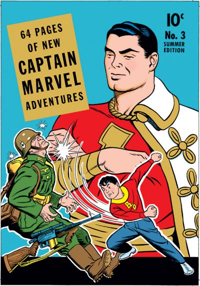
 It’s high time I put up something new here! I guess this qualifies. It’s kind of simultaneously old and new, you could say.
For the 200th issue of FCA (appearing in the pages of Roy Thomas’ Alter Ego #141), I was approached by editor P.C. Hamerlinck with a challenge. A collector named Harry Matesky had bought the original art for the cover of Captain Marvel Adventures #2 (you can see the published comic here.), and made a discovery. The head of Captain Marvel on the published cover was actually a paste-up, and underneath it was a different drawing! P.C. asked if I would be willing to try to complete the original head, so we could see what the cover might have looked like if C.C. Beck had gone ahead and finished it. Game on!
I was provided with high res scans of both the original cover art as published, and a photocopy of the art with the original head removed. It was a bit more tricky than a simple “connect the dots” exercise, as the outer contour of Captain Marvel’s face was basically missing. I heavily referenced the way Beck drew him, trying to make it look as much as possible like his work. And it had to dovetail into the existing linework as seamlessly as possible.
Once I had it inked (digitally), I had to digitally paste up the restored head over the clean scan of the published cover art. At this point in the restoration, I ran into an unforeseen difficulty. As some of you might know, photocopiers can sometimes introduce a bit of distortion or skewing into their output. For most everyday copier uses, you don’t notice something like that, and it’s not a problem. But here, where I really needed the two versions to line up accurately, it was a problem.
After I was finally able to get it sorted out to my satisfaction, I then had a clean new/old black and white original for the cover, which I colored to match the original published version. It appeared as the cover for FCA #200, which I believe is available right now. But here, you get to see it with all the original Captain Marvel Adventures masthead copy intact. It was fun to get to collaborate with C.C. Beck a little bit here, across the gulf of time and space!

Absolutely AWESOME!!! I love stuff like this. You’re a true comic book style archaeologist. Really enjoy your style & works…
Thanks, Loran! Glad you enjoyed it. It was a real honor to get a chance to do this one.
Two thoughts about this, one is that I think both depictions of Captain Marvel convey a sense of pride in Billy’s actions, the original seems a little more paternal to me, still cool. The second is that it’s been a long time since I have seen a comic book cover with this layout. It’s almost like a cereal box and yet there is no doubt who this comic features. I guess a sixties version of this might be Spider-Man 50, where the hero is Super imposed on the back ground. In the seventies they might have just put the shocked faces over the action…but I am hard pressed to think of something like this in the last ten years. Too bad because I think it’s a nice way to hook the reader into the adventure. Fun to look at and read about your efforts.
I hadn’t thought of it that way before, but you have a point: this layout does kind of resemble something you could see on a cereal box.
That trope though of having a larger background figure observing smaller ones in the foreground is something that was used quite effectively on many comics covers through the years. In addition to Amazing Spider-Man #50, I’m also thinking of Giant-Size X‑Men #1, with the new team bursting from a background incorporating the original team, looking on. And it seems to me Jack Kirby (Happy 99th, Jack!) used it more than a time or two with Fantastic Four and Avengers covers.
Unfortunately, this visual device seems to have been pretty much abandoned by today’s comics. Maybe because it’s felt to be too “comic book‑y”? It’s a shame though, because as you point it, it was (and is) a perfectly good and effective way to get the reader hooked.