Years ago, I thought my life’s career was going to be in comics. My way in appeared to be through inking. To that end, I did what all aspiring inkers looking to get into comics did at the time: I got my hands on photocopies of penciled pages, then inked them either on vellum, or by light-boxing them onto bristol board. While recently digging through some old work, I rediscovered this inking sample that I had totally forgotten about!
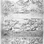
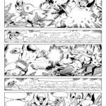
I had generated a number of inking samples working over several different artists in those days. But for some reason, I don’t believe I ever included this when I sent out copies looking for work. Reappraising it all these years later, it’s better than some of the other samples I did back then, so I’m not sure why I didn’t use it. You might recognize the photocopied layout as the work of Jim Starlin, done for Marvel Comics’ Warlock #11 (pg. 14 of the story). It’s a good, clear layout. Pretty much all the info you would need as an inker to carry it to a finish is there. There are even some suggestions about lighting.
When I did my inks, I didn’t have a copy of the finished comic to look at. And really, that would’ve defeated the purpose, seeing how the artwork had actually been finished. Editors and art directors were looking to see how you approach inking, not your processing of someone else’s inks. And keep in mind, in those days, there was no internet where you could go to grab reference.
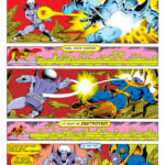
For posting here, I thought it might be fun to also sort of “re-master” the page, add the speech balloons and color it, based on how the page appeared in the comic. I guess that makes it both something old and something new.
Hope you enjoy!
Very cool to see the progression as the work developed. Again I will say I really like how you color, the “reds” in the background of the three panels terrifically accentuate the action point of view. From Magus facing front to his back and then in panel three looking toward us with sort of salmon burst behind, well thought through. The inking lines are firm but not overbearing. Especially in the word balloons, thick lines in my mind can really distract from the action. More please. Thanks.
Thanks, Joe! I can’t really take a lot of credit for the coloring here, as I was taking my cues from how the original page had been colored in the printed comic. They didn’t actually give a specific coloring credit on that issue, but based on other issues around it, it’s likely the work of either Jim Starlin himself, or Steve Leialoha. I agree; the use of the different reds in the BG’s is very effective.