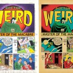
It was recently pointed out to me that in Savage Dragon #235, Erik Larsen had reprinted a bit of my old Big Bang Comics work. This was originally part of a larger storyline (I believe called “The Timebomber”) spread over three issues, where Erik had loaned Big Bang Editor Gary Carlson the use of his Savage Dragon character, and Dragon was being bounced around through time, interacting with multiple Big Bang characters in different eras.
Gary had me contributing to this story in several ways, but the one that’s relevant here is that I penciled and lettered a three page segment (nicely inked by Patrick Tuller), where Dragon met up with Big Bang’s Dr. Weird. It originally appeared in Big Bang Comics #12. I chose to draw it in the style of Golden Age comics artist Bernard Baily, probably best known for his work on DC’s Spectre and Hour-Man strips. I also attempted to match the lettering seen on those strips, which I’d assume is Baily’s, but I don’t know for certain.
Back when I was originally working on this, there were hopes that the issue might be printed in color, but it ended up in b/w. Because there had been that chance though, I actually had done some color guides for the segment, and I think I mailed color photocopies of them to Gary.
Fast forward to this three-pager’s appearance in Savage Dragon #235: Finally it gets to be seen in color! Even if anyone had remembered their existence, the copies of my original color guides were likely nowhere to be found, so this was recolored from scratch. I thought perhaps visitors here might enjoy comparing the two versions, seeing where some choices are the same, and others are different.
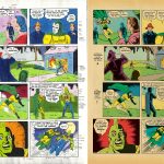
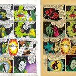
Just a couple of comments/observations about the new version. I appreciate the fact that the colorist who did this for re-publication stuck with the old school color palette. When you’re trying to do something that looks and feels like a genuine old comic, nothing ruins the illusion faster than a color approach that isn’t from that time period!
Also, I noticed that a sort of ending caption was added at the end of page 3 that wasn’t part of the original. Whoever did it either recycled portions of the lettering I had done earlier in the story to get what they needed, or attempted to letter it from scratch so that it looked like my faux Bernard Baily lettering. Either way: again, trying to preserve the illusion that this was the real deal. So: thumbs up for all of that!
Mark, it is great to see this again, and especially in color. And it was clever of you to imitate the style of lettering (whether by Baily or not) of the old Spectre stories. However, as someone who knew Howard Keltner, Dr. Weird’s creator, via correspondence, I feel constrained to mention that Dr. Weird was NOT based on the Spectre, at least not directly. Howard was a great fan of the MLJ line, and his favorite character was Mr. Justice. Now, in all likelihood, Mr. Justice was in turned based on the Spectre, so in essence your take on the lettering makes sense. I don’t recall ever having seen any of the original Mr. J. tales, so who knows what style of lettering they used?
As you point out, Dr. Weird was a pre-existing character who was added to the Big Bang universe. I believe Gary Carlson actually purchased the rights directly from Howard Keltner, and that whenever Dr. Weird appeared, they tried to make sure there was a caption acknowledging that the character was Keltner’s creation.
I can’t speak to what Keltner’s source of inspiration was, but in the context of Big Bang Comics and the Golden Age, Dr. Weird seemed to naturally fit into a role similar to that of DC’s Spectre. Hence my going with Bernard Baily’s style, for both the art and the lettering. It’s all about what the material seems to call for. If this had been written as more of a ’60s tale, for example, I most likely would have attempted a Ditko-esque style instead.
Big Bang was always about trying to invoke a sense of deja vu familiarity, that feeling of “comics history through a funhouse mirror,” rather than just being exact duplicates of whatever archetypes the characters were constructed on. The differences between the Big Bang characters and their archetypes were just as important (if not more so) than the similarities.
Great job on the art! I enjoyed seeing the story in color and own and enjoy all of the original Big Bang comics. The colorist was Adam Pruett. He colors a lot of the Savage Dragon backup material. https://comicvine.gamespot.com/adam-o-pruett/4040–66393/
I’m glad you liked this, Craig! Big Bang was a whole lot of fun to be a part of. It felt like something special while we were doing it.
And thanks for the clarification on the colorist. I appreciate that Adam Pruett followed through with the intent of the artwork by sticking to the “old school” palette. Like I said, nothing can ruin a thing like this faster than a colorist who doesn’t play along!