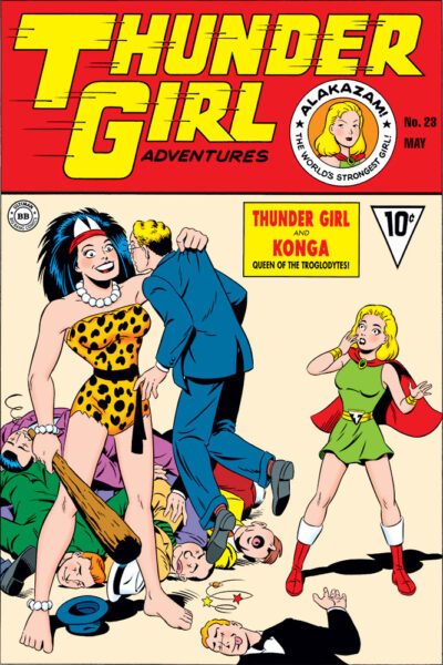
 I’ve recently been posting a number of fake comic covers I did sometime back for Big Bang Comics’ “The Big Bang History of Comics” issues. Here’s another one, newly colored! Thunder Girl Adventures #23, featuring Thunder Girl meeting Konga, Queen of the Troglodytes.
Posting this gives me the opportunity to talk about artist Bill Fugate. Bill ended up being the artist who developed Thunder Girl’s visual design. While I had a lot of respect for my fellow Big Bang artists, I was an outright fan of Bill’s work. Most of us were trying to do different styles, drawing like specific other artists. Bill just drew the way he drew, and he seemed naturally gifted with the kind of cartooning charm to his work that C. C. Beck had. Any time Bill did a Thunder Girl story (or Erik Larsen’s Mighty Man), it was a real treat. I wrote a bit more about Bill here. Wish I’d had the opportunity at some point to tell him just how much I loved his work!
Back to this cover: for the Big Bang Comics History issues (modeled after The Steranko History of Comics volumes), a lot of covers needed to be generated to fill all those pages. While some ideas were discussed, in a number of cases, Big Bang honcho Gary Carlson just kind of let us wing it and come up with whatever seemed right for the particular character or time period. This cover was one of those.
Thunder Girl was kind of Big Bang’s mash-up/equivalent of both the original Captain Marvel and Mary Marvel. One of Capt. Marvel’s enemies was King Kull, the Beastman. Kind of a prehistoric caveman character. Remembering Kull got me wondering what an equivalent kind of character for Thunder Girl might be like, hence Konga. In my mind, though, Konga was less villainous than comedic, coming to the surface world looking for a mate, and not understanding how things work up here.
This cover was inked by Jeffrey Meyer (if my memory’s correct), with pencils, lettering, and now color by me.
There’s a funny story I probably shouldn’t get into here about an interesting fan reaction we got to this cover when it initially appeared in tiny black and white form. If you ever see me out in the real world, ask me and I’ll tell you about it.
Hope you enjoy this!

Your coloring is a festival of beauty. Covers are suppose to piqué the buyer’s/reader’s interest in putting their dime and time down to read the story. The art itself is one thing, but the color makes that “dime down” imperative. Konga’s coming upswing points the direction with her wooden touches of red rusty brown club to Thunder Girl’s flowing red cape completing the direction to the reader to flip the page from right to left, to get to the coming splash page. The evil-doers’ puffy pink tongues seal the deal on messing with the Mighty two. Thanks.
Glad you like it. I was trying to color this using the sort of palette that Fawcett used on their comics covers. Doing the research, I feel like (at least on the covers) Fawcett must have had access to better printing technology than most other Golden Age publishers. They seemed to be able to achieve colors that weren’t within the limits of the color palette most publishers used (like the peachy color I used in the background here, which I saw on a cover of Captain Marvel Adventures). Also, they would occasionally apply some rudimentary rendering to their covers, which was a lot rarer with other publishers.
I actually wasn’t thinking of the guys here as bad guys, and neither was I thinking of Konga as bad. In the story in my head, she’s come topside looking for a mate, and just doesn’t understand how things work up here. So she’s going around konking potential mates on the head, so she can take her pick. And Thunder Girl is trying to figure out how best to tell her she can’t just go around doing that. I think it would’ve been a fun story. I had a couple different possible endings in mind, and wasn’t sure which one was best.
Oh, that is a different take. I like it. That gives Konga’s smile a different depth of meaning. Also closer to something nearer to a Binder creation. “Alakazam!”