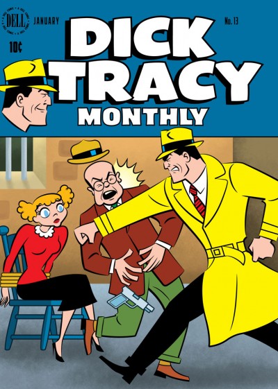
 Perhaps some of you reading this might be familiar with the Covered Blog. If not, it’s a site where artists are challenged to take an existing, published comic book cover and reinterpret it. The results can be interesting, and I thought it might be fun to take a shot at doing one.
I chose to rework the cover of Dell Comics’ Dick Tracy Monthly #13, cover-dated January 1949 (If you’re curious to compare, you can view the original side-by-side with mine over on Covered here). But I didn’t do it in one of my usual styles. Instead, I realized that Chester Gould’s style on Dick Tracy was pretty 2D and graphic to begin with, and that it might be fun to push it just a little further into looking something like a Flash animation style.
I worked on a Flash-animated direct-to-video feature, Hydee and the Hy Tops, and enjoyed it very much. The look of Flash is fun, and I would welcome the opportunity to work on another project in that vein. I have a lot of respect for artists like Craig McCracken and Lauren Faust who do that kind of work very well. So it seemed like this would be a good opportunity to stretch some artistic muscles and try something new.
The BG portion of this cover was done using Photoshop, but the rest of it was done in Adobe Illustrator. If you’ve visited my site before, you know I’ve used Illustrator for a number of different projects. But this project required carrying out the final image in a different way from how I’d done before.
As far as why I chose to reinterpret a Dick Tracy cover in the first place, I think it might be because I’ve been following the regular Dick Tracy strip these last several months, so Tracy was in the back of my mind. The strip’s been rejuvenated by Joe Staton and Mike Curtis, and I’ve been having a blast following it. If you get the chance, give it a look!
