Tag Archives: Image Comics

Getting Blitzed

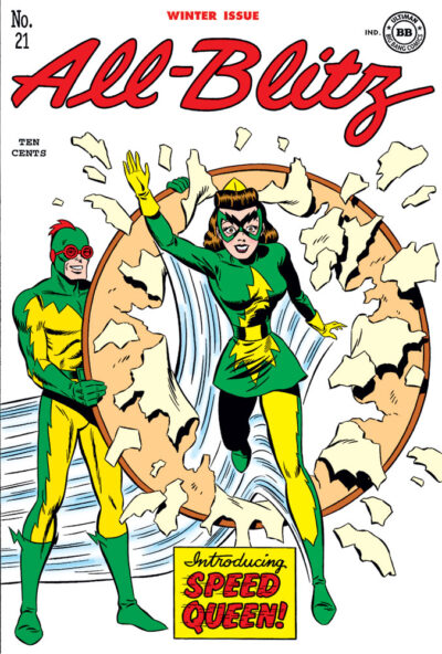
Ear­li­er this year, I was post­ing a num­ber of fake comics cov­ers I’d done for Big Bang Comics’ “His­to­ry Issues” (#24 and #27) that I had new­ly col­ored. Since then, some oth­ers turned up that I did­n’t pre­vi­ous­ly have copies of the fin­ished inks for, which gave me the oppor­tu­ni­ty to final­ly col­or them too. And giv­en that they’re doing #Big­Bang­To­ber again this year, and today’s prompt is Big Bang’s speed­ster, the Blitz, it seemed a good time to post this (final­ly) col­ored ver­sion of the cov­er I drew for All-Blitz #21. It’s a twofer, in that you also get the intro­duc­tion of Speed Queen!

This orig­i­nal­ly appeared (small, in black and white) on pg. 27 of Big Bang Comics #27, AKA “The Big Bang His­to­ry of Comics 2.” The pen­cils, let­ter­ing (and now col­or­ing) are mine. Because of how the con­trib­u­tors were list­ed (and how many years lat­er this is), I’m not entire­ly sure who inked this. Per­haps it was Ed Quin­by? I know he inked one or two oth­er fake cov­ers I did for this project.

As I think I men­tioned before, to do these His­to­ry issues, Gary Carl­son need­ed a WHOLE bunch of cov­ers gen­er­at­ed, so all of us artists had a lot of lat­i­tude to cre­ate stuff. On this one, I was think­ing of how much fun some of those old com­ic cov­ers were when they debuted a new super­heroine, and the name “Speed Queen” popped into my head for a char­ac­ter. Seemed like some­thing they would’ve done back then.

I had also pen­ciled a cou­ple oth­er Gold­en Age Blitz cov­ers, and if good copies of the fin­ished inks for those ever turn up, I’ll prob­a­bly col­or them too. For now: hope you enjoyed this one!

Oblivious

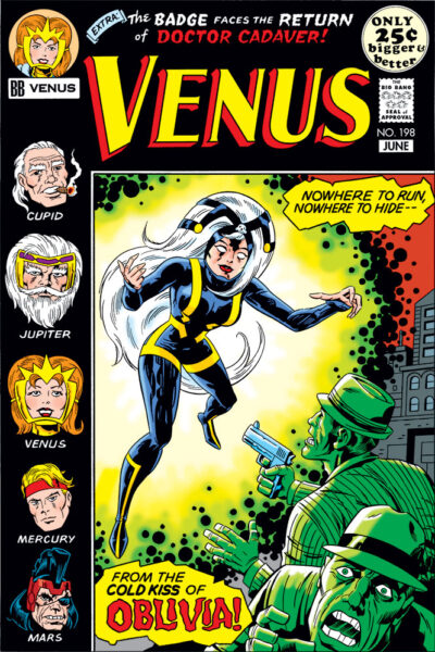
Fake comic cover for Big Bang Comics' Venus #198, with the character Olivia featured on the cover.As has no doubt become clear, I did a lot of fake cov­ers for “The Big Bang His­to­ry of Comics” issues. This one end­ed up being espe­cial­ly fun, for rea­sons you’ll under­stand when I explain who did what.

This cov­er is for the most part my work. I pen­ciled it, let­tered it, and now col­ored it. The inks? By none oth­er than (drum­roll please) Mr. Mike Roy­er him­self! He was Kir­by’s best inker in the ’70s, no ques­tion in my mind. I still kind of can’t believe this hap­pened. More about that in a minute.

Oblivia came about because I was think­ing of those odd char­ac­ters like the Black Rac­er who would sud­den­ly pop up ran­dom­ly out of nowhere in the midst of Jack­’s Fourth World saga at DC. I start­ed think­ing about what Joe Kingler (Big Bang Comics’ equiv­a­lent for Jack) might have done in the con­text of work­ing on Venus, and the name “Oblivia” popped into my head. It seemed to me very much the sort of “play on words” name that Jack often used. So a Venus cov­er fea­tur­ing her did­n’t at all seem out of line.

When I pen­ciled this cov­er, I had no clue who might end up ink­ing it. I prob­a­bly would­n’t have gone ahead and let­tered it if I had known. So when Big Bang’s Gary Carl­son raised a few pos­si­bil­i­ties for inkers, Mike Roy­er being one of them, it was the no-brain­er of all no-brain­ers to say, “Yes!”

I actu­al­ly had the oppor­tu­ni­ty to pick up the fin­ished cov­er in per­son, and was thrilled with the end result. I got to spend a very fun Sun­day after­noon hang­ing out at Mr. Roy­er’s home, con­vers­ing and hear­ing a lot of great sto­ries about his time in comics, work­ing for Dis­ney doing licens­ing art, plus oth­er top­ics. Again, thanks so much, Mr. Royer!

In col­or­ing this, I heav­i­ly ref­er­enced the way all those Fourth World cov­ers at DC were col­ored. That guid­ed me to go in some direc­tions I prob­a­bly would­n’t have gone if I were just col­or­ing this nor­mal­ly on my own (like knock­ing the gang­sters out all in green), but it helped to real­ly get across the right peri­od look.

Thanks for looking!

Venus Vs. Cupid

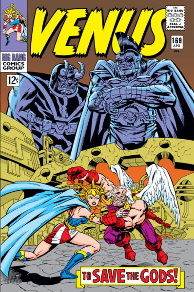
Fake comics cover for Big Bang Comics' Venus #169, with Ares looming in the backgroundI’m adding anoth­er to the group of fake cov­ers I had a hand in cre­at­ing some­time back for “The Big Bang His­to­ry of Comics” issues of Big Bang Comics. Cred­its on this one take a lit­tle expla­na­tion. Pen­cils were by Frank Squil­lace, inks and let­ter­ing by me. Frank did a col­or comp on a pho­to­copy with mark­ers, which I marked up with col­or for­mu­la call­outs to cre­ate a col­orist guide.

This cov­er end­ed up being repur­posed as an actu­al Big Bang cov­er for issue #34, with dif­fer­ent trade dress. For that instance, I believe some­one at Image actu­al­ly gen­er­at­ed the col­or file used to print it, based on the col­or guide we’d pro­vid­ed. I don’t think I actu­al­ly did that one myself in Pho­to­shop, because after much search­ing, I don’t seem to have a file for it. Which means the ver­sion you see here has been total­ly recol­ored by me from scratch in Pho­to­shop, ref­er­enc­ing the col­or guide. I tweaked the ren­der­ing in a few spots to plus what was in the print­ed ver­sion a lit­tle bit, so a sharp eye might spot some of those differences.

I sus­pect most vis­i­tors will imme­di­ate­ly real­ize that Frank and I were shoot­ing for a Jack Kir­by style here. I always thought of Big Bang as sort of “comics his­to­ry through a fun­house mir­ror.” It’s known that when Jack Kir­by jumped from Mar­vel to DC, they offered him any book he want­ed. Jack was­n’t com­fort­able with putting any­one out of work, so he said, “give me your least-sell­ing book.” That’s how Jim­my Olsen end­ed up as part of Jack­’s Fourth World Saga at DC. Any­one who’s stud­ied Jack­’s work knows he had a life­long fas­ci­na­tion with myths and leg­ends. So I thought, what if instead of Jim­my Olsen, Jack had tak­en on Won­der Woman? In Big Bang terms, that would’ve trans­lat­ed to Joe Kingler (Big Bang’s Kir­by equiv­a­lent) tak­ing on the char­ac­ter Venus.

This is the first time this has appeared in col­or with the orig­i­nal Venus mast­head. Hope you enjoy it!

Getting Animated

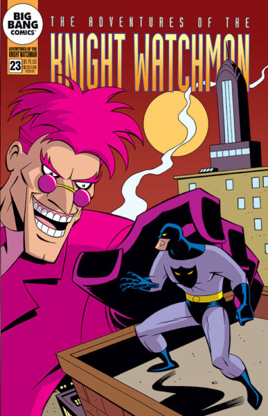
Fake comic cover for Adventures of the Knight Watchman #23, with Big Bang Comics' the Knight Watchman and Pink Flamingo facing off.Here’s anoth­er fake com­ic cov­er I gen­er­at­ed for one of “The Big Bang His­to­ry of Comics” issues, this one fea­tur­ing ani­mat­ed-style ver­sions of the Knight Watch­man and his neme­sis, the Pink Flamin­go. With my pen­cils, inks and let­ter­ing, it appeared orig­i­nal­ly in black and white in Big Bang Comics #24. And now for the first time, it’s in col­or here!

I’m sure I don’t have to explain what style I’m going for here. At the time I orig­i­nal­ly did this, I believe I was like­ly still work­ing on X‑Men: the Ani­mat­ed Series. It would be awhile yet before I final­ly got the chance to work on an ani­mat­ed Bat­man project for Warn­ers, on the direct-to-video Bat­man: Mys­tery of the Bat­woman. Thanks to Curt Geda for giv­ing me the call!

Like with some of the oth­er fake cov­ers I did for Big Bang that I’ve post­ed here recent­ly, I tried to take my col­or cues from the source mate­r­i­al I was imi­tat­ing when draw­ing it. Those books were done around the time that Pho­to­shop was start­ing to be used on some comics, and though I don’t think Pho­to­shop was ever used on those Bat­man Adven­tures comics, it did appear to be hav­ing an influ­ence, in that they were clear­ly using a great­ly expand­ed col­or palette from the usu­al Gold­en, Sil­ver or Bronze age style comics cov­ers I usu­al­ly imi­tate. So it was a fun chal­lenge to try to put my head in a lit­tle dif­fer­ent place and work that out.

A unique thing about all those DC comics based on the WB car­toons was that hard-edged shad­ow col­or they used on the art. I’ve seen orig­i­nal b/w art from those comics, and they’d usu­al­ly indi­cate the shad­ow edges direct­ly on there with a fine point red felt pen (I assume drawn in by the inker). Those red lines would be dropped from the final print­ed art, but the col­orists would use them as their guides for exact place­ment of the shad­ow areas. The shad­ow col­or I’m using here is most like­ly not the same one they used back then, but it’s one I’ve used in the past that’s always worked well for me. I felt like it worked well here, too.

Hope you like it!

Bonk, Bonk on the Head!

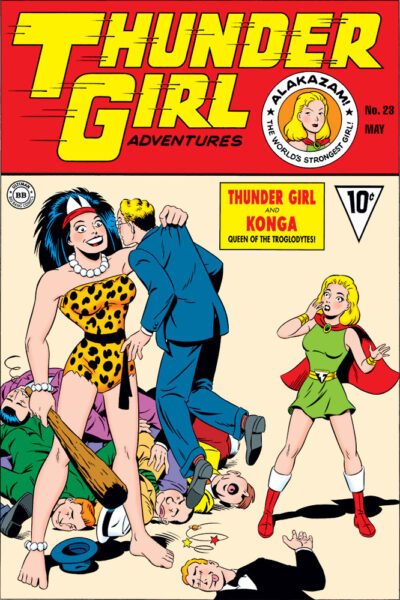
Fake comic cover for Thunder Girl Adventures #23, featuring Big Bang Comics' Thunder Girl meeting Konga, queen of the Troglodytes.I’ve recent­ly been post­ing a num­ber of fake com­ic cov­ers I did some­time back for Big Bang Comics’ “The Big Bang His­to­ry of Comics” issues. Here’s anoth­er one, new­ly col­ored! Thun­der Girl Adven­tures #23, fea­tur­ing Thun­der Girl meet­ing Kon­ga, Queen of the Troglodytes.

Post­ing this gives me the oppor­tu­ni­ty to talk about artist Bill Fugate. Bill end­ed up being the artist who devel­oped Thun­der Girl’s visu­al design. While I had a lot of respect for my fel­low Big Bang artists, I was an out­right fan of Bil­l’s work. Most of us were try­ing to do dif­fer­ent styles, draw­ing like spe­cif­ic oth­er artists. Bill just drew the way he drew, and he seemed nat­u­ral­ly gift­ed with the kind of car­toon­ing charm to his work that C. C. Beck had. Any time Bill did a Thun­der Girl sto­ry (or Erik Larsen’s Mighty Man), it was a real treat. I wrote a bit more about Bill here. Wish I’d had the oppor­tu­ni­ty at some point to tell him just how much I loved his work!

Back to this cov­er: for the Big Bang Comics His­to­ry issues (mod­eled after The Ster­anko His­to­ry of Comics vol­umes), a lot of cov­ers need­ed to be gen­er­at­ed to fill all those pages. While some ideas were dis­cussed, in a num­ber of cas­es, Big Bang hon­cho Gary Carl­son just kind of let us wing it and come up with what­ev­er seemed right for the par­tic­u­lar char­ac­ter or time peri­od. This cov­er was one of those.

Thun­der Girl was kind of Big Bang’s mash-up/e­quiv­a­lent of both the orig­i­nal Cap­tain Mar­vel and Mary Mar­vel. One of Capt. Mar­vel’s ene­mies was King Kull, the Beast­man. Kind of a pre­his­toric cave­man char­ac­ter. Remem­ber­ing Kull got me won­der­ing what an equiv­a­lent kind of char­ac­ter for Thun­der Girl might be like, hence Kon­ga. In my mind, though, Kon­ga was less vil­lain­ous than comedic, com­ing to the sur­face world look­ing for a mate, and not under­stand­ing how things work up here.

This cov­er was inked by Jef­frey Mey­er (if my mem­o­ry’s cor­rect), with pen­cils, let­ter­ing, and now col­or by me.

There’s a fun­ny sto­ry I prob­a­bly should­n’t get into here about an inter­est­ing fan reac­tion we got to this cov­er when it ini­tial­ly appeared in tiny black and white form. If you ever see me out in the real world, ask me and I’ll tell you about it.

Hope you enjoy this!

Behind the Badge Again

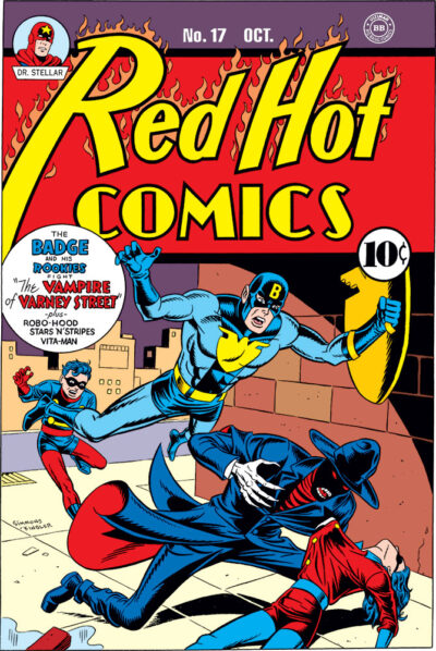
Fake Comic Cover for Red Hot Comics #17, with Big Bang Comics' the Badge and His RookiesI explained last time how, when Big Bang Comics did a cou­ple issues focused on the fic­ti­tious his­to­ry of the com­pa­ny (mim­ic­k­ing Ster­anko’s His­to­ry of Comics vol­umes), they need­ed a whole bunch of fake cov­ers to pull it off and make it all feel believ­able. Here’s anoth­er one from the bunch I generated.

I drew this back then, inked (I believe) by Jeff Mey­er. And now for the first time, appear­ing in col­or! It’s fun to final­ly see this real­ized in this form, after hav­ing it exist only in black and white for all these years.

I’m not exact­ly sure where the idea for this cov­er came from. Per­haps I was think­ing about Simon & Kir­by’s kick-off run of Cap­tain Amer­i­ca, which seemed to draw a lot of inspi­ra­tion from the “weird men­ace” genre of pulps (an ingre­di­ent I’m sur­prised that most peo­ple don’t seem to pick up on). I kin­da wish I could read “The Vam­pire of Var­ney Street!”

I had fun doing this. Hope you enjoy it!

Behind the Badge

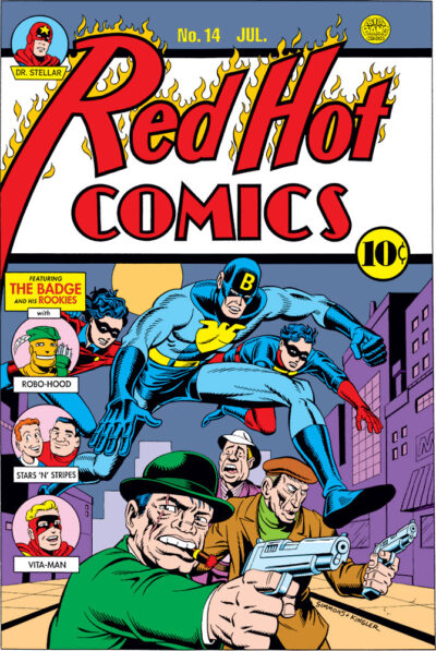
Fake Comic Cover Red Hot Comics #14, with Big Bang Comics' the Badge and His RookiesLong­time vis­i­tors to my site might know that back in the ’90s, I was a con­trib­u­tor to Gary Carl­son and Chris Eck­er’s Big Bang Comics. The first issue had­n’t quite come out through Cal­iber yet when I came onboard, I  think, but some mate­r­i­al was already done.

When I met him, Gary was look­ing for some­one to draw a Simon & Kir­by type Gold­en Age char­ac­ter he had in mind called the Badge, and he’d been point­ed my way. I got to have a pret­ty good hand in devel­op­ing the char­ac­ter, his look and that of side­kicks Troop­er and Bob­bie, even mak­ing some sug­ges­tions about the char­ac­ters’ back sto­ries. So I have to admit to feel­ing a bit of pro­pri­etary inter­est in the Badge.

We even­tu­al­ly did a cou­ple issues of Big Bang sub­ti­tled “The Big Bang His­to­ry of Comics,” in imi­ta­tion of the Ster­anko His­to­ry of Comics vol­umes (not real­ly par­o­dy except in the most lov­ing and respect­ful way, because we all had a lot of affec­tion for those books, as they were a gate­way into a life­long inter­est in comics his­to­ry for many of us).

The His­to­ry issues end­ed up being Big Bang Comics #24 and #27. If you’ve seen the Ster­anko books, imi­tat­ing those meant we need­ed a whole bunch of fake cov­ers! So I and a num­ber of oth­er artists set about to gen­er­ate them. I recent­ly made a list, and was shocked to see just how many I did, while simul­ta­ne­ous­ly hold­ing down my day job in animation!

Any­way, to what you’re see­ing here: this was one of the ear­li­est fake cov­ers I gen­er­at­ed for Big Bang. If my mem­o­ry’s right, I think it might even have appeared as far back as the Cal­iber minis­eries. I recall it appear­ing in col­or, but small, like part of a back cov­er ad. Recent­ly, I thought it would be fun to go back and revis­it a num­ber of those old fake cov­ers I did, and give them the full col­or treat­ment they always called out for. Most have nev­er been seen in col­or at all!

The char­ac­ters along the left side were ones I just made up on the spot, but most of them end­ed up appear­ing in Big Bang sto­ries at one point or anoth­er. I sort of thought of Big Bang as “comics his­to­ry through a fun­house mir­ror,” and to that end when I was draw­ing up this cov­er, I just made up char­ac­ters that felt like they were play­ing with some of those famil­iar old Gold­en Age arche­types, but hope­ful­ly also feel­ing like you had­n’t entire­ly seen them before.

Pen­cils, let­ter­ing (and now col­or­ing) are mine; inks were by Jeff Mey­er (I believe), who inked sev­er­al of my fake cov­ers for the His­to­ry issues, and did a nice job of giv­ing them the cor­rect fin­ished look and feel. You can check out anoth­er of our fake cov­er col­lab­o­ra­tions here.

I still have oth­er cov­ers in the pipeline that I might post too, but I had­n’t put any­thing up here in awhile, and thought this might be fun. Hope you enjoy!

And thanks always, Gary, for let­ting me have a lot of fun on the Big Bang play­ground! Those inter­est­ed can check out more recent Big Bang issues over on Indy Plan­et.

Weird Colors

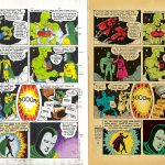
It was recent­ly point­ed out to me that in Sav­age Drag­on #235, Erik Larsen had reprint­ed a bit of my old Big Bang Comics work. This was orig­i­nal­ly part of a larg­er sto­ry­line (I believe called “The Time­bomber”) spread over three issues, where Erik had loaned Big Bang Edi­tor Gary Carl­son the use of his Sav­age Drag­on char­ac­ter, and Drag­on was being bounced around through time, inter­act­ing with mul­ti­ple Big Bang char­ac­ters in dif­fer­ent eras. 

Gary had me con­tribut­ing to this sto­ry in sev­er­al ways, but the one that’s rel­e­vant here is that I pen­ciled and let­tered a three page seg­ment (nice­ly inked by Patrick Tuller), where Drag­on met up with Big Bang’s Dr. Weird. It orig­i­nal­ly appeared in Big Bang Comics #12. I chose to draw it in the style of Gold­en Age comics artist Bernard Bai­ly, prob­a­bly best known for his work on DC’s Spec­tre and Hour-Man strips. I also attempt­ed to match the let­ter­ing seen on those strips, which I’d assume is Bai­ly’s, but I don’t know for certain.

Back when I was orig­i­nal­ly work­ing on this, there were hopes that the issue might be print­ed in col­or, but it end­ed up in b/w. Because there had been that chance though, I actu­al­ly had done some col­or guides for the seg­ment, and I think I mailed col­or pho­to­copies of them to Gary.

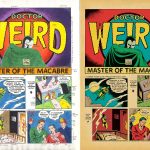
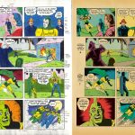
Fast for­ward to this three-pager’s appear­ance in Sav­age Drag­on #235: Final­ly it gets to be seen in col­or! Even if any­one had remem­bered their exis­tence, the copies of my orig­i­nal col­or guides were like­ly nowhere to be found, so this was recol­ored from scratch. I thought per­haps vis­i­tors here might enjoy com­par­ing the two ver­sions, see­ing where some choic­es are the same, and oth­ers are different.

Just a cou­ple of comments/observations about the new ver­sion. I appre­ci­ate the fact that the col­orist who did this for re-pub­li­ca­tion stuck with the old school col­or palette. When you’re try­ing to do some­thing that looks and feels like a gen­uine old com­ic, noth­ing ruins the illu­sion faster than a col­or approach that isn’t from that time period!

Also, I noticed that a sort of end­ing cap­tion was added at the end of page 3 that was­n’t part of the orig­i­nal. Who­ev­er did it either recy­cled por­tions of the let­ter­ing I had done ear­li­er in the sto­ry to get what they need­ed, or attempt­ed to let­ter it from scratch so that it looked like my faux Bernard Bai­ly let­ter­ing. Either way: again, try­ing to pre­serve the illu­sion that this was the real deal. So: thumbs up for all of that!