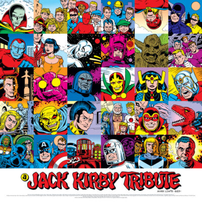
 Recent visitors to my site in August will know that I was doing the online Jack Kirby Tribute every day, the brainchild of Howard Simpson. it was a blast participating, refreshing my appreciation all over again for all the great work Kirby did over the years.
I stuck to a very specific format with all of these: portraits in a small square, colored with the limited palette used in the old comics most of these characters originally appeared in, even down to the dot patterns. And I had in mind that the end goal was to be able to assemble them all into one composite image. I wasn’t sure how that would work out, but here’s how it did!
This was kind of just a personal challenge/exercise in taking the Tribute a step further. Not sure what happens with it beyond this point.
Hope you enjoyed the ride!

Yes. There it is. No Jolly Jaunter. So I am assuming from the beginning you were going with the thirty “squares” and ending with your Jack image in order to complete the larger 6×5 fully developed image. Neat. I hope there is a future for your work. The complete image deserves much more exposure. Thanks, Mr. Lewis.
Glad you stuck it out for the whole ride and enjoyed it, Joe.
Yeah, I left the Jolly Jaunter off for the reason you suggest, as well as the fact he’s not a Kirby Kreation. So while he made sense in the context of the prompts for the month, I didn’t think he made sense being included here. And finishing this up with Jack as the final image just felt right to me.
As I guessed. I would like JJ to get some highlighting. It is a cool idea.
If you decide to sell poster size prints of this composite illustration, I would be interested in purchasing a copy.
Maybe put the year on it, because this is something that might come back around.
You really outdid yourself and I found myself looking forward to checking my email to see the next installment.
Thank you.
Thanks! Glad you enjoyed it all.
And I love the Kirby/Royer style lettering ??
Thanks!
Yeah, it seemed appropriate to try to use that approach for this. That lettering was pretty much unique to material Mike Royer inked and lettered for Kirby. I don’t recall ever seeing Royer use it on anything else he might have inked for another artist, and I also don’t recall ever seeing any other letterer trying to imitate the style. So if you want lettering that says “Kirby” before you see anything else, you can’t go wrong doing this style of lettering. As long as you make sure you get it right, that is.