Category Archives: Comics

Work that’s either done specif­i­cal­ly for comics, or is comic-related.

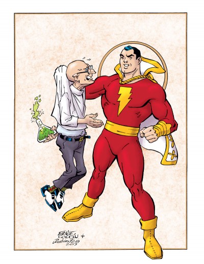
Of Mad Scientists and Big Red Cheeses

FCA Colón/RubinsteinLooks like I missed post­ing last month, due to still being pret­ty busy. Again, that’s a good thing! How­ev­er, now that it’s a new month, I’ve got clear­ance to reveal in full one of the three items I teased back in Feb­ru­ary. This is a cov­er for anoth­er issue of FCA, appear­ing in the upcom­ing July issue of Roy Thomas’ Alter Ego mag­a­zine (actu­al­ly on stands in June, so you don’t have to wait that long!).

Right up front, I need to make it clear that I did not pen­cil or ink this cov­er. It was drawn by Ernie Colón, and inked by Joe Rubin­stein. If you’re famil­iar with those gen­tle­men and their work, that may sound like an unusu­al pair­ing to you at first. I know it did to me, but I’m told that they are col­lab­o­rat­ing quite a bit in recent times. (And if you’re not famil­iar with them, let your fin­gers get to googling!)

So why did I post this on my site if I did­n’t draw it? It’s because I col­ored it. FCA Edi­tor P.C. Hamer­linck con­tact­ed me to ask if I’d be will­ing to, and I said “yes.” Some­thing about the way this was put togeth­er remind­ed me a bit of those clas­sic old illus­trat­ed mag­a­zine cov­ers (for exam­ple, The Sat­ur­day Evening Post). So I tried to give the col­ors on this a lit­tle more of a painter­ly feel than I’ve attempt­ed before, though that might not be entire­ly vis­i­ble at this res­o­lu­tion. I hope Mr. Colón and Mr. Rubin­stein feel I did jus­tice to their work.

Again with the Teasing!

FCA Teaser 3BDue to “busy-ness” here late­ly (a good thing), I’m falling back on the ol’ reli­able tease once again.

The images you’re see­ing here are details from a few illus­tra­tions that have crossed my desk this month which I had a hand in gen­er­at­ing, in one capac­i­ty or anoth­er. These were all done for the FCA sec­tion of Roy Thomas’ Alter Ego mag­a­zine, pub­lished by Twom­or­rows. Full images will appear on my site even­tu­al­ly, once I’ve been giv­en the “all clear” to do so. Mean­time, hope­ful­ly there’s enough here to whet your appetite to see more at a lat­er date.

FCA Teaser 3AI hope the New Year is being good to you all thus far.

FCA Teaser 3C

Clutch Escargot!

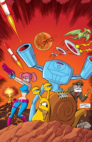
Clutch Escargot CoverIt’s a new year, and I’ve got some­thing new to post. Well, tech­ni­cal­ly it’s not real­ly new, but it will be new to you readers.

Meet Clutch Escar­got and his team, all set for hi-octane adven­ture! Com­ing to you straight from the fevered mind of my friend, the love­ly and tal­ent­ed Jim Sten­strum. If you are a long­time comics fan, you may know Jim best as a writer (he wrote a lot of mem­o­rable clas­sic com­ic sto­ries pub­lished by War­ren). But Jim has also had a sec­ond career in ani­ma­tion, where he is known as quite a tal­ent­ed artist and char­ac­ter design­er. Which makes him a dou­ble threat. And we won’t even get into the years in-between those two careers, where he devel­oped quite a rep­u­ta­tion as a two-fist­ed globe-trot­ting mer­ce­nary. No, real­ly; it’s best we don’t talk about that.

The art you see here was pen­ciled by Jim. He asked me to do the hon­ors of ink­ing and col­or­ing it, so that’s what my con­tri­bu­tion was. I’ve worked with Jim many, many times over the years on var­i­ous ani­ma­tion projects, and it’s no exag­ger­a­tion to say I’ve most like­ly inked a thou­sand of his char­ac­ter designs. It’s always a blast. So say­ing “yes” when he invit­ed me to help him out with this was a no-brain­er. I think the end result is fun. I’d buy this comic.

That’s kind of my ver­sion of what this is and how it came to be. But make sure you don’t miss out on read­ing Jim’s ver­sion over here.

Let’s make sure to do the offi­cial stuff too: Clutch Escar­got is ™ and © 2011 Jim Stenstrum.

Hap­py New Year, y’all! Here’s to a great 2013.

Sorry,…What Was Your Name Again?”

Hm. Where to begin to explain this one?

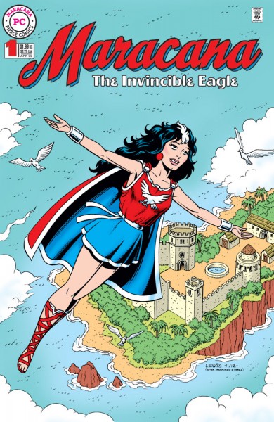
This orig­i­nal­ly start­ed out intend­ed to be just a sketch, done for John Pierce. But as these things some­times hap­pen with me, it sort of took on a whole life of its own. John is a friend, an email cor­re­spon­dent, a long­time comics fan and writer. You may have seen his work in some mag­a­zines about comics like Roy Thomas’ Alter Ego/FCA (the Faw­cett Col­lec­tors of America).

Any­way, John has a char­ac­ter he cre­at­ed called Jon­ni Star. Her sto­ries have appeared in a few small press comics here and there, usu­al­ly illus­trat­ed by Brazil­ian artist Emir Ribeiro. (I even took a crack at draw­ing Jon­ni myself once, and you can see the result here in my Gallery). John had an idea for a com­ic book char­ac­ter that John­na (Jon­ni’s civil­ian iden­ti­ty) liked to read about, called Mara­cana, the Invin­ci­ble Eagle. Which I guess makes Mara­cana a com­ic with­in a comic.

Most comics fans will like­ly be able to sort out for them­selves which char­ac­ter arche­type Mara­cana’s descend­ed from. But John has some inter­est­ing twists in there too, like hav­ing her root­ed in a more Celtic-influ­enced cul­ture instead of the Gre­co-Roman type one might tend to usu­al­ly expect with a char­ac­ter like this. Like I say, this start­ed out intend­ed to be just a sketch, but I guess I got car­ried away and could­n’t help myself. I thought the end result was fun. Seemed like I might just as well go ahead and post it here, while I’m at it.

Mara­cana the Invin­ci­ble Eagle is ™ and © John Pierce.

Frankenstein and Dracula

What? These weren’t the guys you were expecting? 🙂

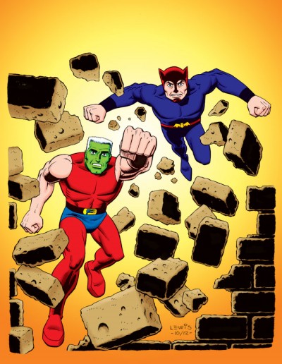
Appar­ent­ly back in the mid/late-’60s, some­one at Dell Comics thought it would be a good idea to take some of the clas­sic mon­sters and re-imag­ine them as super­heroes. There had been a sort of resur­gence of inter­est in the old Uni­ver­sal Mon­sters, due to their expo­sure to a new gen­er­a­tion on TV. You cou­ple that with a burst of inter­est around that time in super­heroes from a pop/camp per­spec­tive (thanks to the Bat­man TV show), and you can see the reasoning.

I’ve nev­er actu­al­ly come across one of these books to be able check them out for myself. My aware­ness of them is very lim­it­ed, gleaned only from their occa­sion­al men­tions in places like Roy Thomas’ Alter Ego mag­a­zine, or on var­i­ous blogs or comics sites.

Then why am I draw­ing these char­ac­ters? I guess there’s a fun sense of wonk­i­ness to the whole thing that kind of appeals to me. Sort of like watch­ing Plan 9 from Out­er Space. I thought it would be a kick to just take a crack at these guys and see what it might wind up look­ing like.

Hap­py Halloween!

Zita’s Back!

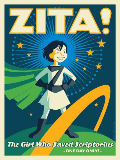
If you’ve checked in on my site from time to time, you may have seen my post­ing about the graph­ic nov­el Zita the Space­girl last year. My last com­ment on the sub­ject then (direct­ed at author Ben Hatke) was “…I hope you have plans for more Zita in the future.” Thank­ful­ly, the future is now!

I’m a lit­tle late men­tion­ing it, but Leg­ends of Zita the Space­girl (book #2 in the series now) came out last month. Based on the first book, Ben set my expec­ta­tions pret­ty high for this new one. And he did not dis­ap­point! Pret­ty much all the things I said last time hold true of this new book too. I don’t want to just repeat myself, but I would like to make some fur­ther obser­va­tions about Ben’s work here. The book also spurred some thoughts about comics in gen­er­al, which fit this discussion.

I’d men­tioned before how much charm Ben Hatke’s art­work has. There’s a nice, organ­ic loose­ness to his approach. He is unapolo­get­i­cal­ly a car­toon­ist (and I don’t under­stand why in some fan quar­ters, “car­toony” is a pejo­ra­tive. Per­son­al­ly, I’ve always grav­i­tat­ed towards artists who are strong styl­ists). I had­n’t made this asso­ci­a­tion pre­vi­ous­ly, but this time out I real­ized his work was remind­ing me a lit­tle bit of the com­ic Mars by Hempel and Wheat­ley, pub­lished back in the ’80s. While I can’t go so far as to pro­claim Hempel and Wheat­ley’s Mars was an influ­ence on Ben, it seems like visu­al­ly he’s com­ing from a sim­i­lar place. Or per­haps they have some influ­ences in com­mon. Whether there’s any con­nec­tion or not, in both cas­es, the visu­al approach allows for a much wider and more imag­i­na­tive range of char­ac­ters and sit­u­a­tions than per­haps a more real­is­tic take would allow.

And the uni­verse Ben has cre­at­ed for Zita is quite imag­i­na­tive! Lots of strange crea­tures and wild con­cepts going on in this book. With­out giv­ing any­thing away, there are a cou­ple of ideas in there that I think would even do Jack Kir­by proud.

Anoth­er thing I was more con­scious of this time is the fact that Ben is not afraid to do whole sequences with­out any dia­logue or cap­tions. He’s will­ing to let his art­work car­ry the whole bur­den of telling the sto­ry at points, through the action, facial expres­sions and pos­es. I think that’s great, and real­ly kind of brave. Doing a book like this (even as writer/artist), I imag­ine there’s a temp­ta­tion to fall back more on the words to car­ry the weight of your sto­ry. While it might be more of a chal­lenge, it can be much more sat­is­fy­ing in some ways if you can get as much as pos­si­ble of the sto­ry across using just your visu­als. The bot­tom line is that comics is a visu­al medi­um. It is quite pos­si­ble to do a com­ic with no words (in fact, it’s been done sev­er­al times over the years). But it’s not pos­si­ble to do a com­ic with­out pictures.

There’s been a lot of debate in recent years about there not being enough comics that are appro­pri­ate for kids. Often the way peo­ple attempt to address that is to do spe­cif­ic “kids’ comics.” In my opin­ion, that’s a risky way to go. The poten­tial pit­fall in that approach is that there can be a temp­ta­tion dumb things down, and talk down to the kids. Kids aren’t stu­pid. If you think back to when you were a kid, you knew it when peo­ple were talk­ing down to you, and I’ll bet you did­n’t like it any more then than you do now. Per­son­al­ly, I believe the bet­ter approach is to attempt to do “all-ages” comics that work on mul­ti­ple lev­els at once. Bring­ing this back on-top­ic, the Zita books are a good exam­ple of that. A younger read­er will appre­ci­ate them on one lev­el, while old­er read­ers will find themes and aspects that res­onate with them on a whole oth­er lev­el. Much like the best chil­dren’s lit­er­a­ture has always done.

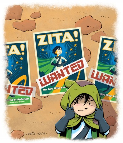
I guess I should talk a lit­tle about the illustration(s) I did to accom­pa­ny this arti­cle (since this site’s sup­posed to be about me draw­ing!). This image is kind of riff­ing off some visu­als and sit­u­a­tions in the book. I don’t want to say too much about the plot and spoil any­thing. But I thought it would be fun to take the poster idea from the book and real­ly do it up, like a full-blown silkscreened poster (inspired by the work of Strongstuff, AKA Tom Whalen).

Any­way, if you like real­ly good all-ages comics, I rec­om­mend you get your hands on this one. If you haven’t already picked up the first vol­ume, Zita the Space­girl, get ’em both!

…The Cool Exec with a Heart of Steel.”

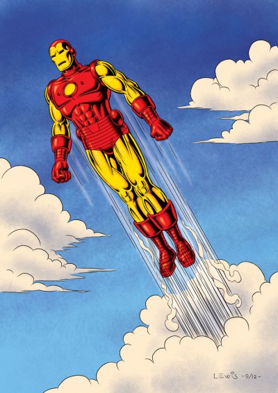
This time out, it’s the invin­ci­ble Iron Man! Thanks to the recent movies, now even more peo­ple know Tony Stark’s alter ego. Obvi­ous­ly I’m not doing the movie ver­sion here. Instead, this is the out­fit that first comes to mind for me when some­one says the phrase “clas­sic Iron Man armor” (though I real­ize oth­ers may think of dif­fer­ent suits).

I can’t claim to have fol­lowed Iron Man reg­u­lar­ly as a kid, but there were still some very cool images and sto­ry­lines I caught back then that stayed with me (such as his epic bat­tle with the giant Tita­ni­um Man!). And as far as wish-ful­fill­ment goes, Iron Man’s a pret­ty cool idea: hav­ing the smarts and mon­ey to invent an armored suit which enables you to fly, gives you great strength as well as many oth­er kinds of cool abil­i­ties and weapons. And he even made his first suit out of spare parts, right under the noses of his cap­tors while being held hostage!

This draw­ing was a big exper­i­ment for me. I elect­ed to make myself do it 100% dig­i­tal­ly, final­ly give myself a project to do using my Man­ga Stu­dio EX soft­ware. It just seemed the appro­pri­ate thing to do, with such a high-tech character.

Work­ing all-dig­i­tal­ly is a dif­fer­ent expe­ri­ence. While I’m very com­fort­able with most oth­er aspects of gen­er­at­ing my art using my com­put­er, the ini­tial draw­ing is a dif­fer­ent mat­ter. It feels very weird to start a draw­ing with­out first pick­ing up a pen­cil and a piece of paper. Almost like I can’t quite ful­ly think or visu­al­ize clear­ly with­out those items. The feel­ing’s a bit like those old dreams where you’d go to school and have this nag­ging sen­sa­tion you for­got some­thing, only to look down and see you left your pants at home! This will take fur­ther work. But regard­less, I don’t think I’ll ever want to entire­ly give up my pen­cil and paper!

This one’s for Frank, A.K.A. Iron Man Fan #1. Hope I did jus­tice to your favorite!

Doc Bruce Banner, Belted by Gamma Rays…”

I was talk­ing with a good friend recent­ly, and he raised a ques­tion. “How come you aren’t draw­ing more of those clas­sic Mar­vel or DC char­ac­ters for your site? You real­ly should be doing more of that stuff.” I had to think about that. There’s real­ly no good rea­son why I haven’t, because I do love that mate­r­i­al. Maybe it’s just one of those things where you’re so close to it, you can’t see it. Or maybe it’s because there are just so many oth­er things I also want to do. Any­way, this post is an attempt to start rec­ti­fy­ing the situation.

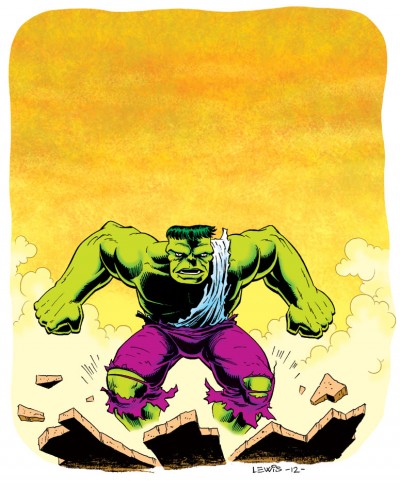
It seemed like it might be fun to take a shot at the Hulk. Sur­pris­ing­ly, I haven’t real­ly drawn him all that often. Hulk’s been around awhile. He’s achieved that rar­efied stra­ta of comics char­ac­ters where even many non-comics-read­ers know who he is (thanks to the recent movies, the TV show, and even the Hulk episodes of the “Mar­vel Super Heroes” car­toons back in the ’60s).

There’ve been a num­ber of takes on the Hulk over the years, but if you’ve vis­it­ed my site much, it prob­a­bly won’t sur­prise you to find out that I grav­i­tate towards the ear­ly ver­sion of the char­ac­ter, as visu­al­ized by Jack Kir­by. There’s just some­thing very fun and pri­mal about that Hulk. He felt more like a wild card, unpre­dictable and mon­strous (appro­pri­ate, giv­en all the mon­ster comics Mar­vel was pub­lish­ing not too long before). I thought I’d try to cap­ture some of that ear­ly wild­ness, with­out nec­es­sar­i­ly com­plete­ly aping Kir­by. While it can be a lot of fun to do that, it seemed like a good idea to try to keep a lit­tle more of myself in there this time.

A big thanks to my friend Mark for sug­gest­ing I expand my horizons!

We’ve Got You Covered!”

Per­haps some of you read­ing this might be famil­iar with the Cov­ered Blog. If not, it’s a site where artists are chal­lenged to take an exist­ing, pub­lished com­ic book cov­er and rein­ter­pret it. The results can be inter­est­ing, and I thought it might be fun to take a shot at doing one.

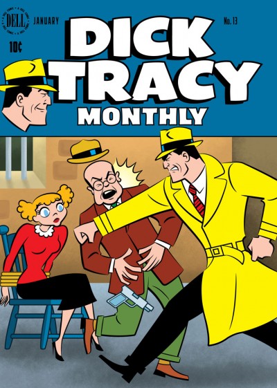
I chose to rework the cov­er of Dell Comics’ Dick Tra­cy Month­ly #13, cov­er-dat­ed Jan­u­ary 1949 (If you’re curi­ous to com­pare, you can view the orig­i­nal side-by-side with mine over on Cov­ered here). But I did­n’t do it in one of my usu­al styles. Instead, I real­ized that Chester Gould’s style on Dick Tra­cy was pret­ty 2D and graph­ic to begin with, and that it might be fun to push it just a lit­tle fur­ther into look­ing some­thing like a Flash ani­ma­tion style.

I worked on a Flash-ani­mat­ed direct-to-video fea­ture, Hydee and the Hy Tops, and enjoyed it very much. The look of Flash is fun, and I would wel­come the oppor­tu­ni­ty to work on anoth­er project in that vein. I have a lot of respect for artists like Craig McCrack­en and Lau­ren Faust who do that kind of work very well. So it seemed like this would be a good oppor­tu­ni­ty to stretch some artis­tic mus­cles and try some­thing new.

The BG por­tion of this cov­er was done using Pho­to­shop, but the rest of it was done in Adobe Illus­tra­tor. If you’ve vis­it­ed my site before, you know I’ve used Illus­tra­tor for a num­ber of dif­fer­ent projects. But this project required car­ry­ing out the final image in a dif­fer­ent way from how I’d done before.

As far as why I chose to rein­ter­pret a Dick Tra­cy cov­er in the first place, I think it might be because I’ve been fol­low­ing the reg­u­lar Dick Tra­cy strip these last sev­er­al months, so Tra­cy was in the back of my mind. The strip’s been reju­ve­nat­ed by Joe Sta­ton and Mike Cur­tis, and I’ve been hav­ing a blast fol­low­ing it. If you get the chance, give it a look!

It’s the Fourth of July!

It’s Inde­pen­dence Day today in the U.S. of A.! That usu­al­ly means time off, doing fun things like pic­nics or bar­be­cues with friends, pos­si­bly tak­ing in a fire­works show (depend­ing on where you live), and maybe hope­ful­ly even giv­ing a thought to some of the free­doms we’re priv­i­leged to enjoy in this coun­try, which we can some­times take for granted.

This post is most­ly moti­vat­ed by the fact that real­iz­ing the hol­i­day was com­ing up, I had an image pop into my mind appro­pri­ate for the day, so I thought I’d go for it! As not­ed there, the char­ac­ter is Miss Fire­crack­er from Big Bang Comics, though she’s depict­ed here in a dif­fer­ent style from how she ever appeared in Big Bang.

This is a good oppor­tu­ni­ty to talk about Big Bang Comics a lit­tle bit. Some peo­ple read­ing this may know that I was a con­trib­u­tor to Big Bang through its most active years. Though I can’t claim to have been there from the absolute very begin­ning, I did get in pret­ty ear­ly on. The char­ac­ter I had the most involve­ment in shap­ing would’ve been the Badge. But thanks to Big Bang hon­chos Gary Carl­son and Chris Eck­er, I got the chance to get my hands into a whole lot more than that.

Not only did I get to draw a num­ber of oth­er Big Bang char­ac­ters (par­tic­u­lar­ly on fake com­ic cov­ers as seen in “The Big Bang His­to­ry of Comics” issues of Big Bang Comics), I got to design sev­er­al oth­er char­ac­ters, cre­ate logos, even kib­itz on some sto­ry­lines, ink and col­or. The way I looked at Big Bang, it was sort of  “comics his­to­ry through a fun­house mir­ror.” You got to cre­ate things that felt famil­iar, yet new at the same time. It was a real­ly fun ride, guys! Thanks much!

I’ve got anoth­er post already in the pipeline that I hope to be able to pull the trig­ger on soon, but that’s it for this one. Have a great 4th, everyone!