Category Archives: Personal

Work done just for fun.

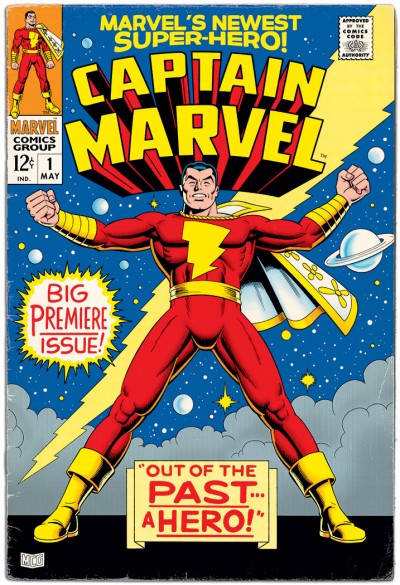
Captain Marvel is #1!

Captain Marvel #1 FakeOkay, I real­ize I’ve done a lot of Mar­vel Fam­i­ly-cen­tric posts here late­ly. I hon­est­ly intend­ed that I was going to move away from that this time. But I could­n’t help myself!

My orig­i­nal plan here was to do a straight recreation/reinterpretation of the cov­er of  Cap­tain Mar­vel #1, pub­lished by Mar­vel Comics in 1968 and fea­tur­ing their alien ver­sion of Cap­tain Mar­vel (Kree, to be spe­cif­ic). It was to have been kind of a lit­tle joke, that it would be a Cap­tain Mar­vel, but not the same Cap­tain Mar­vel I usu­al­ly draw. Plus, I’ve always kind of liked the Kree Cap­tain Mar­vel’s orig­i­nal green and white out­fit for some reason.

But then, as I was look­ing at the cov­er, I remem­bered a con­ver­sa­tion I’d had with FCA Edi­tor P.C. Hamer­linck. For those of us with an inter­est in comics his­to­ry (who did what, who pub­lished what, and when), some­times it’s fun to play a game of “What If?” You take events as they hap­pened, then pro­pose a change. It’s like throw­ing a stone into a stream, and see­ing what rip­ples it makes. In this case, P.C. and I once had a con­ver­sa­tion where he threw out the idea, “What if instead of DC pick­ing up the rights to Faw­cett’s Cap­tain Mar­vel, it had been Mar­vel Comics that had made that call?”

That con­ver­sa­tion sud­den­ly came to mind as I looked at the orig­i­nal ver­sion of this cov­er, and real­ized that the pose of the Kree Cap­tain would­n’t take much to rework it slight­ly and make it work just as well for the orig­i­nal Cap­tain Mar­vel. So I got hooked on the idea. This was the result.

Please bear with me for a lit­tle fan­boy indul­gence here: who do I think would’ve been the like­ly can­di­dates to do this book, if Mar­vel had bought the rights back then? Every­one’s obvi­ous first thought would like­ly be Jack Kir­by. How­ev­er, at that point in time, Kir­by’s con­tri­bu­tions to Mar­vel were mov­ing towards being most­ly just between the cov­ers of Fan­tas­tic Four and Thor. I believe it’s more like­ly that some­one from the sec­ond wave of Mar­vel cre­ators com­ing in at that time would’ve been giv­en this assign­ment. Art­wise, at the moment, I’m think­ing per­haps Bill Everett might’ve been the best choice. He had some of that Mar­vel ener­gy going for him, yet he also still had a cer­tain “car­toony-ness” to his work that I think Cap­tain Mar­vel needs.

The writ­ing side of the equa­tion is a no-brain­er. I’m sure Roy Thomas would’ve argued a very strong case for his being the one to get this assign­ment. And I’m think­ing Stan Lee most like­ly would’ve giv­en in and hand­ed the book to him.

Zita’s Back!

If you’ve checked in on my site from time to time, you may have seen my post­ing about the graph­ic nov­el Zita the Space­girl last year. My last com­ment on the sub­ject then (direct­ed at author Ben Hatke) was “…I hope you have plans for more Zita in the future.” Thank­ful­ly, the future is now!

I’m a lit­tle late men­tion­ing it, but Leg­ends of Zita the Space­girl (book #2 in the series now) came out last month. Based on the first book, Ben set my expec­ta­tions pret­ty high for this new one. And he did not dis­ap­point! Pret­ty much all the things I said last time hold true of this new book too. I don’t want to just repeat myself, but I would like to make some fur­ther obser­va­tions about Ben’s work here. The book also spurred some thoughts about comics in gen­er­al, which fit this discussion.

I’d men­tioned before how much charm Ben Hatke’s art­work has. There’s a nice, organ­ic loose­ness to his approach. He is unapolo­get­i­cal­ly a car­toon­ist (and I don’t under­stand why in some fan quar­ters, “car­toony” is a pejo­ra­tive. Per­son­al­ly, I’ve always grav­i­tat­ed towards artists who are strong styl­ists). I had­n’t made this asso­ci­a­tion pre­vi­ous­ly, but this time out I real­ized his work was remind­ing me a lit­tle bit of the com­ic Mars by Hempel and Wheat­ley, pub­lished back in the ’80s. While I can’t go so far as to pro­claim Hempel and Wheat­ley’s Mars was an influ­ence on Ben, it seems like visu­al­ly he’s com­ing from a sim­i­lar place. Or per­haps they have some influ­ences in com­mon. Whether there’s any con­nec­tion or not, in both cas­es, the visu­al approach allows for a much wider and more imag­i­na­tive range of char­ac­ters and sit­u­a­tions than per­haps a more real­is­tic take would allow.

And the uni­verse Ben has cre­at­ed for Zita is quite imag­i­na­tive! Lots of strange crea­tures and wild con­cepts going on in this book. With­out giv­ing any­thing away, there are a cou­ple of ideas in there that I think would even do Jack Kir­by proud.

Anoth­er thing I was more con­scious of this time is the fact that Ben is not afraid to do whole sequences with­out any dia­logue or cap­tions. He’s will­ing to let his art­work car­ry the whole bur­den of telling the sto­ry at points, through the action, facial expres­sions and pos­es. I think that’s great, and real­ly kind of brave. Doing a book like this (even as writer/artist), I imag­ine there’s a temp­ta­tion to fall back more on the words to car­ry the weight of your sto­ry. While it might be more of a chal­lenge, it can be much more sat­is­fy­ing in some ways if you can get as much as pos­si­ble of the sto­ry across using just your visu­als. The bot­tom line is that comics is a visu­al medi­um. It is quite pos­si­ble to do a com­ic with no words (in fact, it’s been done sev­er­al times over the years). But it’s not pos­si­ble to do a com­ic with­out pictures.

There’s been a lot of debate in recent years about there not being enough comics that are appro­pri­ate for kids. Often the way peo­ple attempt to address that is to do spe­cif­ic “kids’ comics.” In my opin­ion, that’s a risky way to go. The poten­tial pit­fall in that approach is that there can be a temp­ta­tion dumb things down, and talk down to the kids. Kids aren’t stu­pid. If you think back to when you were a kid, you knew it when peo­ple were talk­ing down to you, and I’ll bet you did­n’t like it any more then than you do now. Per­son­al­ly, I believe the bet­ter approach is to attempt to do “all-ages” comics that work on mul­ti­ple lev­els at once. Bring­ing this back on-top­ic, the Zita books are a good exam­ple of that. A younger read­er will appre­ci­ate them on one lev­el, while old­er read­ers will find themes and aspects that res­onate with them on a whole oth­er lev­el. Much like the best chil­dren’s lit­er­a­ture has always done.

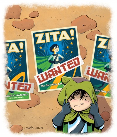
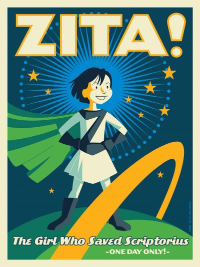
I guess I should talk a lit­tle about the illustration(s) I did to accom­pa­ny this arti­cle (since this site’s sup­posed to be about me draw­ing!). This image is kind of riff­ing off some visu­als and sit­u­a­tions in the book. I don’t want to say too much about the plot and spoil any­thing. But I thought it would be fun to take the poster idea from the book and real­ly do it up, like a full-blown silkscreened poster (inspired by the work of Strongstuff, AKA Tom Whalen).

Any­way, if you like real­ly good all-ages comics, I rec­om­mend you get your hands on this one. If you haven’t already picked up the first vol­ume, Zita the Space­girl, get ’em both!

It’s the Fourth of July!

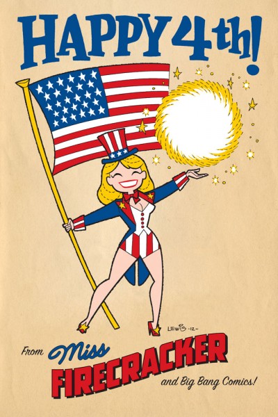
It’s Inde­pen­dence Day today in the U.S. of A.! That usu­al­ly means time off, doing fun things like pic­nics or bar­be­cues with friends, pos­si­bly tak­ing in a fire­works show (depend­ing on where you live), and maybe hope­ful­ly even giv­ing a thought to some of the free­doms we’re priv­i­leged to enjoy in this coun­try, which we can some­times take for granted.

This post is most­ly moti­vat­ed by the fact that real­iz­ing the hol­i­day was com­ing up, I had an image pop into my mind appro­pri­ate for the day, so I thought I’d go for it! As not­ed there, the char­ac­ter is Miss Fire­crack­er from Big Bang Comics, though she’s depict­ed here in a dif­fer­ent style from how she ever appeared in Big Bang.

This is a good oppor­tu­ni­ty to talk about Big Bang Comics a lit­tle bit. Some peo­ple read­ing this may know that I was a con­trib­u­tor to Big Bang through its most active years. Though I can’t claim to have been there from the absolute very begin­ning, I did get in pret­ty ear­ly on. The char­ac­ter I had the most involve­ment in shap­ing would’ve been the Badge. But thanks to Big Bang hon­chos Gary Carl­son and Chris Eck­er, I got the chance to get my hands into a whole lot more than that.

Not only did I get to draw a num­ber of oth­er Big Bang char­ac­ters (par­tic­u­lar­ly on fake com­ic cov­ers as seen in “The Big Bang His­to­ry of Comics” issues of Big Bang Comics), I got to design sev­er­al oth­er char­ac­ters, cre­ate logos, even kib­itz on some sto­ry­lines, ink and col­or. The way I looked at Big Bang, it was sort of  “comics his­to­ry through a fun­house mir­ror.” You got to cre­ate things that felt famil­iar, yet new at the same time. It was a real­ly fun ride, guys! Thanks much!

I’ve got anoth­er post already in the pipeline that I hope to be able to pull the trig­ger on soon, but that’s it for this one. Have a great 4th, everyone!

The 50th

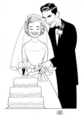
This is not exact­ly some­thing brand new, but done a few years back for the invites to my Mom and Dad’s 50th Anniver­sary cel­e­bra­tion. I thought maybe a few more peo­ple than just those who saw it back then might enjoy it.

I don’t nor­mal­ly do a lot of car­i­ca­ture. So I fig­ured as long as I was going to attempt it, I might take my cues from one of the best: Al Hirschfeld. It was def­i­nite­ly a chal­lenge to work this way, but I was hap­py with the result. Oh; don’t strain your eyes look­ing for “Ninas,” because there aren’t any!

Not much more to say about this right now, except; Mom, Dad, I love you very much.

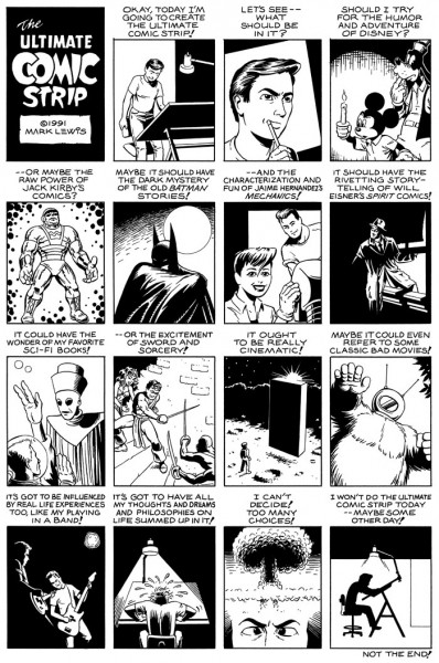
The Ultimate Comic Strip

I see this mon­th’s zip­ping by, and as busy as I am, I’m just not at a point where I can post any­thing cur­rent and new yet. So instead of that, here’s some­thing old that might be of interest.

This was done while I attend­ed Art Cen­ter in Pasade­na, back in the ear­ly ’90s. Some of the specifics are lost to time now, but I had an illus­tra­tion class at the time, and for our final, we were to do a self-por­trait. The para­me­ters of the assign­ment and how you could inter­pret it were wide open.

I was­n’t sure what to do, how to approach it, and was wrack­ing my brains. Until one of my friends in the class made the off­hand com­ment, “Oh, you’ll just do yours as a com­ic, right?” It was one of those fore­head-slap­ping moments. I was too close to it to see the solu­tion myself, though it was the obvi­ous way to go in the eyes of my friends in the class who knew my inter­est in comics.

And this was the result. Though I think I draw a bit bet­ter now (I did this twen­ty years ago now?! Yeesh!), I still kind of like this. I think most artists can relate, at some point or anoth­er. Any­way, enjoy! I hope to have some new cur­rent work to post next time.

The Man from Planet X

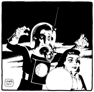
A con­fes­sion: I like a lot of old movies. And I have a bit of a soft spot for many of the old sci-fi or mon­ster movies. Recent­ly, I had the chance to watch The Man from Plan­et X (cour­tesy of TCM and my DVR), which I’d nev­er seen before. I had only ever run across men­tions of it as a kid from time to time in library books on sci-fi films. Turned out the film was decent, but noth­ing real­ly all that special…except for one thing: the title char­ac­ter. There was some­thing real­ly strik­ing about the alien design for this film.

When you boil it down, I sup­pose there’s not all that much to it. It’s just a nice bit of sculp­tur­al design for the head and hel­met assem­bly. The thing that prob­a­bly sells the alien and makes him mem­o­rable is the built-in up-light­ing they includ­ed in his hel­met, so he car­ried “dra­ma” with him wher­ev­er he went. Oth­ers’ mileage may vary, but the visu­al was strik­ing enough to lodge in my head at least. It’s a good exam­ple of mak­ing very effec­tive use of what was prob­a­bly a lim­it­ed pro­duc­tion budget.

So here’s my shot at the Man from Plan­et X. I saw it as a chance to play around with some dra­mat­ic light­ing and black-spot­ting. It’s a bit of an exper­i­ment, in that I tried to ink it the way Mil­ton Can­iff and Noel Sick­les used to do: bang­ing in all my blacks first with a brush (scary!), then going back in with pen where it still need­ed it. I do like the whole “lost edges” effect that work­ing this way helps to achieve.

This scene did­n’t exact­ly hap­pen this way in the movie, but so what? It’s my blog, and I can draw what I want! And any­way, it seems a rea­son­ably appro­pri­ate image for Halloween.

One last thing here, a bit of triv­ia: the female lead in the film was Mar­garet Field, the moth­er of Sal­ly Field. I don’t know if any­thing like that would ever come up in a game of Triv­ial Pur­suit or not, but if so, don’t say I nev­er did any­thing for you!

UPDATE: FCA Edi­tor P.C. Hamer­linck made me aware of the fact Faw­cett had actu­al­ly pub­lished a com­ic adapt­ing this movie, with art by Kurt Schaf­fen­berg­er, and that you can check out a b/w UK reprint of it here. Inter­est­ing to see Schaf­fen­berg­er take his art in a dif­fer­ent direc­tion from what we’re used to see­ing him do, and to note that there are places in the com­ic where they diverged from the movie! Thanks Paul!

Obey the Bear!

Okay, I prob­a­bly need to explain about this one. To do that, I need to get into a lit­tle of the “behind the scenes” work­ings of WordPress.

A few months back, I decid­ed it would be a good thing to have some kind of a hit counter for my site, run­ning in the back­ground. The beau­ty of Word­Press is that there’s like­ly a Plu­g­in you can install for just about any pur­pose. I want­ed a Plu­g­in that would give me an idea of how many hits my site was get­ting, where peo­ple were com­ing from, what they were look­ing at, etc. It’s been fas­ci­nat­ing to watch this info accu­mu­late as time goes by. In some cas­es, it’s been sur­pris­ing to see what posts and images get more hits than oth­ers. And one thing that’s turned up is that the Care Bears images on my site have been pret­ty popular.

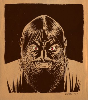
So, I’m no dum­my; it made sense to per­haps gen­er­ate one more. I revis­it­ed a Post-it draw­ing I did as a goof back when I was work­ing on “Care Bears,” pol­ish­ing it up in Adobe Illus­tra­tor. Some of you will rec­og­nize this as a play on Shep­ard Fairey’s OBEY Giant image, fea­tur­ing the late wrestler André the Giant done up pro­pa­gan­da poster style. Per­haps it’s a bit of an oblique gag to play off that icon­ic imagery with a Care Bear, but have you ever had one of those visu­al ideas that get stuck in your head and won’t go away unless you get them out on paper? You oth­er artists out there know what I’m talk­ing about.

So here you are, for what­ev­er it’s worth. And for those who won­der which Bear this is, I fig­ure it’s prob­a­bly Grumpy. Because he’s cool like that.

Missile Mouse

I men­tioned ear­li­er that from time to time, I intend to do posts of “inspi­ra­tional stuff.” Basi­cal­ly, we’re talk­ing comics I’ve come across that I think are real­ly good, and kind of inspire you to draw. So here’s another.

If you’ve ever checked out the list of artists over in my side­bar, per­haps you’ve looked at the work of Jake Park­er. He’s one of those artists that seem to strad­dle mul­ti­ple media, includ­ing comics and ani­ma­tion. His stuff is very imag­i­na­tive, appeal­ing and a lot of fun to look at.

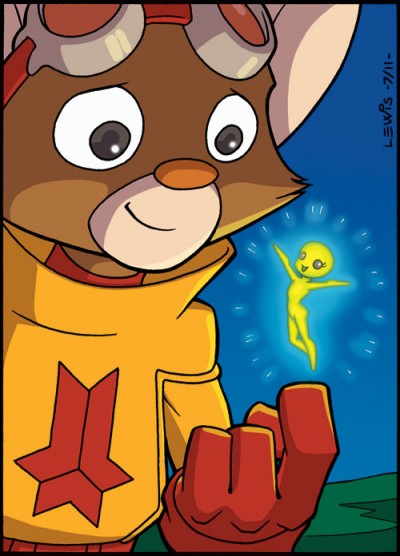
One of Jake’s cre­ations, Mis­sile Mouse, has now been fea­tured in two books: The Star Crush­er and Res­cue on Tanki­um 3 (Actu­al­ly, Mis­sile Mouse has appeared in three books, if you want to count Flight Explor­er Vol. 1) . You can buy them here. Mis­sile Mouse is a tough lit­tle char­ac­ter who usu­al­ly has to face down char­ac­ters and sit­u­a­tions that are much big­ger than him, but he nev­er backs down. He always does what he has to do.

In my opin­ion, one of the best aspects of these books is the way every­thing’s so clear­ly been thought out in great detail. Jake is a “world-builder.” He plain­ly puts a lot of thought into design­ing even the tini­est prop. In the back of Res­cue on Tanki­um 3 is a sec­tion where among oth­er things, he goes into great detail about all of Mis­sile Mouse’s gear, how it’s assem­bled, what prin­ci­ples it works on. The lev­el of back detail and thought put into these books makes for a fun and rich read­ing expe­ri­ence. They’re good all-ages reads, and worth check­ing out.

Since it’s my art­blog, of course I’ve got to put up some art. So up top is my Mis­sile Mouse fan art piece. As usu­al, my ani­ma­tion train­ing seems to have com­pelled me to try to get as close to on-mod­el as I can.  I did some exper­i­ment­ing with the col­or meth­ods, because if I can’t do that here, where can I? It struck me that most­ly we’ve seen Mis­sile Mouse inter­act­ing with beings who are a good deal big­ger than he is (play­ing the “David and Goliath” card very well), so I thought it might be fun to see him inter­act with some­thing much small­er than himself.

Mis­sile Mouse is ™ and © Jake Parker.

UPDATE: If you look in the Com­ments below, you’ll see that Jake has seen this post. He appar­ent­ly liked my draw­ing well enough to post it on his own site here. I’m very flat­tered! Thanks, Jake!

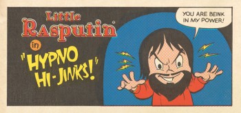
Rasputin

Cour­tesy of Turn­er Clas­sic Movies and my DVR (what a great inven­tion!), I had the chance not long ago to check out a cou­ple of old movies I’d nev­er seen before, both deal­ing with the infa­mous Rasputin. TCM played both films back to back when they aired. First on the agen­da was Rasputin and the Empress from 1932, with Lionel Bar­ry­more play­ing Rasputin (and doing a good and creepy job of it, too!). They fol­lowed that up with Christo­pher Lee play­ing the role in the 1966 Ham­mer Stu­dios film Rasputin: The Mad Monk. Lee, as usu­al, did a great job. He’s always a lot of fun to watch.

I don’t pre­tend to be any kind of an expert on the his­tor­i­cal Rasputin, so I can’t com­ment on the accu­ra­cy of either of these films. But they were fas­ci­nat­ing to watch. And obvi­ous­ly I’m not the only one who finds the char­ac­ter intrigu­ing; look­ing on IMDB, the first time some­one played Rasputin on film was back in 1917, only one year after his death. And he keeps crop­ping up as a char­ac­ter in films, to this day!

With­out try­ing for a like­ness of either Bar­ry­more or Lee (or the real Rasputin), I thought it might be fun to take a shot at a char­ac­ter draw­ing. I only meant to do one draw­ing, but then I was­n’t entire­ly sure about how it was com­ing out, so I kept going, envi­sion­ing dif­fer­ent approach­es. There’s a whole bunch of exper­i­men­ta­tion going on here, with styles, tools, col­or­ing etc. Instead of mak­ing myself crazy try­ing to decide which way to go, I thought I’d just go ahead and run them all up the flag­pole, let the chips fall where they may. And that’s prob­a­bly more than enough Rasputin for any­body in one dose!

I was a one-man meme!

Tunes!

Okay, I know this is sup­posed to be my portfolio/artblog. But here’s the thing: any­one who knows me knows that I also love music. If you come up to my desk while I’m work­ing at some stu­dio, odds are I’ve got tunes play­ing in the back­ground. My iTunes is loaded with almost 70 GB of music. In addi­tion to my art, it’s anoth­er big part of who I am.

So to that end, I thought I’d add some music links over in the side­bar. These are far from being the only bands and artists I like! They’re only a small hand­ful of musi­cians who would leave a notice­able absence for me if they were removed from my iTunes and CD libraries. If you haven’t heard some of these per­form­ers, do your­self a favor and put some­thing new in your ears! Maybe I’ll add to the list from time to time.

And of course, since this is sup­posed to be an art­blog, I ough­ta post some art to go with this announce­ment, right? The illus­tra­tion up top was part of an assign­ment I did for one of my class­es back when I was attend­ing Art Cen­ter, to illus­trate and design a CD pack­age. I had no Pho­to­shop skills back then, so it’s all pen & ink with water­col­ors. Today, I’d prob­a­bly still draw some­thing like this con­ven­tion­al­ly, but I’d use Pho­to­shop for the color.