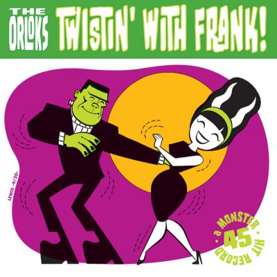
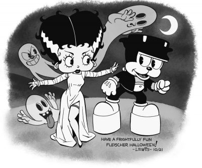
 Long time visitors to this site may recall that come Halloween, I have something of a loose tradition of doing a Frankenstein drawing to celebrate.
This year, I was kind of wracking my brain for inspiration, looking at various old comics covers, movie stills and things, and none of the ideas I was coming up with were really grabbing me. Then I stumbled across a two hour block of Fleischer Studios cartoons airing on TCM, done by way of celebrating the studio’s 100th anniversary. Watching one of the Betty Boop cartoons, an idea finally struck me that I had to do. It grew from there. This is the result.
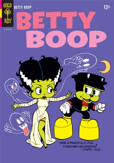 Originally, I was just going to do the black and white image, but while working on it, the thought struck me that this could also work as a comic book cover. Some of you may be wondering: why make this a Gold Key cover particularly? Because back in the Silver Age, if you wanted to read a comic featuring a cartoon character, you were going to end up buying a Gold Key comic. They had the licenses to pretty much all of the characters. Though (so far as I’ve been able to determine) they never actually did a Betty Boop comic, if anyone had published one back then, Gold Key would’ve been the publisher.
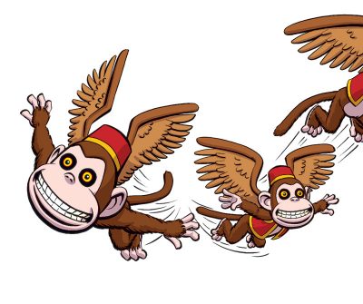
I’ve always had a general soft spot for the “ball and rubber hose” school of animation. And more specifically, I’ve always gotten a kick out of the Fleischer Studios cartoons, because they have their own personality that’s nothing like Disney’s, Warner Bros., or anyone else’s. The Fleischer cartoons are chaotic in a fun way, where almost anything can happen. Inanimate objects come to life at a moment’s notice.
If you don’t know about the Fleischer Studios cartoons, you really should do something to rectify that. You can probably find a number of them on YouTube. They’re a real treat (no trick!).
“Dad joke” free of charge. Happy Halloween!