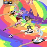
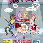
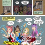
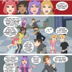
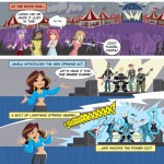
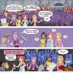
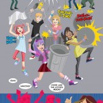
Author Archives: Mark

Hydee Hits the Funny Pages

I’ve just been giv­en the go-ahead to final­ly spill the beans about a project I worked on ear­li­er this year. It’s what I was talk­ing about in this post. I got to help with the art for a short Hydee and the Hy Tops com­ic, which is to be pro­duced as a give­away. You get to see it all above, for the first time any­where, probably.

Once again, I was giv­en the oppor­tu­ni­ty to col­lab­o­rate with the love­ly and tal­ent­ed Jim Sten­strum (who is try­ing to get togeth­er a site of his own. When that hap­pens, it will be in my blogroll). Jim pen­cilled these pages, while I did all the col­or­ing and let­ter­ing. There were no pen­cils harmed in the mak­ing of this com­ic, as there was no ink­ing in the usu­al sense. The art style has no con­tain­ment lines; just flat areas of col­or, with occa­sion­al bits of col­ored linework only where need­ed. The look of the com­ic was based on what we’d done for the flash-ani­mat­ed Hydee fea­ture, which I don’t think has been released just yet (Though you can see some of the work I did for that here in my Gal­leries).

I enjoyed work­ing with the Hydee char­ac­ters, both in the com­ic and on the fea­ture. The sce­nario was kind of “Josie and the Pussy­cats by way of the Go-Gos, but if they were being formed now for the Dis­ney Chan­nel,” if that descrip­tion makes any sense. And the client was a dream to work with (which, as any­one in ani­ma­tion can tell you, is not some­thing you can expect to hap­pen all that often). I wish all clients were that good to work with! If the oppor­tu­ni­ty pre­sent­ed itself to work with the prop­er­ty again, under the same kind of cir­cum­stances, I would not hes­i­tate to do it. It was fun.

The Man from Planet X

A con­fes­sion: I like a lot of old movies. And I have a bit of a soft spot for many of the old sci-fi or mon­ster movies. Recent­ly, I had the chance to watch The Man from Plan­et X (cour­tesy of TCM and my DVR), which I’d nev­er seen before. I had only ever run across men­tions of it as a kid from time to time in library books on sci-fi films. Turned out the film was decent, but noth­ing real­ly all that special…except for one thing: the title char­ac­ter. There was some­thing real­ly strik­ing about the alien design for this film.

When you boil it down, I sup­pose there’s not all that much to it. It’s just a nice bit of sculp­tur­al design for the head and hel­met assem­bly. The thing that prob­a­bly sells the alien and makes him mem­o­rable is the built-in up-light­ing they includ­ed in his hel­met, so he car­ried “dra­ma” with him wher­ev­er he went. Oth­ers’ mileage may vary, but the visu­al was strik­ing enough to lodge in my head at least. It’s a good exam­ple of mak­ing very effec­tive use of what was prob­a­bly a lim­it­ed pro­duc­tion budget.

So here’s my shot at the Man from Plan­et X. I saw it as a chance to play around with some dra­mat­ic light­ing and black-spot­ting. It’s a bit of an exper­i­ment, in that I tried to ink it the way Mil­ton Can­iff and Noel Sick­les used to do: bang­ing in all my blacks first with a brush (scary!), then going back in with pen where it still need­ed it. I do like the whole “lost edges” effect that work­ing this way helps to achieve.

This scene did­n’t exact­ly hap­pen this way in the movie, but so what? It’s my blog, and I can draw what I want! And any­way, it seems a rea­son­ably appro­pri­ate image for Halloween.

One last thing here, a bit of triv­ia: the female lead in the film was Mar­garet Field, the moth­er of Sal­ly Field. I don’t know if any­thing like that would ever come up in a game of Triv­ial Pur­suit or not, but if so, don’t say I nev­er did any­thing for you!

UPDATE: FCA Edi­tor P.C. Hamer­linck made me aware of the fact Faw­cett had actu­al­ly pub­lished a com­ic adapt­ing this movie, with art by Kurt Schaf­fen­berg­er, and that you can check out a b/w UK reprint of it here. Inter­est­ing to see Schaf­fen­berg­er take his art in a dif­fer­ent direc­tion from what we’re used to see­ing him do, and to note that there are places in the com­ic where they diverged from the movie! Thanks Paul!

She’s a Sensation!

Though DC’s big reboot has already been sprung on us, I had one more image in that poster style that I had to try. Might as well com­plete the tri­fec­ta, right?

So this time out, it’s Won­der Woman. If you’ve read my pre­vi­ous posts on these gold­en age char­ac­ters, I real­ized I kind of uncon­scious­ly set up a pro­gres­sion; I men­tioned that I liked Super­man, but lat­er con­fessed I liked Bat­man a lit­tle more. So you might be expect­ing me this time out to say I liked Won­der Woman the best. But you’d be wrong.

Sor­ry to say, I real­ly was­n’t all that into Won­der Woman as a kid. I appre­ci­ate the strip much more now as an adult than I did back then, for its his­toric sig­nif­i­cance as well as some of the aspects that are unique to it (the fan­ta­sy ele­ments, the mytho­log­i­cal, etc.). Per­haps the gold­en age art (by H.G. Peter) looked a lit­tle heavy-hand­ed and crude to me in some ways as a kid. Look­ing at it now, I have more of an appre­ci­a­tion for it (It feels at times like a sort of car­toon ver­sion of an Albrecht Dür­er engraving).

Won­der Woman is an inter­est­ing con­cept that seems to be a tough one for writ­ers and artists to get a han­dle on. And even if they man­age, it seems hard to get a han­dle on it such that it will engage peo­ple and get them to buy the book (Which is prob­a­bly the more impor­tant point). Many approach­es have been tried with vary­ing degrees of suc­cess, and some don’t get tried at all. But Marston and Peter must’ve had a han­dle on some­thing when they cre­at­ed her. She’s sur­vived this long and man­aged to become part of our col­lec­tive pop cul­ture men­tal land­scape, rec­og­niz­able even to non-comics read­ers. I think that’s worth a lit­tle salute here.

A con­fes­sion: this poster is a loose homage (which I acknowl­edged in how I signed it) to an orig­i­nal poster by Lud­wig Hohlwein. In study­ing his work online, I stum­bled across one poster that just seemed a nat­ur­al to adapt for a Won­der Woman image. It all but cried out for it. So that is what I did!

Obey the Bear!

Okay, I prob­a­bly need to explain about this one. To do that, I need to get into a lit­tle of the “behind the scenes” work­ings of WordPress.

A few months back, I decid­ed it would be a good thing to have some kind of a hit counter for my site, run­ning in the back­ground. The beau­ty of Word­Press is that there’s like­ly a Plu­g­in you can install for just about any pur­pose. I want­ed a Plu­g­in that would give me an idea of how many hits my site was get­ting, where peo­ple were com­ing from, what they were look­ing at, etc. It’s been fas­ci­nat­ing to watch this info accu­mu­late as time goes by. In some cas­es, it’s been sur­pris­ing to see what posts and images get more hits than oth­ers. And one thing that’s turned up is that the Care Bears images on my site have been pret­ty popular.

So, I’m no dum­my; it made sense to per­haps gen­er­ate one more. I revis­it­ed a Post-it draw­ing I did as a goof back when I was work­ing on “Care Bears,” pol­ish­ing it up in Adobe Illus­tra­tor. Some of you will rec­og­nize this as a play on Shep­ard Fairey’s OBEY Giant image, fea­tur­ing the late wrestler André the Giant done up pro­pa­gan­da poster style. Per­haps it’s a bit of an oblique gag to play off that icon­ic imagery with a Care Bear, but have you ever had one of those visu­al ideas that get stuck in your head and won’t go away unless you get them out on paper? You oth­er artists out there know what I’m talk­ing about.

So here you are, for what­ev­er it’s worth. And for those who won­der which Bear this is, I fig­ure it’s prob­a­bly Grumpy. Because he’s cool like that.

I Shall Become a BAT!”

The clock is count­ing down to DC Comics’ big reboot, and it’s still got me think­ing back on the orig­i­nals. I thought I should get at least one more post in here, before it hap­pens. Super­man was look­ing a lit­tle lonely.

Like I said in my pre­vi­ous post, I’ve always had an attrac­tion to the ear­ly gold­en age ver­sions of some of these char­ac­ters, despite the occa­sion­al rugged­ness in exe­cu­tion. There was a pri­mal kind of ener­gy there that per­haps got lost a lit­tle bit along the way, as the artists and writ­ers got bet­ter at their craft, and began to for­mu­late the rules for how you were sup­posed to do this sort of thing.

Last time, I copped to hav­ing an affec­tion for the gold­en age Super­man. But if pushed, I’d have to admit that I prob­a­bly liked the gold­en age Bat­man just a lit­tle bit more. Those ear­ly strips just dripped with mood: dark shad­ows, misty nights with almost always an enor­mous full moon, and plen­ty of strange char­ac­ters for the Bat­man to go up against. When I first began to encounter this stuff in those DC 100-Page Super-Spec­tac­u­lars as a kid, I had no prob­lem at all under­stand­ing why kids encoun­ter­ing these sto­ries for the first time on news­stands back in the gold­en age were attract­ed to it. This stuff cap­tured your imagination.

In the same vein as the Super­man poster, here’s one fea­tur­ing Bat­man in that ear­ly 20th Cen­tu­ry Poster Style. This time out, I did my ver­sion of a clas­sic pose that Kane used a num­ber of times in those ear­ly issues. A very big “Thank You” to Bill Fin­ger, Bob Kane, Jer­ry Robin­son, George Rous­sos, and all the rest of Kane’s “ghosts” over the years who made Bat­man what he was!

Look! Up in the Sky!”

If you fol­low comics news at all, you’ve prob­a­bly heard there’s this big reboot that DC Comics is doing in Sep­tem­ber. They’re start­ing all their books over from #1, redesign­ing all the char­ac­ters and redo­ing their ori­gins. You can’t assume now that you know any­thing for sure about who they are, their moti­va­tions or the over­all scenario.

I’m not going to get into com­men­tary on that here (there’s been plen­ty of that already in oth­er places online). But I’ll admit the idea of the retire­ment of the orig­i­nal char­ac­ters has me think­ing back on them a bit wist­ful­ly. Though tech­ni­cal­ly a child of comics’ sil­ver and bronze ages, I’ve always had a fas­ci­na­tion with the gold­en age era too. Despite the fact that work was often a bit crude in com­par­i­son to what came lat­er, there was a cer­tain life and raw ener­gy to those ear­ly incar­na­tions of the characters.

It’s a lot eas­i­er to lay hands on gold­en age comics sto­ries now. Back when I was a kid, most­ly you just got to read about them (in books like Ster­anko’s His­to­ry of Comics, or All in Col­or for a Dime). If you could lay hands on one of DC’s 100-Page Super-Spec­tac­u­lars though, you knew you were in for a rare treat.

Like I say, I’ve long had a soft spot for these ear­ly, pri­mal ver­sions of char­ac­ters like Super­man (the proof is at left; a scan of a fake gold­en age cov­er I did when I was about 12 or 13). And with the DC reboot com­ing, I thought I’d revis­it the orig­i­nal Super­man once again. The new image up top could’ve gone in sev­er­al dif­fer­ent direc­tions, but what I wound up hon­ing in on is a Shus­ter-esque ver­sion, posed more for­mal­ly. It’s been tak­en in the direc­tion of vin­tage poster art from an even ear­li­er era. Because that seemed like a fun idea at the time.

Just my salute to the gold­en age in gen­er­al, and the orig­i­nal Super­man in par­tic­u­lar. Thanks very much, Mr. Siegel and Mr. Shuster!

UPDATE: I recent­ly dis­cov­ered online these neat Super­man pages, drawn by Stew­art Immo­nen some years back. Done in the style of Win­sor McCay’s “Lit­tle Nemo,” they’re not entire­ly unre­lat­ed to what I’m try­ing to do here with this poster. I thought these were real­ly neat, and worth shar­ing. It’s fun­ny how well Super­man works in a style like this!

Missile Mouse

I men­tioned ear­li­er that from time to time, I intend to do posts of “inspi­ra­tional stuff.” Basi­cal­ly, we’re talk­ing comics I’ve come across that I think are real­ly good, and kind of inspire you to draw. So here’s another.

If you’ve ever checked out the list of artists over in my side­bar, per­haps you’ve looked at the work of Jake Park­er. He’s one of those artists that seem to strad­dle mul­ti­ple media, includ­ing comics and ani­ma­tion. His stuff is very imag­i­na­tive, appeal­ing and a lot of fun to look at.

One of Jake’s cre­ations, Mis­sile Mouse, has now been fea­tured in two books: The Star Crush­er and Res­cue on Tanki­um 3 (Actu­al­ly, Mis­sile Mouse has appeared in three books, if you want to count Flight Explor­er Vol. 1) . You can buy them here. Mis­sile Mouse is a tough lit­tle char­ac­ter who usu­al­ly has to face down char­ac­ters and sit­u­a­tions that are much big­ger than him, but he nev­er backs down. He always does what he has to do.

In my opin­ion, one of the best aspects of these books is the way every­thing’s so clear­ly been thought out in great detail. Jake is a “world-builder.” He plain­ly puts a lot of thought into design­ing even the tini­est prop. In the back of Res­cue on Tanki­um 3 is a sec­tion where among oth­er things, he goes into great detail about all of Mis­sile Mouse’s gear, how it’s assem­bled, what prin­ci­ples it works on. The lev­el of back detail and thought put into these books makes for a fun and rich read­ing expe­ri­ence. They’re good all-ages reads, and worth check­ing out.

Since it’s my art­blog, of course I’ve got to put up some art. So up top is my Mis­sile Mouse fan art piece. As usu­al, my ani­ma­tion train­ing seems to have com­pelled me to try to get as close to on-mod­el as I can.  I did some exper­i­ment­ing with the col­or meth­ods, because if I can’t do that here, where can I? It struck me that most­ly we’ve seen Mis­sile Mouse inter­act­ing with beings who are a good deal big­ger than he is (play­ing the “David and Goliath” card very well), so I thought it might be fun to see him inter­act with some­thing much small­er than himself.

Mis­sile Mouse is ™ and © Jake Parker.

UPDATE: If you look in the Com­ments below, you’ll see that Jake has seen this post. He appar­ent­ly liked my draw­ing well enough to post it on his own site here. I’m very flat­tered! Thanks, Jake!

Five Color Comics

So my local com­ic shop, House of Secrets (Hi Paul, Erik and Amy!) also occa­sion­al­ly pub­lish­es spe­cial projects of their own, under the name Art of Fic­tion. One of them is a title they call Five Col­or Comics. The inter­est­ing thing about it is that they have each pan­el of the sto­ries drawn by a dif­fer­ent artist. Bit of an exer­cise in herd­ing cats for them some­times, I’m sure, but the results are interesting.

I con­tributed to vol­ume one, and they recent­ly pub­lished vol­ume two. Which I was also invit­ed to con­tribute to. You can see my pan­el con­tri­bu­tion here, sans cap­tions. No “Pho­to­shop­pery” going on; it was done the old-school way, direct­ly on paper with pen, ink and col­ored pen­cils. In con­text with the oth­er pan­els, it’s inter­est­ing to see how there still man­ages to be a cer­tain over­all cohe­sive­ness to the sto­ry, despite the fact we all have such dif­fer­ent styles.

Rasputin

Cour­tesy of Turn­er Clas­sic Movies and my DVR (what a great inven­tion!), I had the chance not long ago to check out a cou­ple of old movies I’d nev­er seen before, both deal­ing with the infa­mous Rasputin. TCM played both films back to back when they aired. First on the agen­da was Rasputin and the Empress from 1932, with Lionel Bar­ry­more play­ing Rasputin (and doing a good and creepy job of it, too!). They fol­lowed that up with Christo­pher Lee play­ing the role in the 1966 Ham­mer Stu­dios film Rasputin: The Mad Monk. Lee, as usu­al, did a great job. He’s always a lot of fun to watch.

I don’t pre­tend to be any kind of an expert on the his­tor­i­cal Rasputin, so I can’t com­ment on the accu­ra­cy of either of these films. But they were fas­ci­nat­ing to watch. And obvi­ous­ly I’m not the only one who finds the char­ac­ter intrigu­ing; look­ing on IMDB, the first time some­one played Rasputin on film was back in 1917, only one year after his death. And he keeps crop­ping up as a char­ac­ter in films, to this day!

With­out try­ing for a like­ness of either Bar­ry­more or Lee (or the real Rasputin), I thought it might be fun to take a shot at a char­ac­ter draw­ing. I only meant to do one draw­ing, but then I was­n’t entire­ly sure about how it was com­ing out, so I kept going, envi­sion­ing dif­fer­ent approach­es. There’s a whole bunch of exper­i­men­ta­tion going on here, with styles, tools, col­or­ing etc. Instead of mak­ing myself crazy try­ing to decide which way to go, I thought I’d just go ahead and run them all up the flag­pole, let the chips fall where they may. And that’s prob­a­bly more than enough Rasputin for any­body in one dose!

I was a one-man meme!

Tunes!

Okay, I know this is sup­posed to be my portfolio/artblog. But here’s the thing: any­one who knows me knows that I also love music. If you come up to my desk while I’m work­ing at some stu­dio, odds are I’ve got tunes play­ing in the back­ground. My iTunes is loaded with almost 70 GB of music. In addi­tion to my art, it’s anoth­er big part of who I am.

So to that end, I thought I’d add some music links over in the side­bar. These are far from being the only bands and artists I like! They’re only a small hand­ful of musi­cians who would leave a notice­able absence for me if they were removed from my iTunes and CD libraries. If you haven’t heard some of these per­form­ers, do your­self a favor and put some­thing new in your ears! Maybe I’ll add to the list from time to time.

And of course, since this is sup­posed to be an art­blog, I ough­ta post some art to go with this announce­ment, right? The illus­tra­tion up top was part of an assign­ment I did for one of my class­es back when I was attend­ing Art Cen­ter, to illus­trate and design a CD pack­age. I had no Pho­to­shop skills back then, so it’s all pen & ink with water­col­ors. Today, I’d prob­a­bly still draw some­thing like this con­ven­tion­al­ly, but I’d use Pho­to­shop for the color.