Category Archives: Comics

Work that’s either done specif­i­cal­ly for comics, or is comic-related.

Before “Before Watchmen”

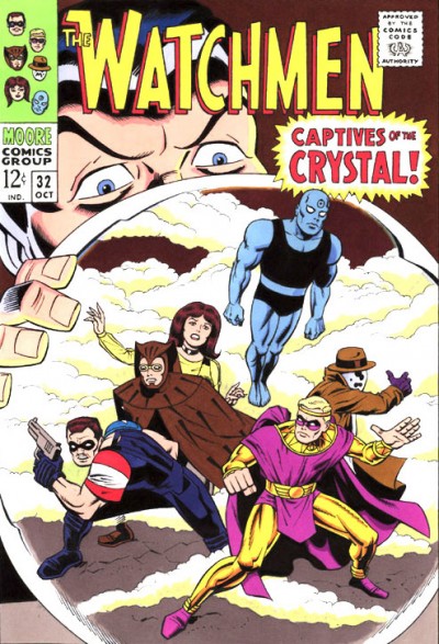
The image I’m post­ing this time is not a new one (it’s already over in the Gal­leries side of my site), but I’ve had some friends make the case that with DC Comics doing all their “Before Watch­men” books right now, it’s a good time to call atten­tion to it anew here on the front page.

There’s a sto­ry behind this piece. A friend of mine in the ani­ma­tion field, Lance Falk, has these sketch­books he pass­es around. They have art by some amaz­ing artists. Chances are if you can think of some big name artist, Lance very like­ly has art by him or her in one of his books. Way back when we were work­ing on “The Real Adven­tures of Jon­ny Quest” togeth­er, Lance asked if I’d be will­ing to do a sketch for his then-cur­rent book. It’s both huge­ly flat­ter­ing and daunt­ing, once you see the lev­el of work oth­ers have done.

Lance sug­gest­ed he might like to see the Watch­men done as if Kir­by had drawn them. I wound up mak­ing a whole cov­er pro­duc­tion out of it, as if it were done in the mid-’60s. Lance was very hap­py with the end result, and I was huge­ly relieved that it was well-received.

Fast for­ward some months lat­er (maybe even a year), and I find out that this sketch­book had been cir­cu­lat­ing fur­ther. It had crossed orig­i­nal Watch­men artist and co-cre­ator Dave Gib­bons’ path in Lon­don. When I first heard he’d seen the book with my draw­ing in it, I must admit I was tak­en aback. But Lance assured me that Mr. Gib­bons actu­al­ly got a big kick out of what I’d done. Once again, I was huge­ly relieved.

Fast for­ward to more recent times, and the pub­li­ca­tion of Mr. Gib­bons’ book, Watch­ing the Watch­men, which com­piled all kinds of back­ground mate­r­i­al on that piv­otal work. He appar­ent­ly liked this Kir­by Watch­men cov­er well enough, he asked me if I’d mind his includ­ing it in the book. What do you think I said? 🙂

Thanks much, Lance and Mr. Gibbons!

The Original Black Cat

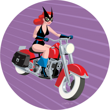
This time out, for no spe­cial rea­son, here is the orig­i­nal Black Cat. I’ve kind of had a soft spot for Har­vey Comics’ ver­sion of the Black Cat from the gold­en age for a while now.

If you’re not famil­iar with the char­ac­ter, behind the Black Cat’s mask in the comics was actress Lin­da Turn­er. She’d start­ed out her career orig­i­nal­ly as a stunt­woman, but had suc­cess­ful­ly tran­si­tioned into becom­ing a lead actress. The var­i­ous skills she’d picked up dur­ing her stunt­woman career enabled her to fight crimes and solve mys­ter­ies incog­ni­to as the Black Cat. The ’40s Hol­ly­wood milieu gave her sto­ries a lit­tle dif­fer­ent feel from oth­er, more typ­i­cal­ly NYC-fla­vored super­hero comics.

Sev­er­al artists drew her sto­ries, but the artist most asso­ci­at­ed with the char­ac­ter would have to be Lee Elias. Elias was clear­ly a Can­iff dis­ci­ple, and he did that style very well. He gave his hero­ine (and the strip in gen­er­al) a real charm and appeal.

Obvi­ous­ly I did­n’t both­er try­ing to mim­ic Elias’ work here. For some rea­son, I envi­sioned this from the begin­ning as using a vec­tor-based Adobe Illus­tra­tor approach. Yet anoth­er exper­i­ment. The beau­ty of this being my site, I can exper­i­ment with all kinds of approaches.

If you’re curi­ous to see some Black Cat comics for your­self, I’m not sure where you could buy them now (with­out pay­ing the usu­al prices for gold­en age comics). I picked up a set of reprints some years back now via Bud Plant (and thanks once again to my bud­dy Eric Wight for alert­ing me to those back then!). Unfor­tu­nate­ly though, I don’t think those are in stock any­more. But, the good news is, you can view just about every issue of Black Cat online, cour­tesy of The Dig­i­tal Com­ic Muse­um (What a great resource!).

And that’s a wrap for this one!

With One Magic Word…

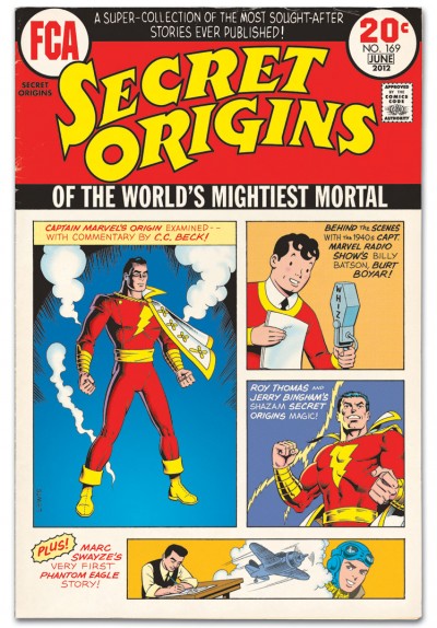
Final­ly I get to show off the last of those two items I teased back in Decem­ber. I gave a fur­ther peek at it here. It’s anoth­er cov­er done for FCA, which appears in the back of Roy Thomas’ Alter Ego mag­a­zine. This one was obvi­ous­ly done up to look like one of those issues of Secret Ori­gins that DC Comics pub­lished in the ear­ly ’70s. I loved those as a kid, because back then they were one of the rare venues where you had an oppor­tu­ni­ty to see any of that gold­en age com­ic material.

I’ve talked in pre­vi­ous posts about how much I liked the gold­en age Super­man and Bat­man. But with­out a doubt, my favorite gold­en age char­ac­ter would have to be Cap­tain Mar­vel. When DC brought him back from pub­lish­ing lim­bo in the ear­ly ’70s, I was already primed for it. I’d read about the “Big Red Cheese” in our local library’s copy of All in Col­or for a Dime, as well as in The Ster­anko His­to­ry of Comics. Some­thing about the visu­al and the idea of the char­ac­ter hooked me, even with­out ever hav­ing seen a sin­gle Cap­tain Mar­vel sto­ry yet.

Not to dis­miss the sto­ries, but a huge part of the appeal of those gold­en age Cap­tain Mar­vel comics for me is the art. As the char­ac­ter’s design­er and main artist, C.C. Beck set the tone there. Most gold­en age com­ic book artists doing super­heroes looked to the news­pa­per adven­ture strips for their inspi­ra­tion. They most­ly tend­ed to fall into one of two schools: it was either the illus­tra­tive real­ism of Fos­ter and Ray­mond, or the more impres­sion­is­tic approach of Sick­les and Can­iff. Instead, Beck looked to the “fun­ny” por­tion of the fun­ny pages for his inspi­ra­tion (like Jack Cole did with Plas­tic Man). The result was a strip that had a look and feel like no oth­er. And of course, the writ­ing played a role in mak­ing that pos­si­ble too.

While the high­er-ups at Faw­cett may have want­ed Bill Park­er and C.C. Beck to just give them a knock­off of Super­man, that was not what they got. They got some­thing bet­ter. Many read­ers back then must have thought so too; at the peak of the char­ac­ter’s pop­u­lar­i­ty, they were pub­lish­ing Cap­tain Mar­vel Adven­tures bi-week­ly and sell­ing 1.3 mil­lion copies of each issue!

I know some­times mod­ern fans have trou­ble with Mr. Tawky Tawny and some of the more whim­si­cal aspects of the strip, but for me, the clas­sic Cap­tain Mar­vel mate­r­i­al is inspi­ra­tional stuff. I wish I could tell you of a rel­a­tive­ly cheap and easy way to lay hands on that work if you haven’t seen it, but it seems hard­er to come by these days.

Doc (“Don’t Call Me ‘Doctor!‘”) Strange

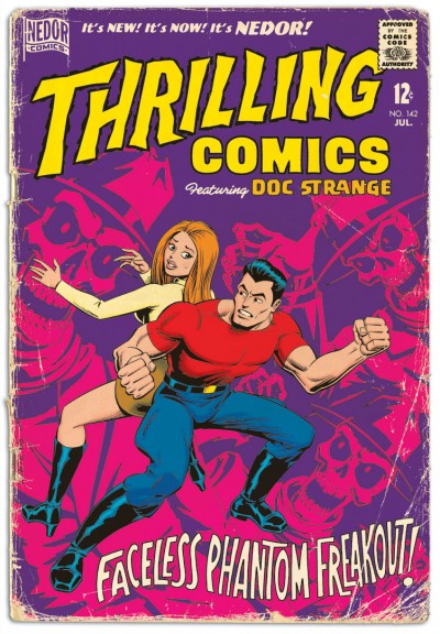
Now that it’s fin­ished, I can show you one of the two items I teased back in Decem­ber. It’s a pin-up of the old Nedor Comics hero Doc Strange, as he might have appeared on the cov­er of an issue of Thrilling Comics in 1965, had Nedor still been pub­lish­ing at that point.

If you’re not famil­iar with the com­pa­ny, Nedor pub­lished (under sev­er­al names) dur­ing the gold­en age. They actu­al­ly had a fair­ly siz­able group of heroes, includ­ing Doc Strange. Nedor ceased pub­lish­ing comics at the end of the gold­en age. Since then, many peo­ple have tak­en a shot at doing some­thing with their old char­ac­ters. AC Comics has made use of them over the years, and so did Alan Moore and Peter Hogan more recent­ly in the Tom Strong spin­off minis­eries, Ter­ra Obscura.

Doc was a scientist/adventurer who invent­ed a serum he named Alo­sun, dis­tilled from “sun atoms.” This serum gave him super­hu­man strength, flight and invul­ner­a­bil­i­ty when he used it.

Enough of the his­to­ry les­son. So why did I do this pin-up/­cov­er? Easy; because I was asked. The one and only Will Meugniot is cur­rent­ly doing a new cre­ator-owned series (in the back of AC Comics’ Fem­Force) that picks up the threads of the Nedor books with the descen­dants of some of the char­ac­ters. It’s called “Agents of N.E.D.O.R.,” and is intend­ed as a peri­od piece tak­ing place in 1965. Will invit­ed sev­er­al artists to con­tribute pin-ups of the orig­i­nal Nedor char­ac­ters, and I was very flat­tered to be asked if I’d like to do so too.

As is typ­i­cal for me, instead of mak­ing things sim­ple on myself, I had to make a whole cov­er out of it. Since Will’s sto­ry takes place in 1965, I thought this should be a cov­er for Thrilling Comics (which starred Doc) also from ’65, as if Nedor had kept on pub­lish­ing all that time. I even did some math to work out the issue num­ber. How’s that for obsessive?

Doc Strange most often went on his adven­tures accom­pa­nied by his young side­kick Mike (who wore an iden­ti­cal out­fit, only with the addi­tion of a green cape for some rea­son). I thought it would be more fun though to show Doc with his girl­friend, Vir­ginia Thomp­son, as she would also some­times take part in his adven­tures. Of course, I updat­ed her look here for the times.

This will appear in b/w line art form in Fem­Force #159, since the book has b/w inte­ri­ors. But for my blog here, I want­ed to go full col­or. Because it’s how I saw this in my head from the start. I get asked to do a b/w pin-up and I envi­sion some­thing in col­or; go figure!

Thanks, Will. This was a lot of fun!

Yet More Teasing

Things are real­ly busy here. I fin­ished one of the projects I teased last month, but I still can’t show off the whole thing quite just yet. How­ev­er, rather than let the month pass with­out post­ing any­thing, I thought I’d at least show a por­tion of the final art. It’s anoth­er faux com­ic cov­er (some­thing I’ve done a lot of). This one I’m quite hap­py with (So is the client, which is always a good thing when you can man­age it), and I look for­ward to when the whole thing can be shown!

Once Again, a Merry Christmas and Happy Holidays!

Well, I find myself in a strange posi­tion at the moment: buried under a num­ber of var­i­ous side projects. It’s unusu­al for me to get hit all at once like this, so I’m not quite sure what to make of it. They’re all the kinds of inter­est­ing and chal­leng­ing assign­ments that are hard to say “no” to, and should be a lot of fun to see through. Got­ta keep them all mov­ing though. If you can imag­ine me fran­ti­cal­ly jug­gling to the musi­cal accom­pa­ni­ment of the “Sabre Dance,” you’ll get the idea.

Unfor­tu­nate­ly, though I’ve got all these projects going, they’re all just works-in-progress at the moment. None of them are done and ready to post. Even if they were, some of the peo­ple I’m doing them for might not be ready for me to put them up quite yet. And with the hol­i­days so close, I don’t think I’m going to have time to do any­thing else spe­cial for my site right now. So in lieu of that, I hope maybe some sneak peeks at a cou­ple of the works in progress will suf­fice for the moment. It’s either that, or let this month go by with­out post­ing anything.

One brand new item I can point out: I am pleased to announce that I am now being rep­re­sent­ed by Ellen Ann Mersereau, who works with a ros­ter of some of the most tal­ent­ed cre­ators in the busi­ness. You can find her con­tact info over to your right in the sidebar.

Wher­ev­er you are, what­ev­er your cur­rent cir­cum­stances, I hope the hol­i­days are good to you; that you have a good Christ­mas, and an excel­lent New Year!

Hydee Hits the Funny Pages

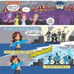
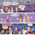
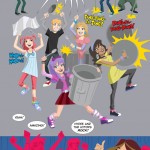
I’ve just been giv­en the go-ahead to final­ly spill the beans about a project I worked on ear­li­er this year. It’s what I was talk­ing about in this post. I got to help with the art for a short Hydee and the Hy Tops com­ic, which is to be pro­duced as a give­away. You get to see it all above, for the first time any­where, probably.

Once again, I was giv­en the oppor­tu­ni­ty to col­lab­o­rate with the love­ly and tal­ent­ed Jim Sten­strum (who is try­ing to get togeth­er a site of his own. When that hap­pens, it will be in my blogroll). Jim pen­cilled these pages, while I did all the col­or­ing and let­ter­ing. There were no pen­cils harmed in the mak­ing of this com­ic, as there was no ink­ing in the usu­al sense. The art style has no con­tain­ment lines; just flat areas of col­or, with occa­sion­al bits of col­ored linework only where need­ed. The look of the com­ic was based on what we’d done for the flash-ani­mat­ed Hydee fea­ture, which I don’t think has been released just yet (Though you can see some of the work I did for that here in my Gal­leries).

I enjoyed work­ing with the Hydee char­ac­ters, both in the com­ic and on the fea­ture. The sce­nario was kind of “Josie and the Pussy­cats by way of the Go-Gos, but if they were being formed now for the Dis­ney Chan­nel,” if that descrip­tion makes any sense. And the client was a dream to work with (which, as any­one in ani­ma­tion can tell you, is not some­thing you can expect to hap­pen all that often). I wish all clients were that good to work with! If the oppor­tu­ni­ty pre­sent­ed itself to work with the prop­er­ty again, under the same kind of cir­cum­stances, I would not hes­i­tate to do it. It was fun.

She’s a Sensation!

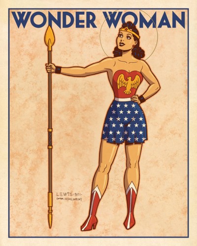
Though DC’s big reboot has already been sprung on us, I had one more image in that poster style that I had to try. Might as well com­plete the tri­fec­ta, right?

So this time out, it’s Won­der Woman. If you’ve read my pre­vi­ous posts on these gold­en age char­ac­ters, I real­ized I kind of uncon­scious­ly set up a pro­gres­sion; I men­tioned that I liked Super­man, but lat­er con­fessed I liked Bat­man a lit­tle more. So you might be expect­ing me this time out to say I liked Won­der Woman the best. But you’d be wrong.

Sor­ry to say, I real­ly was­n’t all that into Won­der Woman as a kid. I appre­ci­ate the strip much more now as an adult than I did back then, for its his­toric sig­nif­i­cance as well as some of the aspects that are unique to it (the fan­ta­sy ele­ments, the mytho­log­i­cal, etc.). Per­haps the gold­en age art (by H.G. Peter) looked a lit­tle heavy-hand­ed and crude to me in some ways as a kid. Look­ing at it now, I have more of an appre­ci­a­tion for it (It feels at times like a sort of car­toon ver­sion of an Albrecht Dür­er engraving).

Won­der Woman is an inter­est­ing con­cept that seems to be a tough one for writ­ers and artists to get a han­dle on. And even if they man­age, it seems hard to get a han­dle on it such that it will engage peo­ple and get them to buy the book (Which is prob­a­bly the more impor­tant point). Many approach­es have been tried with vary­ing degrees of suc­cess, and some don’t get tried at all. But Marston and Peter must’ve had a han­dle on some­thing when they cre­at­ed her. She’s sur­vived this long and man­aged to become part of our col­lec­tive pop cul­ture men­tal land­scape, rec­og­niz­able even to non-comics read­ers. I think that’s worth a lit­tle salute here.

A con­fes­sion: this poster is a loose homage (which I acknowl­edged in how I signed it) to an orig­i­nal poster by Lud­wig Hohlwein. In study­ing his work online, I stum­bled across one poster that just seemed a nat­ur­al to adapt for a Won­der Woman image. It all but cried out for it. So that is what I did!

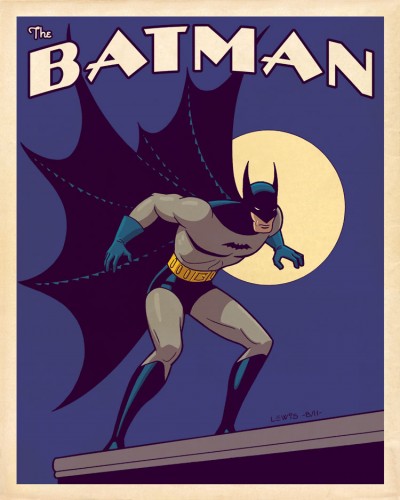
I Shall Become a BAT!”

The clock is count­ing down to DC Comics’ big reboot, and it’s still got me think­ing back on the orig­i­nals. I thought I should get at least one more post in here, before it hap­pens. Super­man was look­ing a lit­tle lonely.

Like I said in my pre­vi­ous post, I’ve always had an attrac­tion to the ear­ly gold­en age ver­sions of some of these char­ac­ters, despite the occa­sion­al rugged­ness in exe­cu­tion. There was a pri­mal kind of ener­gy there that per­haps got lost a lit­tle bit along the way, as the artists and writ­ers got bet­ter at their craft, and began to for­mu­late the rules for how you were sup­posed to do this sort of thing.

Last time, I copped to hav­ing an affec­tion for the gold­en age Super­man. But if pushed, I’d have to admit that I prob­a­bly liked the gold­en age Bat­man just a lit­tle bit more. Those ear­ly strips just dripped with mood: dark shad­ows, misty nights with almost always an enor­mous full moon, and plen­ty of strange char­ac­ters for the Bat­man to go up against. When I first began to encounter this stuff in those DC 100-Page Super-Spec­tac­u­lars as a kid, I had no prob­lem at all under­stand­ing why kids encoun­ter­ing these sto­ries for the first time on news­stands back in the gold­en age were attract­ed to it. This stuff cap­tured your imagination.

In the same vein as the Super­man poster, here’s one fea­tur­ing Bat­man in that ear­ly 20th Cen­tu­ry Poster Style. This time out, I did my ver­sion of a clas­sic pose that Kane used a num­ber of times in those ear­ly issues. A very big “Thank You” to Bill Fin­ger, Bob Kane, Jer­ry Robin­son, George Rous­sos, and all the rest of Kane’s “ghosts” over the years who made Bat­man what he was!

Look! Up in the Sky!”

If you fol­low comics news at all, you’ve prob­a­bly heard there’s this big reboot that DC Comics is doing in Sep­tem­ber. They’re start­ing all their books over from #1, redesign­ing all the char­ac­ters and redo­ing their ori­gins. You can’t assume now that you know any­thing for sure about who they are, their moti­va­tions or the over­all scenario.

I’m not going to get into com­men­tary on that here (there’s been plen­ty of that already in oth­er places online). But I’ll admit the idea of the retire­ment of the orig­i­nal char­ac­ters has me think­ing back on them a bit wist­ful­ly. Though tech­ni­cal­ly a child of comics’ sil­ver and bronze ages, I’ve always had a fas­ci­na­tion with the gold­en age era too. Despite the fact that work was often a bit crude in com­par­i­son to what came lat­er, there was a cer­tain life and raw ener­gy to those ear­ly incar­na­tions of the characters.

It’s a lot eas­i­er to lay hands on gold­en age comics sto­ries now. Back when I was a kid, most­ly you just got to read about them (in books like Ster­anko’s His­to­ry of Comics, or All in Col­or for a Dime). If you could lay hands on one of DC’s 100-Page Super-Spec­tac­u­lars though, you knew you were in for a rare treat.

Like I say, I’ve long had a soft spot for these ear­ly, pri­mal ver­sions of char­ac­ters like Super­man (the proof is at left; a scan of a fake gold­en age cov­er I did when I was about 12 or 13). And with the DC reboot com­ing, I thought I’d revis­it the orig­i­nal Super­man once again. The new image up top could’ve gone in sev­er­al dif­fer­ent direc­tions, but what I wound up hon­ing in on is a Shus­ter-esque ver­sion, posed more for­mal­ly. It’s been tak­en in the direc­tion of vin­tage poster art from an even ear­li­er era. Because that seemed like a fun idea at the time.

Just my salute to the gold­en age in gen­er­al, and the orig­i­nal Super­man in par­tic­u­lar. Thanks very much, Mr. Siegel and Mr. Shuster!

UPDATE: I recent­ly dis­cov­ered online these neat Super­man pages, drawn by Stew­art Immo­nen some years back. Done in the style of Win­sor McCay’s “Lit­tle Nemo,” they’re not entire­ly unre­lat­ed to what I’m try­ing to do here with this poster. I thought these were real­ly neat, and worth shar­ing. It’s fun­ny how well Super­man works in a style like this!