 Longtime visitors to my site might know that back in the ’90s, I was a contributor to Gary Carlson and Chris Ecker’s Big Bang Comics. The first issue hadn’t quite come out through Caliber yet when I came onboard, I think, but some material was already done.
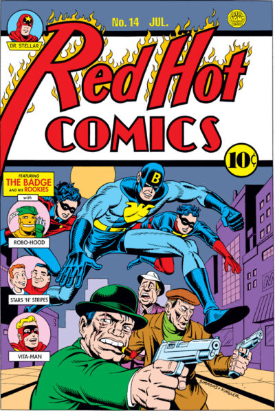
When I met him, Gary was looking for someone to draw a Simon & Kirby type Golden Age character he had in mind called the Badge, and he’d been pointed my way. I got to have a pretty good hand in developing the character, his look and that of sidekicks Trooper and Bobbie, even making some suggestions about the characters’ back stories. So I have to admit to feeling a bit of proprietary interest in the Badge.
We eventually did a couple issues of Big Bang subtitled “The Big Bang History of Comics,” in imitation of the Steranko History of Comics volumes (not really parody except in the most loving and respectful way, because we all had a lot of affection for those books, as they were a gateway into a lifelong interest in comics history for many of us).
The History issues ended up being Big Bang Comics #24 and #27. If you’ve seen the Steranko books, imitating those meant we needed a whole bunch of fake covers! So I and a number of other artists set about to generate them. I recently made a list, and was shocked to see just how many I did, while simultaneously holding down my day job in animation!
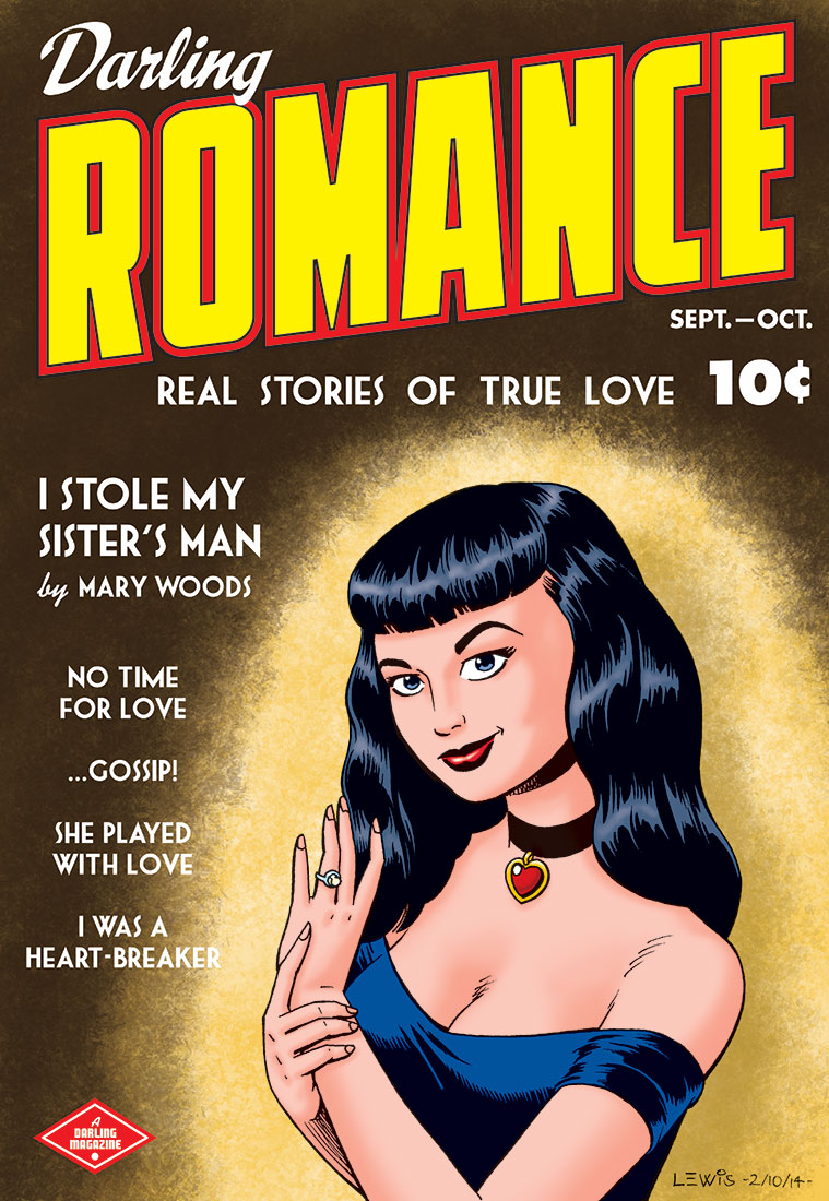
Anyway, to what you’re seeing here: this was one of the earliest fake covers I generated for Big Bang. If my memory’s right, I think it might even have appeared as far back as the Caliber miniseries. I recall it appearing in color, but small, like part of a back cover ad. Recently, I thought it would be fun to go back and revisit a number of those old fake covers I did, and give them the full color treatment they always called out for. Most have never been seen in color at all!
The characters along the left side were ones I just made up on the spot, but most of them ended up appearing in Big Bang stories at one point or another. I sort of thought of Big Bang as “comics history through a funhouse mirror,” and to that end when I was drawing up this cover, I just made up characters that felt like they were playing with some of those familiar old Golden Age archetypes, but hopefully also feeling like you hadn’t entirely seen them before.
Pencils, lettering (and now coloring) are mine; inks were by Jeff Meyer (I believe), who inked several of my fake covers for the History issues, and did a nice job of giving them the correct finished look and feel. You can check out another of our fake cover collaborations here.
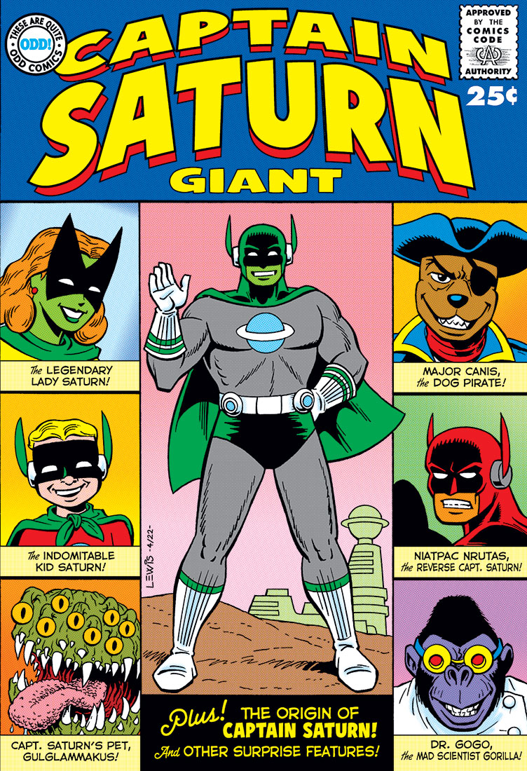
I still have other covers in the pipeline that I might post too, but I hadn’t put anything up here in awhile, and thought this might be fun. Hope you enjoy!
And thanks always, Gary, for letting me have a lot of fun on the Big Bang playground! Those interested can check out more recent Big Bang issues over on Indy Planet.
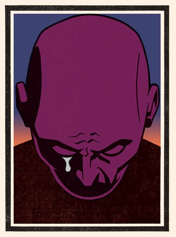
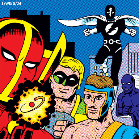 Well, we’ve made it to the 31st here, the final day of Jack Kirby Tribute Month (the brainchild of Howard Simpson). And the prompt for the final day of the month, like last year, is a bit of a wild card. As Howard put it last year, “Draw your own original character. The King would want you to create characters you own.”
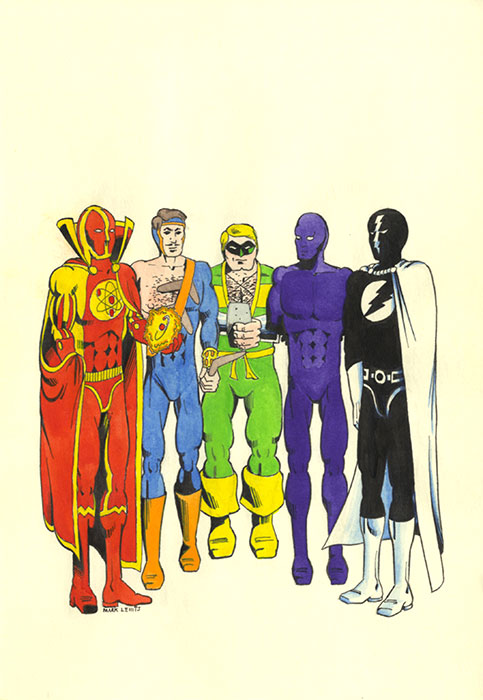 I drew the original drawing when I was around 15, I figure. And I admit to cringing a little bit at the drawing (those lollipop calves!) and some of those costume designs. All I can say in my defense is it was the ’70s, and I guess I was influenced a bit too much by some of the trendier superhero costumes of the time. And why so many full face masks? Though I do think the Wizard design is actually kind of cool still, even all these years later. Kind of brave to just go full black and white like that.
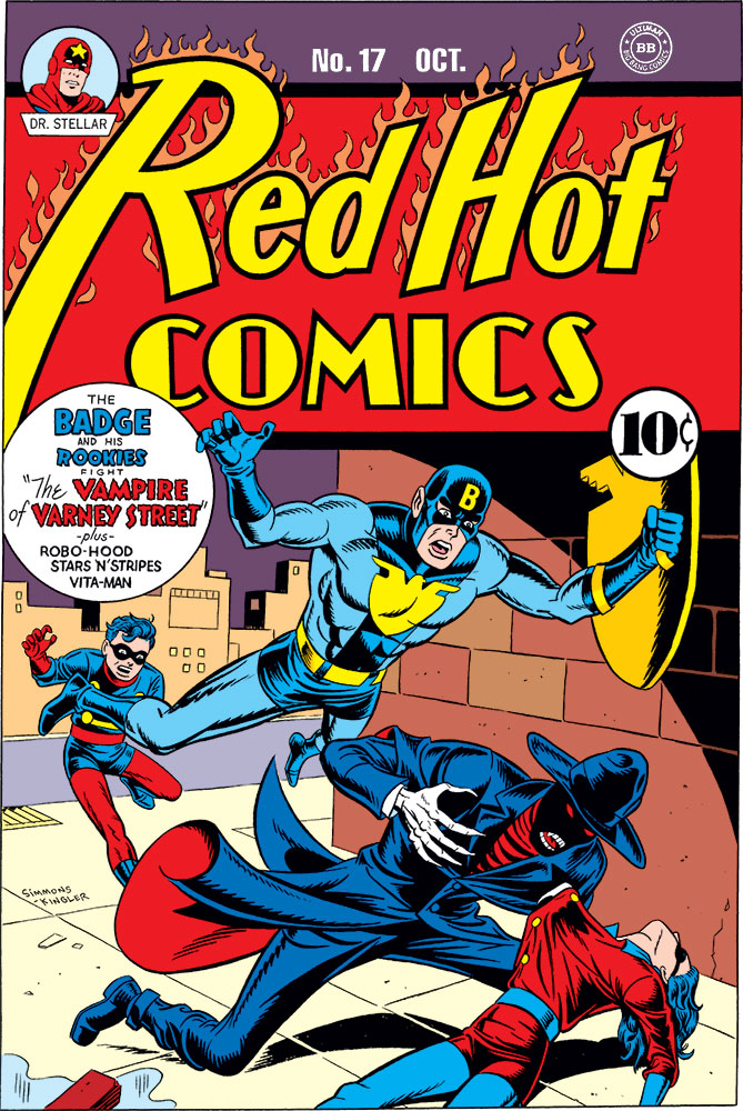


")


")


Web")
