 Here’s Day 9 of Howard Simpson’s month-long online Kirby Celebration, during Kirby’s birth month of August. Open to all creatives, you should be able to find other people’s work on your favorite social media platforms by the hashtag #KirbyArtTributes.
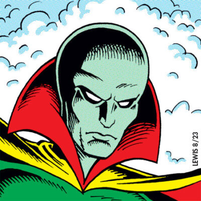
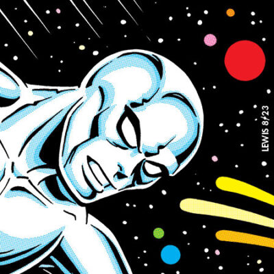
Today’s prompt is the Silver Surfer, who first appeared in Fantastic Four during what may be that book’s best-loved and remembered storyline, the Galactus trilogy. He wasn’t anything that was in any plot that Stan Lee and Jack Kirby had discussed, and Stan elsewhere has acknowledged that he was surprised when he initially saw the penciled pages to discover him. Jack explained that he felt a character as conceptually big and godlike as Galactus ought to have some kind of herald to accompany and precede him, hence the Surfer.
Stan was so taken with the Surfer, he made him his own, and eventually spun him off into his own title. Not working with Kirby, but John Buscema. It’s a highly regarded book (and character), but Stan’s conception was different from what Jack originally intended. Where Stan had the Surfer previously existing as Norrin Rad, who sacrificed himself and his identity to save his planet, Jack thought of the Surfer as a being who was basically created out of nothing, and was learning as he traveled. That’s definitely how things read in his initial appearance as part of the Galactus trilogy.
Anyway, I hope you enjoy my shot at the Surfer. Tune in again tomorrow…