Tag Archives: Modern Age

Art Vs. Artist!

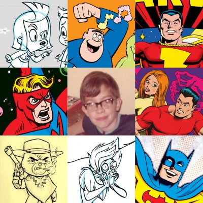
So there’s this thing, and I guess all the cool kids are doing it over on the Twit­ters and the Insta­grams. It’s called “Art Vs. Artist.” You put some of your work togeth­er in this for­mat, along with a pic­ture of your­self in the cen­ter. It seemed like some­thing that might be sor­ta fun to take a crack at, so here we go!

To be hon­est, I’m not entire­ly sure what all the rules are (if there are any), so I’m prob­a­bly break­ing some of them. I did get the idea that this was sup­posed to cen­ter around faces, so there’s at least that. Some of these sam­ples are more recent and oth­ers slight­ly old­er. At the moment, I feel like this works pret­ty well. If I were to attempt this again tomor­row, it’s pos­si­ble I could pick a few oth­er images.

I feel like I might be break­ing one of the rules with my pho­to in the cen­ter. It’s (obvi­ous­ly) not a cur­rent self­ie. Not by a long shot! That’s a 12 year-old me, on my birth­day. If you could see more of the pic­ture, you’d see I was attempt­ing to paint a pic­ture (using oils) of the USS Enter­prise fir­ing on a Klin­gon ship. Why that pho­to? I fig­ure: don’t we all start some­place like that as artists? Every­thing else flows from that.

Captains All!

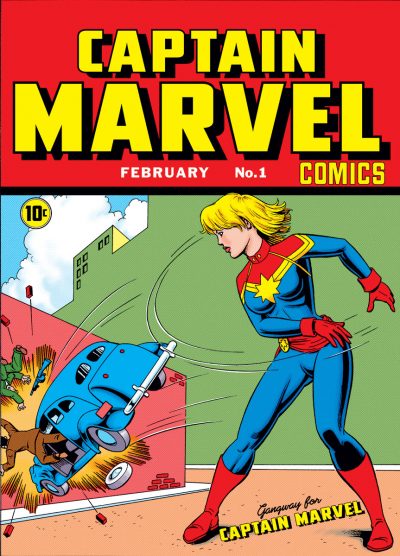
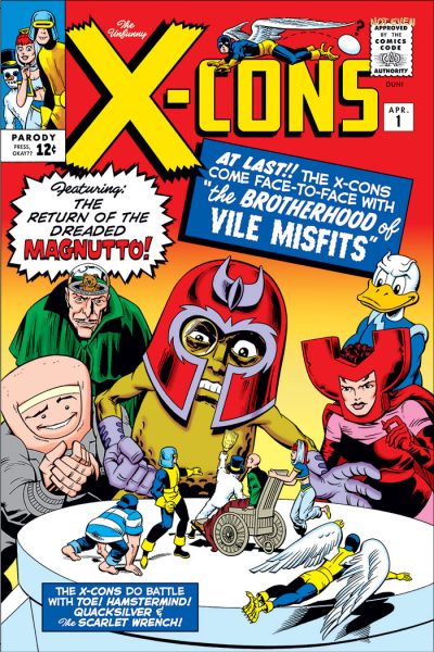
Some of you will rec­og­nize this as a re-cre­ation/rein­ter­pre­ta­tion of the cov­er of Whiz Comics #2, first appear­ance of the orig­i­nal Cap­tain Mar­vel in the Gold­en Age.

This was inspired by a sto­ry a friend told me a few weeks back. Like me, his default set­ting when some­one says “Cap­tain Mar­vel” is to think first of the Faw­cett Comics orig­i­nal. His wife does­n’t par­tic­u­lar­ly read a lot of comics, but she’s famil­iar with the char­ac­ter through him. Recent­ly, he and his wife were out at the movies. They were look­ing at the posters for com­ing attrac­tions. One was for Mar­vel’s Cap­tain Mar­vel film. My friend’s wife looked at the poster and was puz­zled. “Um, why is Cap­tain Mar­vel a girl?”

Look­ing around online, there seems to be more than one per­son out there who’s a lit­tle con­fused as to why these dif­fer­ent char­ac­ters have the same name. I’ve seen forums where this ques­tion’s been asked. Peo­ple who know what’s going on try to explain, only to per­haps go into too much detail, caus­ing the eyes of those who asked the ques­tion to glaze over and regret their hav­ing asked. So I’m not going to get into all that here.

This just appealed to my sense of fun to make this swap. It’s not like I haven’t made a char­ac­ter swap like this before! I’ve even swapped pub­lish­ers on this one. In my mind, this would’ve been pub­lished by Timely/Marvel. I even gave the Cap­tain a new/old logo, in line with the kind of logos they used back then.

And like many of you, I’m look­ing for­ward to see­ing what Mar­vel has done with their Cap­tain Mar­vel in the movie!

Weird Colors

It was recent­ly point­ed out to me that in Sav­age Drag­on #235, Erik Larsen had reprint­ed a bit of my old Big Bang Comics work. This was orig­i­nal­ly part of a larg­er sto­ry­line (I believe called “The Time­bomber”) spread over three issues, where Erik had loaned Big Bang Edi­tor Gary Carl­son the use of his Sav­age Drag­on char­ac­ter, and Drag­on was being bounced around through time, inter­act­ing with mul­ti­ple Big Bang char­ac­ters in dif­fer­ent eras. 

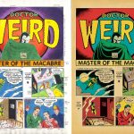
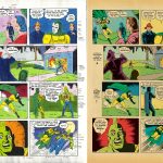
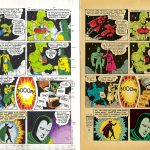
Gary had me con­tribut­ing to this sto­ry in sev­er­al ways, but the one that’s rel­e­vant here is that I pen­ciled and let­tered a three page seg­ment (nice­ly inked by Patrick Tuller), where Drag­on met up with Big Bang’s Dr. Weird. It orig­i­nal­ly appeared in Big Bang Comics #12. I chose to draw it in the style of Gold­en Age comics artist Bernard Bai­ly, prob­a­bly best known for his work on DC’s Spec­tre and Hour-Man strips. I also attempt­ed to match the let­ter­ing seen on those strips, which I’d assume is Bai­ly’s, but I don’t know for certain.

Back when I was orig­i­nal­ly work­ing on this, there were hopes that the issue might be print­ed in col­or, but it end­ed up in b/w. Because there had been that chance though, I actu­al­ly had done some col­or guides for the seg­ment, and I think I mailed col­or pho­to­copies of them to Gary.

Fast for­ward to this three-pager’s appear­ance in Sav­age Drag­on #235: Final­ly it gets to be seen in col­or! Even if any­one had remem­bered their exis­tence, the copies of my orig­i­nal col­or guides were like­ly nowhere to be found, so this was recol­ored from scratch. I thought per­haps vis­i­tors here might enjoy com­par­ing the two ver­sions, see­ing where some choic­es are the same, and oth­ers are different.

Just a cou­ple of comments/observations about the new ver­sion. I appre­ci­ate the fact that the col­orist who did this for re-pub­li­ca­tion stuck with the old school col­or palette. When you’re try­ing to do some­thing that looks and feels like a gen­uine old com­ic, noth­ing ruins the illu­sion faster than a col­or approach that isn’t from that time period!

Also, I noticed that a sort of end­ing cap­tion was added at the end of page 3 that was­n’t part of the orig­i­nal. Who­ev­er did it either recy­cled por­tions of the let­ter­ing I had done ear­li­er in the sto­ry to get what they need­ed, or attempt­ed to let­ter it from scratch so that it looked like my faux Bernard Bai­ly let­ter­ing. Either way: again, try­ing to pre­serve the illu­sion that this was the real deal. So: thumbs up for all of that!


Hey, Mister!

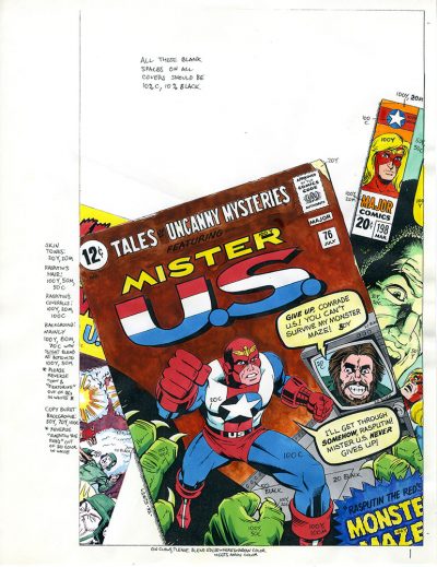
Long­time vis­i­tors to this blog might know that I was a reg­u­lar con­trib­u­tor to Big Bang Comics back in the day. I had lots of fun being a part of that! On his blog over on the Big Bang Comics site, Big Bang co-founder Gary Carl­son has been writ­ing an arti­cle about each issue that came out, in pub­li­ca­tion order. He just made it up to #8, which end­ed up fea­tur­ing a char­ac­ter named Mis­ter U.S. (co-cre­at­ed by writer Nat Gertler and I). You can read all about it here.

Just so there’s some­thing to look at here, I’ve put up a col­or guide I did for one of the vari­ant cov­ers. Back in those days, I was­n’t using Pho­to­shop yet, so this was all done using mark­ers and water­col­ors, then mark­ing up the page with the CMYK col­or for­mu­lae I want­ed for each col­or. Aside from that, between Gary and Nat, they’ve cov­ered the rest of the sto­ry pret­ty well, and I don’t want to spoil any­thing here. But it’s worth check­ing out, if you’re curi­ous about the “secret ori­gin” of this issue and how it came to be.


X” Marks the Spot

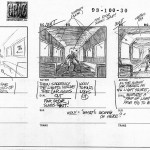
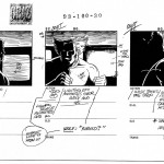
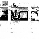
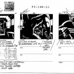
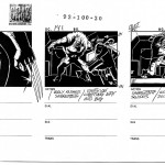
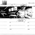
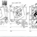
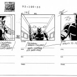
I think I’ve men­tioned this here before, but my first job in ani­ma­tion was work­ing on X‑Men: The Ani­mat­ed Series. And recent­ly (due to inter­est expressed by some of my cur­rent col­leagues at work), I’ve had occa­sion to dig out the box con­tain­ing my copies of some of the work I kept from that series. This led to my re-encoun­ter­ing a sto­ry­board sequence I’ve always thought of as “Wolver­ine down in the Sub­way.” I thought per­haps it (and the sto­ry behind it) might be of interest.

My boss on X‑Men was Producer/Director Lar­ry Hous­ton. You’d be hard-pressed to find a bet­ter first boss in ani­ma­tion to teach you the ropes. Lar­ry and Will Meugniot co-direct­ed the first sea­son, but by the time I was hired at the start of the sec­ond sea­son, Lar­ry was the one still run­ning with the baton. If you liked the series, Lar­ry deserves a siz­able por­tion of the cred­it for that. He was a big time comics fan him­self, and was com­mit­ted to doing the absolute best job he could with the time and resources that he’d been given.

To get back to this sto­ry­board sequence, this was part of an episode in which Pro­fes­sor Xavier suf­fered some kind of psy­chic schism, and a sort of dark ver­sion of his psy­che broke loose and was run­ning free, cre­at­ing prob­lems for the X‑Men. It’s long enough ago now, I for­get some of the specifics. Lar­ry found he need­ed a sort of addi­tion­al bridg­ing sequence that was­n’t called for in the script, so he set about to cre­ate it him­self, sto­ry­board­ing it on the fly. It start­ed off with Wolver­ine down in the sub­way, unknow­ing­ly encoun­ter­ing this dark ver­sion of Prof. X. As Lar­ry board­ed the sequence, it kind of grew and took on a life of its own. He could­n’t stop!

When he final­ly fin­ished, Lar­ry asked me to do the cleanup over his pen­ciled board. The art­work was very clear, but in com­ic art terms he had what might be con­sid­ered break­downs, and I was being asked to embell­ish them. Fun! And that’s the board sequence I’ve post­ed here. “Wolver­ine down in the Sub­way.” Except for the next-to-last page (122, inked by Frank Squil­lace, because we were com­ing up against the dead­line), it’s all my embell­ish­ment over Lar­ry’s board­ing. We were all pret­ty hap­py with how the final board here came out!

Jeff Bonivert’s Atomic Man

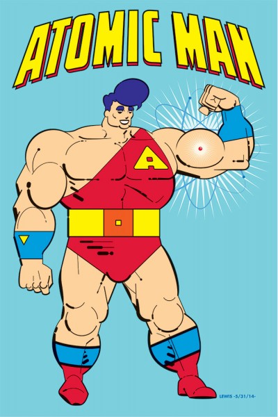
Atomic-ManAnd now, for some­thing com­plete­ly different!”

I’m dig­ging deep for this one. The ’80s saw a lot of inter­est­ing, fun, odd, inde­pen­dent comics. Jeff Bonivert’s Atom­ic Man Comics was one of them.

I don’t remem­ber just how I first encoun­tered Jeff Bonivert’s work, but it most def­i­nite­ly caught my eye. It’s unique for the abstract geo­met­ric and graph­ic way he approach­es his draw­ings. I pick up a bit of an art deco or stream­lined feel to it in places. There’s no mis­tak­ing his work for any­one else’s.

I believe that like me, Jeff is from the Bay Area. There was a time in the ’80s when we even worked at the same place, but unfor­tu­nate­ly I nev­er got to meet him and talk comics (it was a pret­ty big place).

I some­how man­aged to get all three issues of Jef­f’s Atom­ic Man Comics back when they came out, and there’s a def­i­nite sense of fun to the pro­ceed­ings. Atom­ic Man is real­ly kind of a clas­sic-style comics hero. He has super-strength and invul­ner­a­bil­i­ty, but does­n’t appear to have any oth­er super­pow­ers beyond that. Jeff added some fresh ideas to the mix, in that Atom­ic Man is hap­pi­ly mar­ried, with two kids, liv­ing in San Fran­cis­co. Being from the Bay Area, that last part sort of mat­tered to me, because it seems like the tra­di­tion­al default for most super­heroes has been to base them in NYC (or some fic­ti­tious NYC surrogate).

For my Atom­ic Man salute, I thought a styl­is­tic exper­i­ment using Adobe Illus­tra­tor might be a good way of attempt­ing some­thing that could evoke the look of Jeff Bonivert’s work.

Atom­ic Man is ™ and © 2014 Jeff Bonivert.

Qui est Cette Fille?

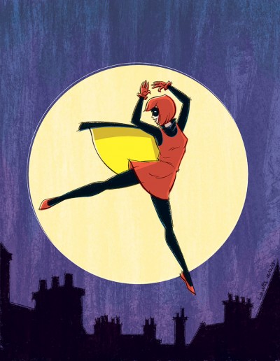
BandetteI’m con­tin­u­ing with the theme from last time, talk­ing about good comics I’ve read recent­ly. The rea­son this post’s title is in French will become clear in a bit.

This time out, it’s Paul Tobin and Colleen Coover’s Ban­dette. From the moment I first saw art from this com­ic, I knew it would be right up my alley. But it’s only recent­ly that I was able to buy a copy. This is because up until now, Ban­dette did­n’t exist in phys­i­cal form. It was part of the Mon­key­brain line of dig­i­tal comics.

Here’s where I might sound like a bit of an old fogey, but I haven’t quite been able to cross over yet to pur­chas­ing comics that exist sole­ly in dig­i­tal form. I’m not anti-dig­i­tal media by any means! I love check­ing out my favorite web comics, and I love the fact that if I devel­oped a sud­den ran­dom crav­ing to buy mari­achi music at 2 am, I could pur­chase it instant­ly on iTunes. But even so, I can’t quite get past feel­ing a lit­tle odd over the fact there’s noth­ing phys­i­cal to show for those pur­chas­es. Feels a bit like buy­ing air, even though I know it’s not the case.

Any­how, in this case, I knew that as soon as Ban­dette became avail­able in phys­i­cal form, I’d want to pick up a copy. And I was not dis­ap­point­ed! Ban­dette Vol­ume One: Presto! is an absolute blast.

Her adven­tures take place in Paris (hence my post title). You might think from the visu­al that Ban­dette would be a super­heroine, but no! Actu­al­ly, she’s a thief! Albeit an incred­i­bly gift­ed one, (with “Presto!”, as she’d say) who occa­sion­al­ly comes to the aid of Police Inspec­tor Belgique.

Ban­dette is adorable, irre­press­ible, with je ne sais quoi and joie de vivre (and per­haps oth­er French phras­es that go beyond the extent of my lim­it­ed recall of my high school and col­lege French). You can’t help but like her! Some of it is due to the writ­ing (Paul Tobin dis­plays a tal­ent for giv­ing the dia­logue a French-feel­ing rhythm with­out resort­ing to pho­net­ic accents). A lot of it also comes from Colleen Coover’s art, which imbues Ban­dette with so much life and appeal, and spontaneity.

I’d think most read­ers junior high age and up (or old­er read­ers who are still some­what young at heart) will love this book. My only regret is that there isn’t a Vol­ume 2 ready to read right now! I’d def­i­nite­ly rec­om­mend check­ing Ban­dette out, if you get the chance.

Before I close, it seems appro­pri­ate (giv­en my tim­ing, and the top­ic) to wish all my site vis­i­tors a joyeux noel et bonne année!

Ban­dette is ™ and © Paul Tobin and Colleen Coover.

Go, Molly, Go!

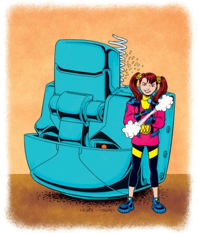
Molly Danger ColorIt’s occurred to me that it’s been awhile since I talked about any new comics I’ve read that I liked, and there’ve been more than a few recent­ly. So I thought this would be a good time to do that again.

This time out, I’m going to talk about Jamal Igle’s Mol­ly Dan­ger. Jamal is an artist and writer who has done a lot of work for DC, Mar­vel and oth­er pub­lish­ers. Mol­ly is the result of his decid­ing to throw his hat into the cre­ator-owned ring. I applaud when cre­ators do this. Not only is this good for the cre­ators, but we fans and read­ers win too!

Mol­ly Dan­ger is a ten-year-old girl, who just hap­pens to also have super-strength and invul­ner­a­bil­i­ty. She’s the res­i­dent super­hero of Coop­ersville, NY, pro­tect­ing res­i­dents from the men­ace of the “Super­me­chs” that crop up from time to time. Mol­ly even has a whole sup­port team work­ing with her, called D.A.R.T. (the Dan­ger Action Response Team).

This vol­ume is the first of a pro­ject­ed four vol­ume series. The book’s for­mat is larg­er than a stan­dard com­ic and in hard­cov­er, kind of like some of the Euro­pean albums I’ve seen. It’s a fun, all-ages ride that Igle has craft­ed here. And “craft” is the right word, as every aspect of this is lov­ing­ly and appeal­ing­ly crafted.

I get some of the same sense of fun from this that I used to get from read­ing my favorite Mar­vel or DC Comics when I was a kid. Not to imply that this book is done in some kind of “retro” style, because it’s not. Igle and his crew are using all the mod­ern tools at their dis­pos­al. There are ele­ments in the writ­ing that you prob­a­bly would not have seen in an old com­ic, but they make the char­ac­ters more relat­able to both young and old­er mod­ern read­ers alike. If any­thing, I’d say that what Igle’s got going here is per­haps some­thing of a sign­post for how peo­ple could approach doing mod­ern all-ages super­hero comics.

Style­wise, I’d put Jamal in the camp of the “com­ic book real­ists.” I sus­pect per­haps artists like Kevin Maguire might have been an influ­ence on him. But for my draw­ing here, I elect­ed to go my own way with it. I was kind of curi­ous to see what Mol­ly might look like with the old school col­or palette.

If you’re still a fan of good all-ages comics like I am, you might want to give Mol­ly a look!

Mol­ly Dan­ger is ™ and © Jamal Igle and Com­pa­ny LLC.

Sorry,…What Was Your Name Again?”

Hm. Where to begin to explain this one?

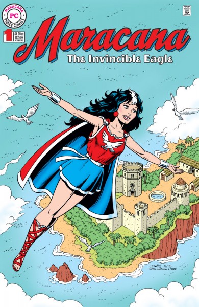
This orig­i­nal­ly start­ed out intend­ed to be just a sketch, done for John Pierce. But as these things some­times hap­pen with me, it sort of took on a whole life of its own. John is a friend, an email cor­re­spon­dent, a long­time comics fan and writer. You may have seen his work in some mag­a­zines about comics like Roy Thomas’ Alter Ego/FCA (the Faw­cett Col­lec­tors of America).

Any­way, John has a char­ac­ter he cre­at­ed called Jon­ni Star. Her sto­ries have appeared in a few small press comics here and there, usu­al­ly illus­trat­ed by Brazil­ian artist Emir Ribeiro. (I even took a crack at draw­ing Jon­ni myself once, and you can see the result here in my Gallery). John had an idea for a com­ic book char­ac­ter that John­na (Jon­ni’s civil­ian iden­ti­ty) liked to read about, called Mara­cana, the Invin­ci­ble Eagle. Which I guess makes Mara­cana a com­ic with­in a comic.

Most comics fans will like­ly be able to sort out for them­selves which char­ac­ter arche­type Mara­cana’s descend­ed from. But John has some inter­est­ing twists in there too, like hav­ing her root­ed in a more Celtic-influ­enced cul­ture instead of the Gre­co-Roman type one might tend to usu­al­ly expect with a char­ac­ter like this. Like I say, this start­ed out intend­ed to be just a sketch, but I guess I got car­ried away and could­n’t help myself. I thought the end result was fun. Seemed like I might just as well go ahead and post it here, while I’m at it.

Mara­cana the Invin­ci­ble Eagle is ™ and © John Pierce.