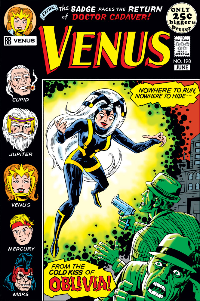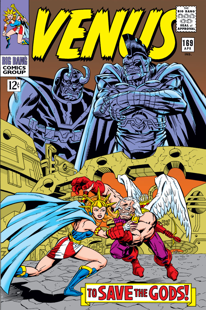
 Longtime visitors to my site might know that I was a contributor to Gary Carlson’s Big Bang Comics. But before Big Bang Comics, there was Megaton!
There was this whole eco-system of fan and semi-pro independent comics going on in the ’70s and ’80s that I had barely any awareness of at the time. If a comic showed up in a comics shop, or if the publisher had sufficient funds for an ad someplace like The Comics Journal, Amazing Heroes, or other similar magazines back then, then I might have heard of it. But there were a lot of self-published comics that never got that exposure. It was kind of “the wild west” for people who wanted to get eyeballs on the work they were putting out.
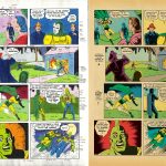
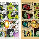
Megaton was one of those comics that I had no clue about its existence when it was originally coming out. The comic featured the title character, while also serving as an anthology showcasing other characters. Gary Carlson had a knack for finding artists to work for him who were right on the verge, sort of “almost ready for primetime” players. But this was a double-edged sword, in that often he’d only get a story or two out of an artist before they’d get the call from Marvel or DC. Gary was either the first to hire, or gave very early work to, artists like Butch/Jackson Guice, Erik Larsen, S. Clarke Hawbaker, Angel Medina, and Rob Liefeld.
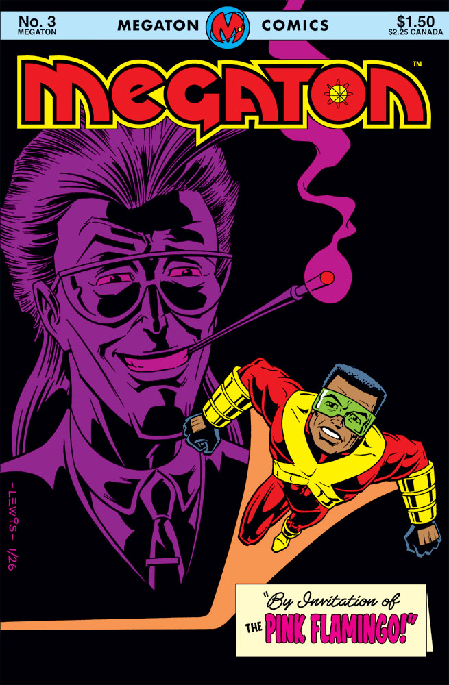
Gary managed to get eight issues of Megaton out, with color covers and b/w interiors. In August of 1987, plans were announced to expand into a whole Megaton Comics line (starting off with four titles), this time with color interiors. Megaton volume 2 #1 was slated to be one of those titles. The artist was going to be Gary Thomas Washington (hereafter GTW), who had drawn the Megaton strip since volume 1 #7.
Unfortunately, none of those comics ever came out. The bottom had kind of fallen out of the market at that point, and Gary was forced to pull the plug. GTW had completed art for all of #1, part of #2, and a character concept sketch for #3 when the order came down.
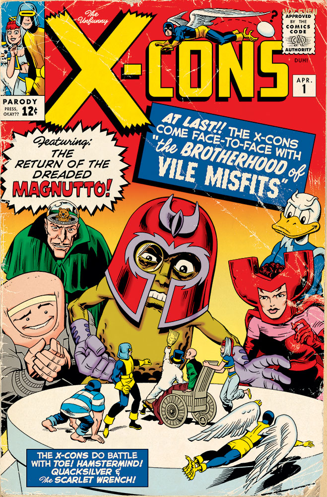
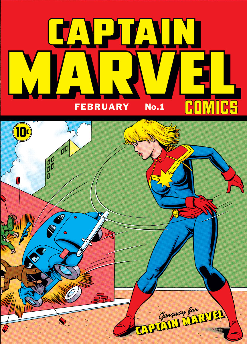
Here’s where we get into “fantasy world” territory. While I got in pretty close to the ground floor on Big Bang Comics, if I had even the slightest clue about Megaton back then, I probably would’ve reached out to Gary to try to get work. So maybe I could’ve ended up becoming a contributor to Megaton in 1987.
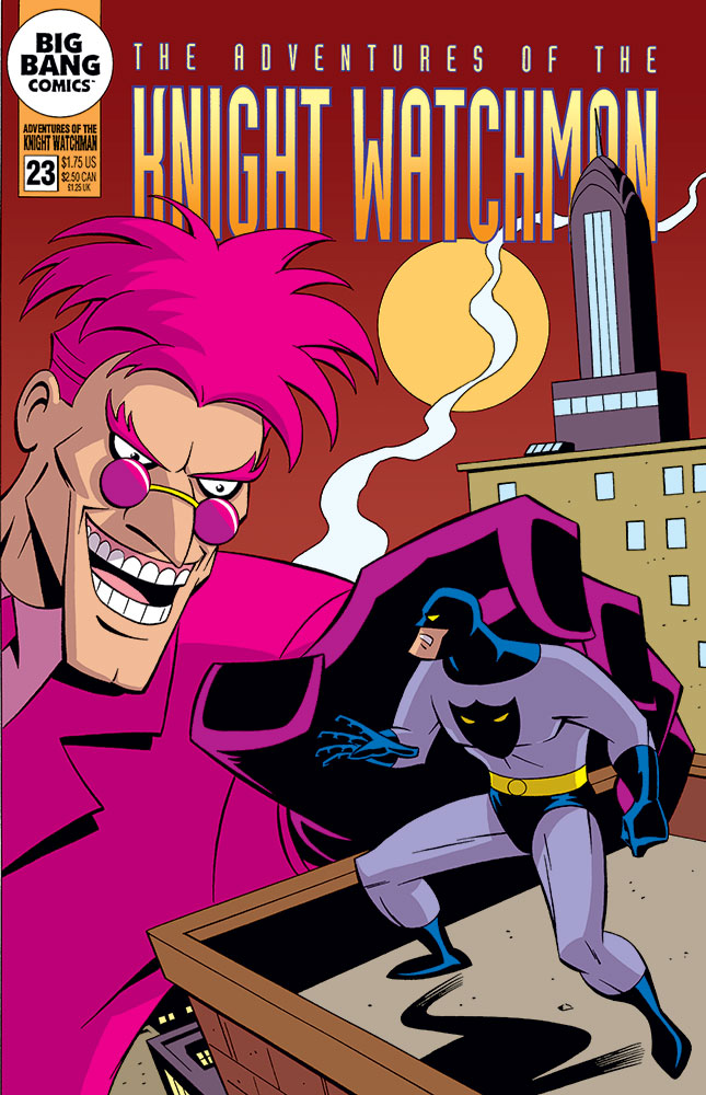
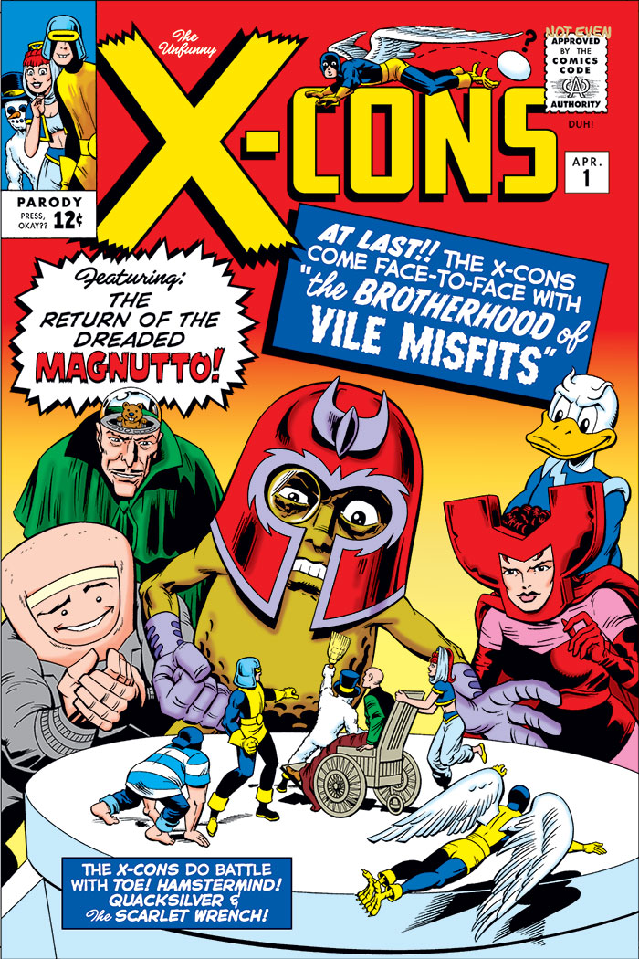
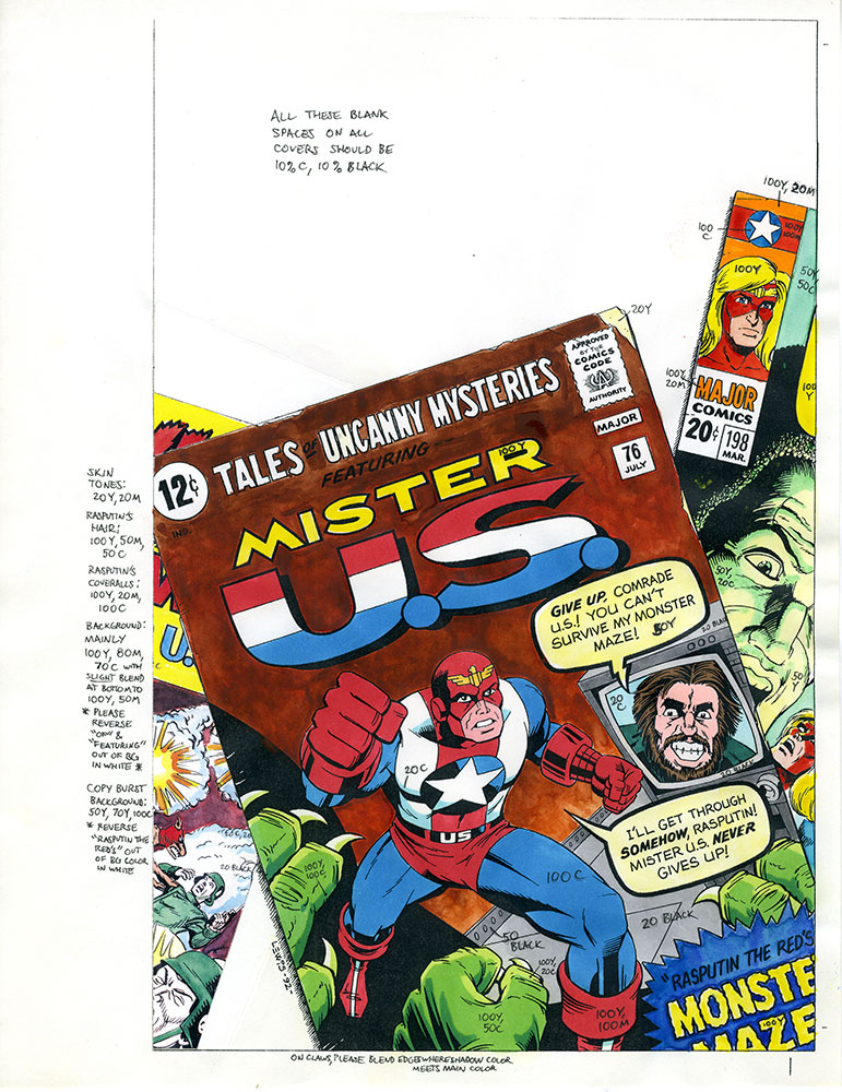
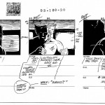
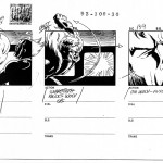
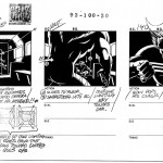
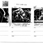
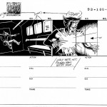
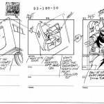
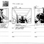
I didn’t want to overwrite the work GTW had done, so I avoided the first two issues of volume 2. #3 seemed fair game. If you’re familiar with Big Bang Comics characters, the visual for the villain in the background may be confusing to you. He doesn’t look like the Pink Flamingo who’s the Knight Watchman’s archnemesis. That’s because this is the original version of the character (based on a concept sketch by GTW), who was intended as a villain for Megaton in volume 2 #3. He got retooled for Big Bang. This will probably be the first time anyone outside the Big Bang/Megaton orbit has ever seen this version of the character.
Anyway, folks, I hope you enjoy this cover of a comic from another timeline/universe!