![]() I just did a piece of pinup art of Frank Squillace’s Transducer Man! ‘Nuff said!…
I just did a piece of pinup art of Frank Squillace’s Transducer Man! ‘Nuff said!…
…No? Guess not. Okay; here’s more. Years ago, on my first day in animation (working on X‑Men: The Animated Series) , the very first person I met was Frank Squillace. My friend Frank has always been one of those artists whom you could describe as an “idea engine.” For example, Jack Kirby was clearly that kind of artist. Frank has always been coming up with ideas for different characters and stories, as if it were the easiest thing in the world. He’s got so many of them! I must confess to being a bit jealous of Frank’s ability to do that, because I’ve never been wired quite that way.
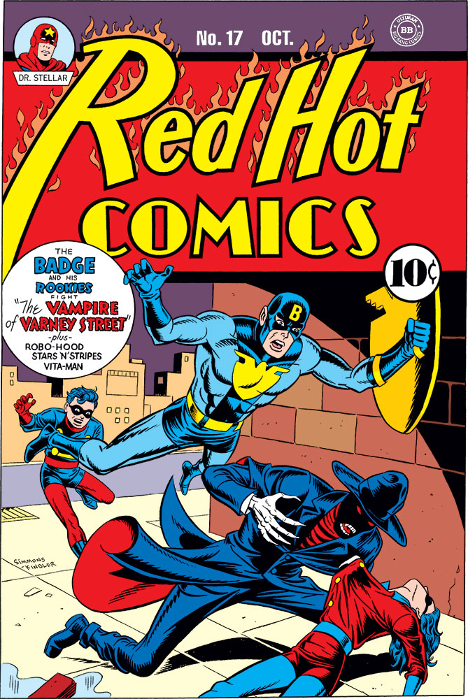
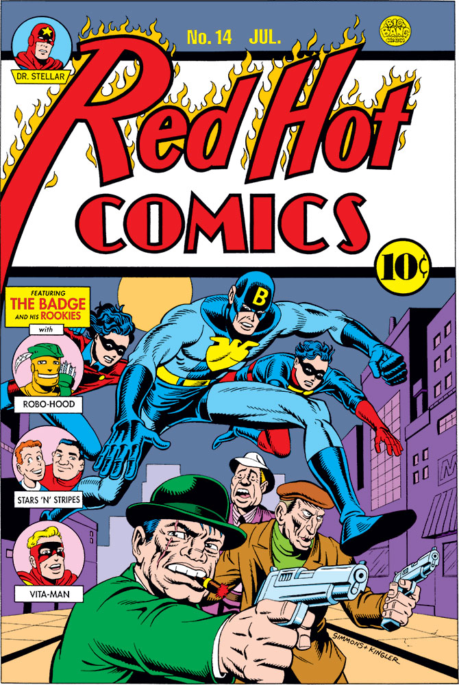
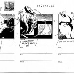
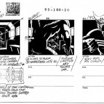
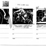
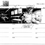
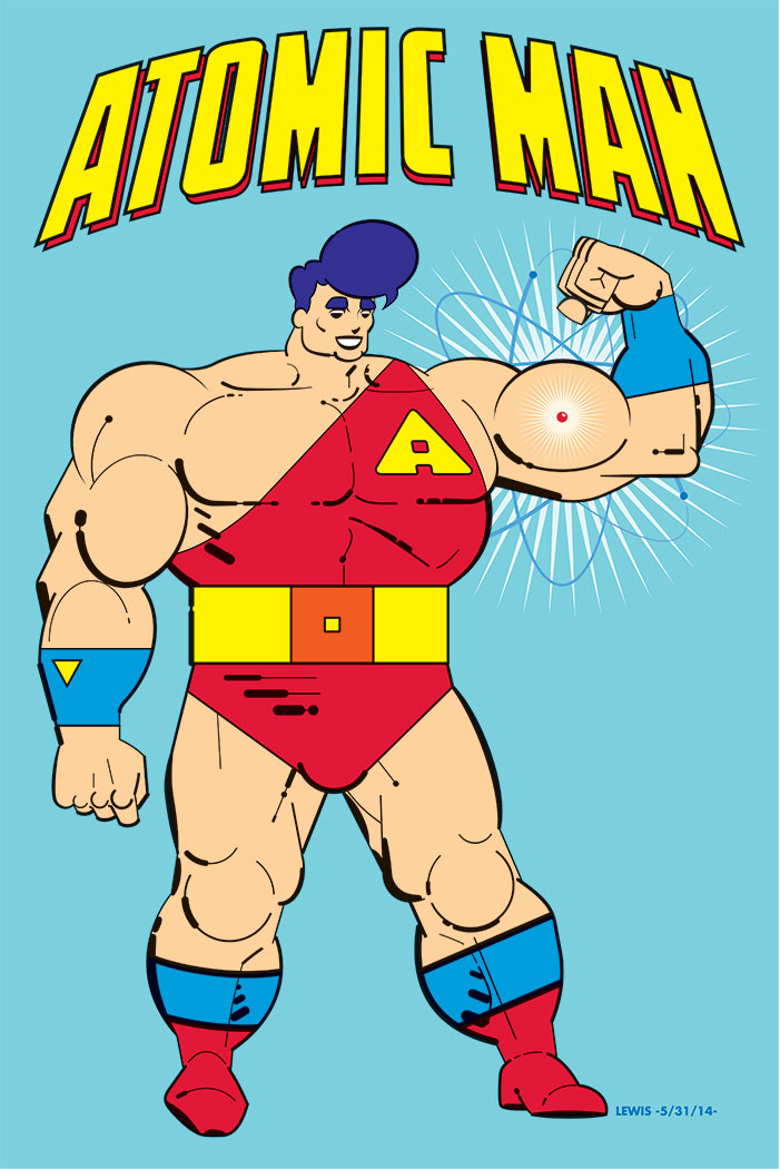
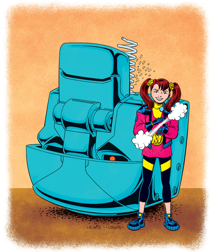
Frank’s had his Transducer Man character for a good, long while, probably since well before we ever met. The character’s gone through several iterations over the years, as he periodically played with the concept, honing and shaping it. Back when we were working together on X‑Men, I even did a few drawings of his character (as he was at that point) myself. I’ve included one here, below.
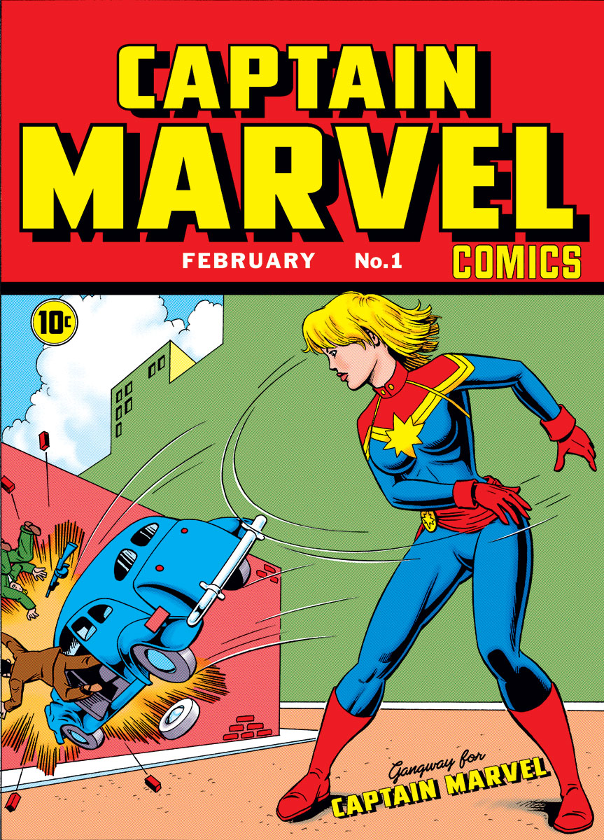
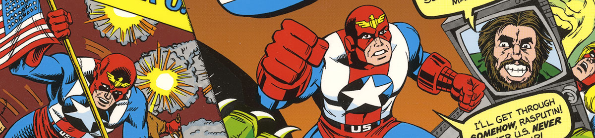
![]() Frank and I have been talking recently, and he’s been really fired up to do something with Transducer Man again. Specifically as a comic. As often happens with Frank, the concept has been expanded and altered again. Currently, Transducer Man’s more in the vein of a classic Golden Age comic character (while not entirely abandoning his original more pulp-based roots). Hearing what Frank intends on doing with his comic, I couldn’t help but get the itch to take a crack at drawing the current iteration myself!
Frank and I have been talking recently, and he’s been really fired up to do something with Transducer Man again. Specifically as a comic. As often happens with Frank, the concept has been expanded and altered again. Currently, Transducer Man’s more in the vein of a classic Golden Age comic character (while not entirely abandoning his original more pulp-based roots). Hearing what Frank intends on doing with his comic, I couldn’t help but get the itch to take a crack at drawing the current iteration myself!
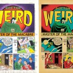
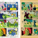
Meanwhile, Frank is currently furiously working on his Transducer Man book, hoping to get it out. Stay tuned; I’ll let you know when it happens! It will include my pinup…along with other guest pieces of art!
Transducer Man is ™ & © Frank Squillace.