If you’ve checked in on my site from time to time, you may have seen my posting about the graphic novel Zita the Spacegirl last year. My last comment on the subject then (directed at author Ben Hatke) was “…I hope you have plans for more Zita in the future.” Thankfully, the future is now!
I’m a little late mentioning it, but Legends of Zita the Spacegirl (book #2 in the series now) came out last month. Based on the first book, Ben set my expectations pretty high for this new one. And he did not disappoint! Pretty much all the things I said last time hold true of this new book too. I don’t want to just repeat myself, but I would like to make some further observations about Ben’s work here. The book also spurred some thoughts about comics in general, which fit this discussion.
I’d mentioned before how much charm Ben Hatke’s artwork has. There’s a nice, organic looseness to his approach. He is unapologetically a cartoonist (and I don’t understand why in some fan quarters, “cartoony” is a pejorative. Personally, I’ve always gravitated towards artists who are strong stylists). I hadn’t made this association previously, but this time out I realized his work was reminding me a little bit of the comic Mars by Hempel and Wheatley, published back in the ’80s. While I can’t go so far as to proclaim Hempel and Wheatley’s Mars was an influence on Ben, it seems like visually he’s coming from a similar place. Or perhaps they have some influences in common. Whether there’s any connection or not, in both cases, the visual approach allows for a much wider and more imaginative range of characters and situations than perhaps a more realistic take would allow.
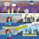
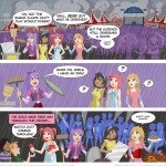
And the universe Ben has created for Zita is quite imaginative! Lots of strange creatures and wild concepts going on in this book. Without giving anything away, there are a couple of ideas in there that I think would even do Jack Kirby proud.
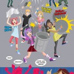
 Another thing I was more conscious of this time is the fact that Ben is not afraid to do whole sequences without any dialogue or captions. He’s willing to let his artwork carry the whole burden of telling the story at points, through the action, facial expressions and poses. I think that’s great, and really kind of brave. Doing a book like this (even as writer/artist), I imagine there’s a temptation to fall back more on the words to carry the weight of your story. While it might be more of a challenge, it can be much more satisfying in some ways if you can get as much as possible of the story across using just your visuals. The bottom line is that comics is a visual medium. It is quite possible to do a comic with no words (in fact, it’s been done several times over the years). But it’s not possible to do a comic without pictures.
There’s been a lot of debate in recent years about there not being enough comics that are appropriate for kids. Often the way people attempt to address that is to do specific “kids’ comics.” In my opinion, that’s a risky way to go. The potential pitfall in that approach is that there can be a temptation dumb things down, and talk down to the kids. Kids aren’t stupid. If you think back to when you were a kid, you knew it when people were talking down to you, and I’ll bet you didn’t like it any more then than you do now. Personally, I believe the better approach is to attempt to do “all-ages” comics that work on multiple levels at once. Bringing this back on-topic, the Zita books are a good example of that. A younger reader will appreciate them on one level, while older readers will find themes and aspects that resonate with them on a whole other level. Much like the best children’s literature has always done.
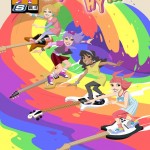
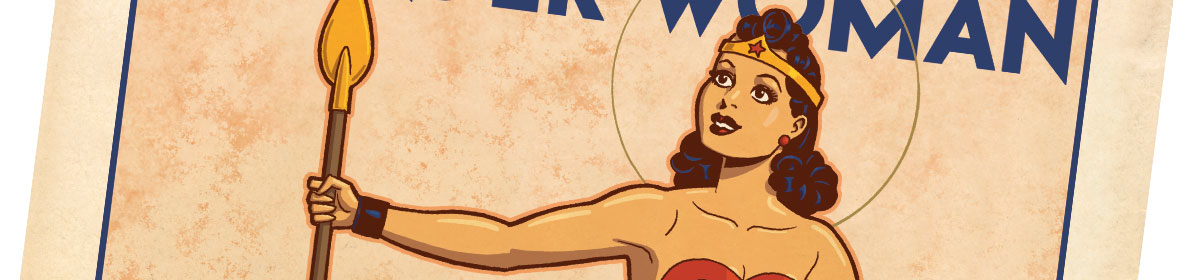
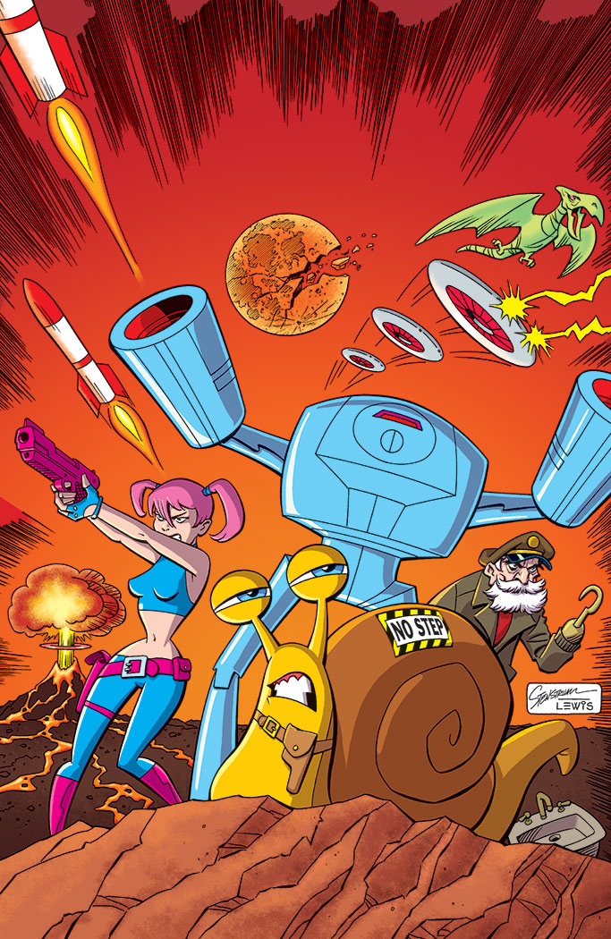
I guess I should talk a little about the illustration(s) I did to accompany this article (since this site’s supposed to be about me drawing!). This image is kind of riffing off some visuals and situations in the book. I don’t want to say too much about the plot and spoil anything. But I thought it would be fun to take the poster idea from the book and really do it up, like a full-blown silkscreened poster (inspired by the work of Strongstuff, AKA Tom Whalen).
Anyway, if you like really good all-ages comics, I recommend you get your hands on this one. If you haven’t already picked up the first volume, Zita the Spacegirl, get ’em both!
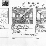
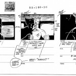
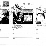
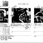
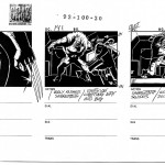
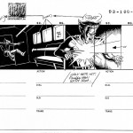
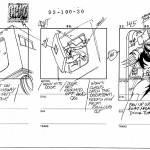
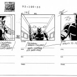
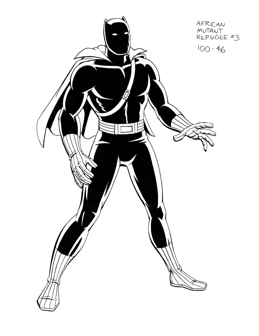 Like a lot of people, I’m looking forward to the release of Black Panther, the latest Marvel movie this Friday, February 16th. This last weekend, I had an email from my first boss when I started working in animation, Larry Houston (whom I also consider a friend). Larry was the producer/director of the original X‑Men: the Animated Series (as it seems to have become known now). I did character model clean-up on the series, and a fair amount of character design too, along the way.


")