 There’s a story behind this one. Of course! Isn’t there always? 😀
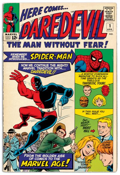
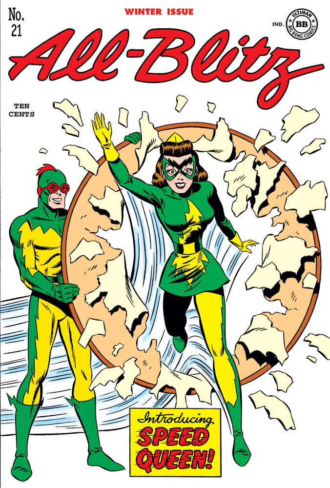
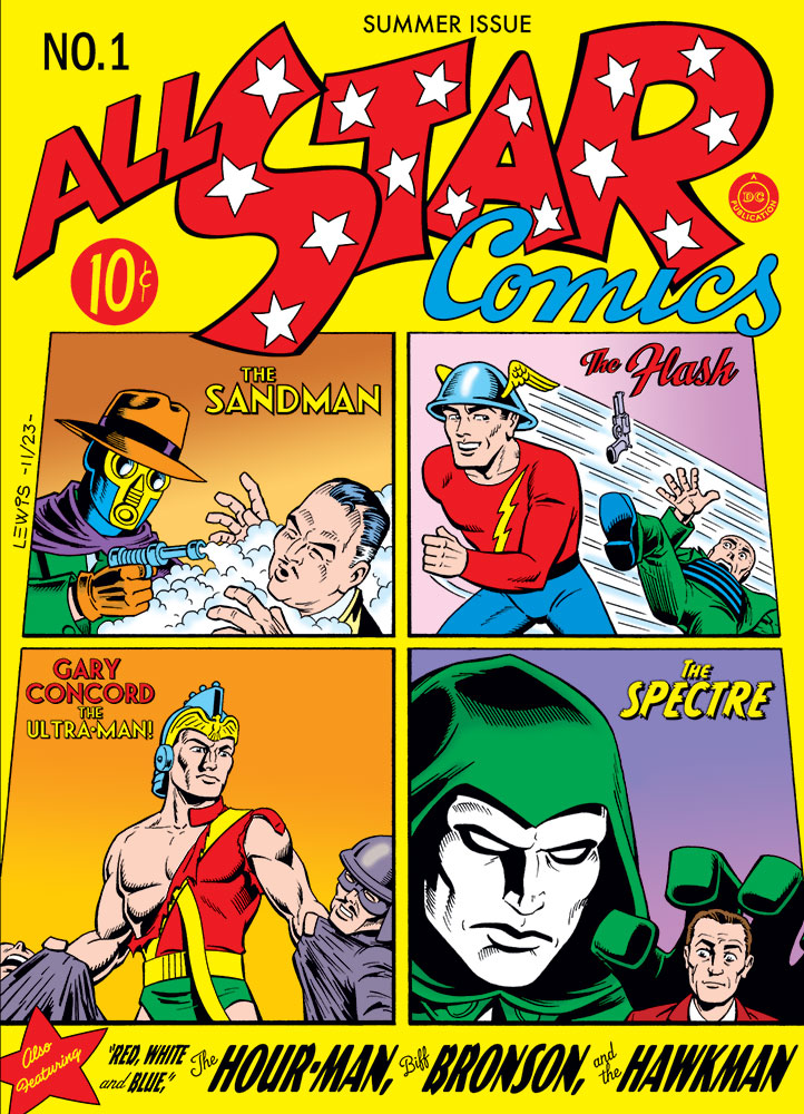
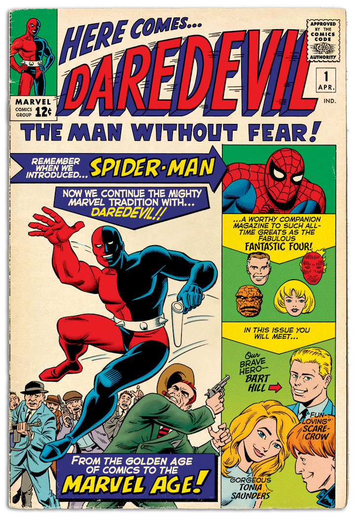
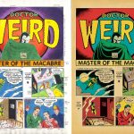
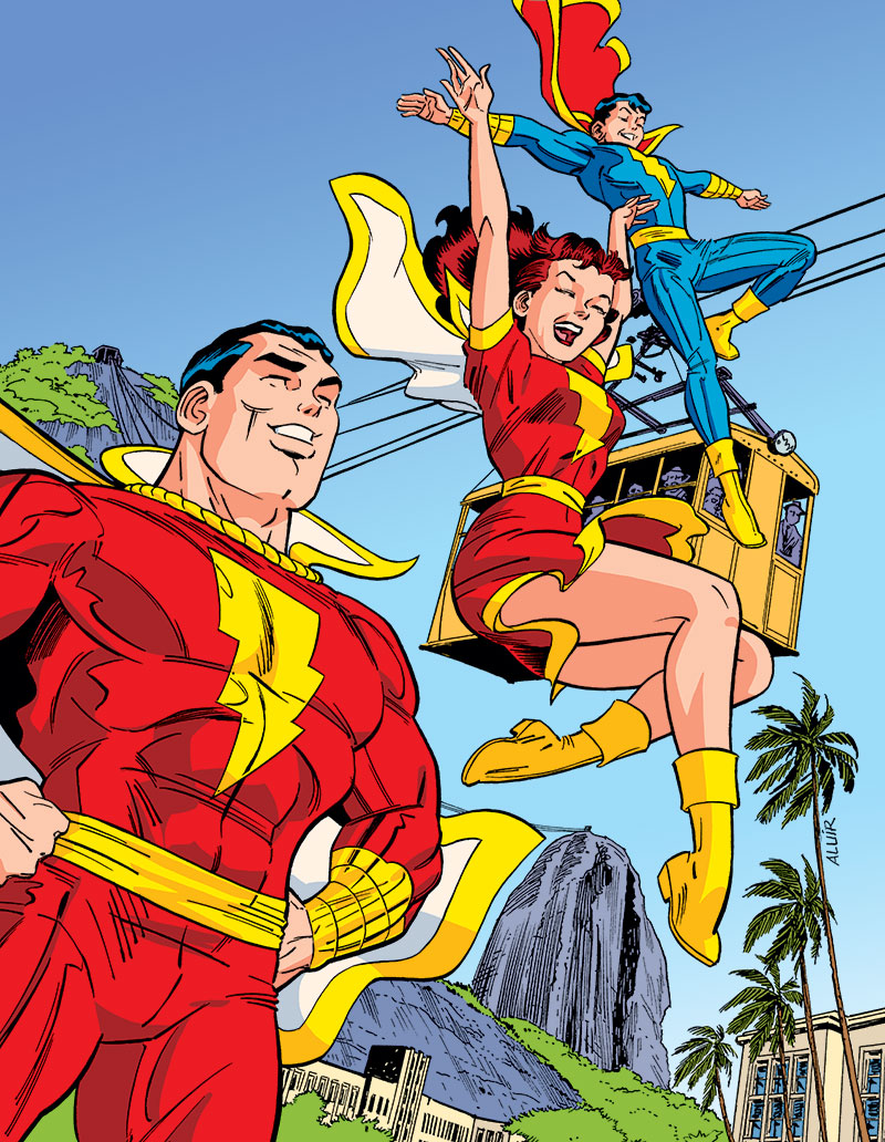
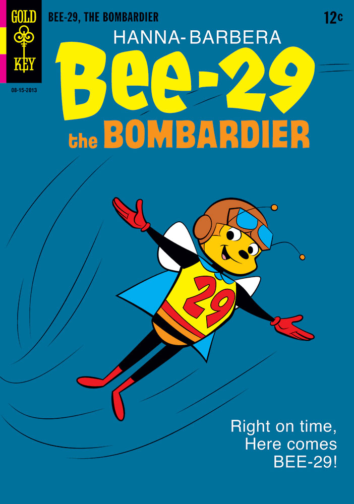
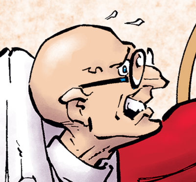
But first; there are probably some of you scratching your heads, going, “Huh? That’s not Daredevil!” It’s understandable that you might only know about Marvel Comics’ version of Daredevil, from the comics and the recent Netflix series. But back in the Golden Age of comics, there was a different Daredevil, published by Lev Gleason. The character’s title sold very well, running for about 16 years, until sales fell (like many superhero titles did post-WWII). This Daredevil had a kid gang who hung around with him called the Little Wise Guys. The boys had taken over his title by the time the book ceased publishing, Daredevil himself having gone MIA about six years prior to that.
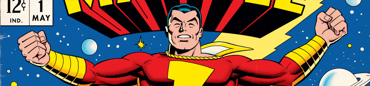
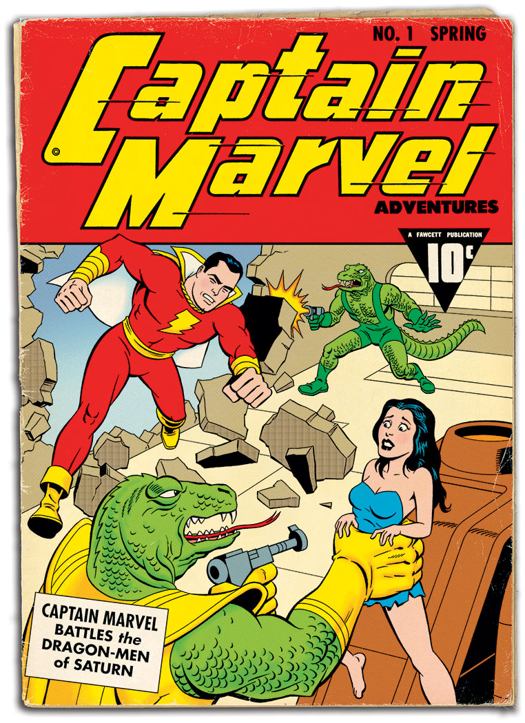
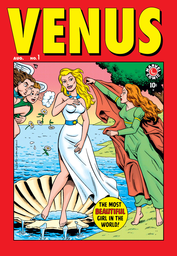
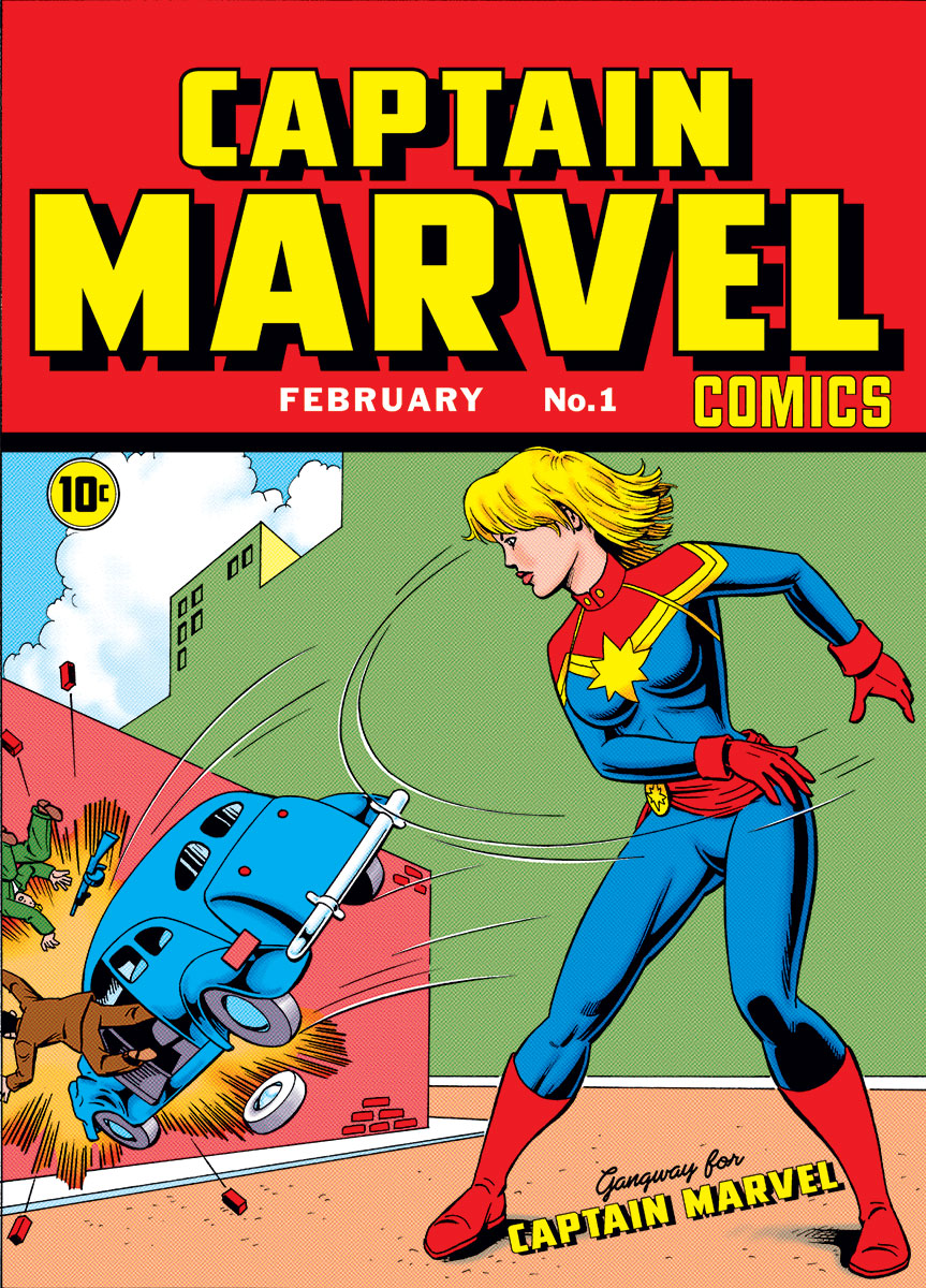
But I should get back to the story behind this re-creation/reinterpretation. Earlier this year, I was chatting with director Dan Riba (known for his work on Batman: the Animated Series, among many other cartoons). In the course of our conversation, he mentioned that he’d recently had an online interaction with movie producer Michael Uslan, via the Book of Faces. Somewhere out there on the internet, Mr. Uslan had stumbled across my earlier re-working of Marvel’s Captain Marvel #1, replacing the Kree version with the Golden Age Fawcett original, as if Marvel had bought the rights to the character from Fawcett.
Dan told me that Mr. Uslan liked my cover, but didn’t know where it had come from (The internet sometimes has a way of stripping us creative folk of credit for our work). Dan informed him that it was my work. In reply, Mr. Uslan wondered if I had ever considered doing a similar thing with Daredevil #1, reworking it as if in some alternate universe, Marvel had bought the rights to the original Golden Age character instead of inventing their own new version. (Somewhere, I read that this was actually considered briefly).
I told Dan that I hadn’t thought of that, but it was an interesting idea. The conversation moved on from there, and I didn’t think about it again. At least not for a little while. But this thought kept periodically circling back into my brain. And as occasionally happens, it got lodged in there. When that happens, I’ve found the only way to get it out is to actually do the thing. So here it is!
Re-creating and re-imagining this cover was a much bigger challenge than my Captain Marvel #1 was. In the process of digging in and working with a cover image like this, you come to realize certain things about it. One is that for a Marvel Comics cover of this vintage, it’s a very busy cover! It’s almost more like a DC Annual or 80-Page Giant cover of that era.
I have a theory about the reason why this cover is so uncharacteristically busy for Marvel. It’s only a guess, mind you, but I suspect that originally the cover was going to be just the primary image at left. That part looks to have been drawn by Jack Kirby, while there are other hands in the rest of the art. Three of the Fantastic Four heads are just the paste-up art they used in that comic’s corner box! I can’t help but wonder if someone (perhaps Stan Lee, or maybe Martin Goodman) felt like this new title needed more of a sales boost than just the one image, so the main piece of art was reduced and shoved to the left, and all the additional text mentioning Spider-Man and the Fantastic Four was added in that column on the right.
Adding to my suspicions are all the tangents that existed on the original, which I made an effort to fix here. They feel like the sort of thing that happens when art is re-worked after the fact by other hands, in ways the initial artist didn’t plan for.
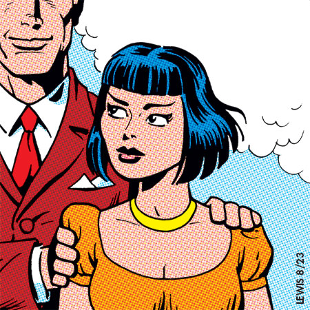
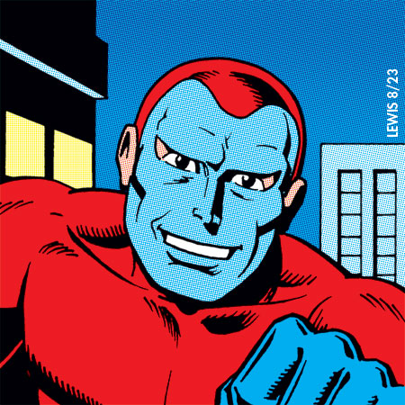
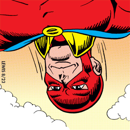
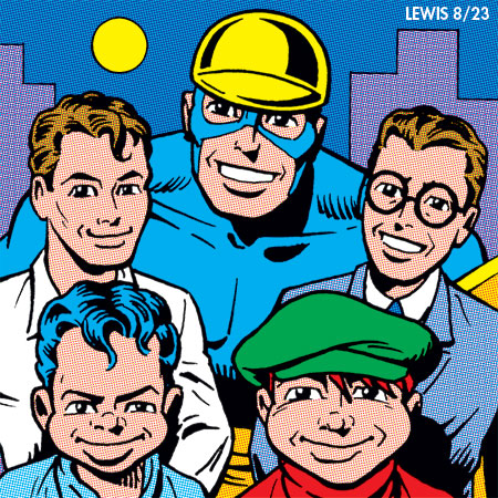
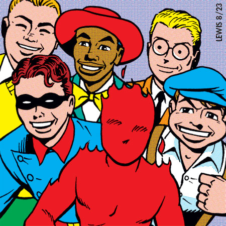
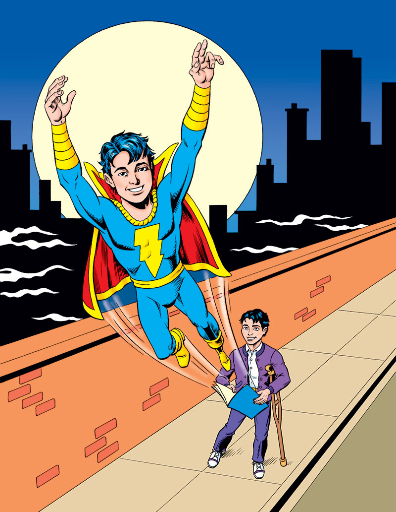
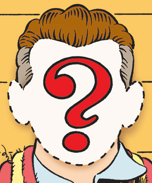
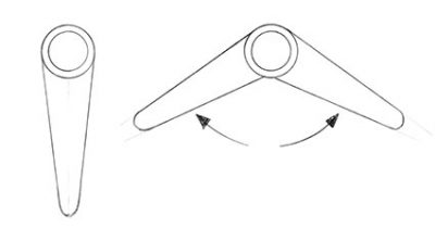 There are a couple additional things I should mention, because of course there are story bits about this new/old version that I worked out in my head while doing this cover. I figure Marvel might have given Daredevil fold-up boomerangs that he could store in his belt (see diagram). And at first I wasn’t sure what to do with the spot at lower right where Foggy Nelson was on the original cover. Who could I put there? But as I thought about it, the idea of aging up the Little Wise Guys to teenagers (ala Rick Jones), and having them form a band seemed like a good way to go. They’re represented here by Scarecrow. It wasn’t too hard to take his haircut from his Golden Age look and turn it into more of a Beatle cut.
Thanks to Mr. Uslan and Dan for planting the bug in my brain!
 It’s apparently that time of year, when artists look back and post a sampling of the work they’ve done the previous year in this format on social media. I’ve been seeing some of these popping up on LinkedIn the last few weeks or so, with the #ArtVsArtist hashtag. Looking back, it’s been awhile since I did one (2020!), so I thought maybe I’d do it again, join in on the fun.


")

